Alan Cohen: Line
|
Alan Cohen is an American photographer whose work spans from the mid 1900s to the early 2000s . After earning earning a degree in nuclear engineering, he would began photography and eventually left sciences to study photography. He was awarded a M.Sc. Photography degree in 1972. Most, if not all of his work is in black and white and revolves around lines. These lines are mostly taken in urban settings, showing pavements, pillars, shadows off of buildings, to rural settings, like cracks in rocks and stones.
|
|
|
|
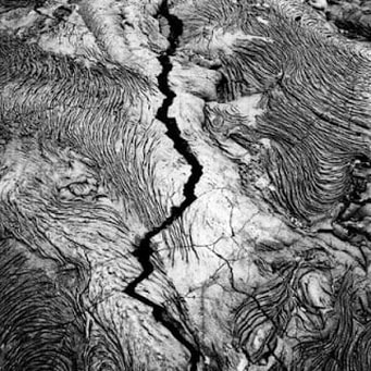
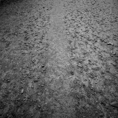
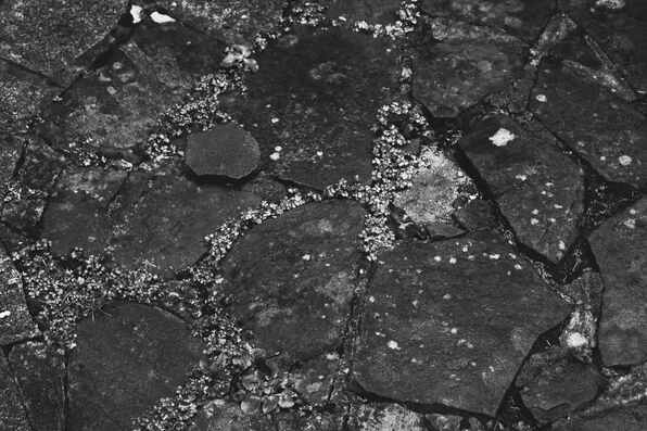
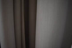
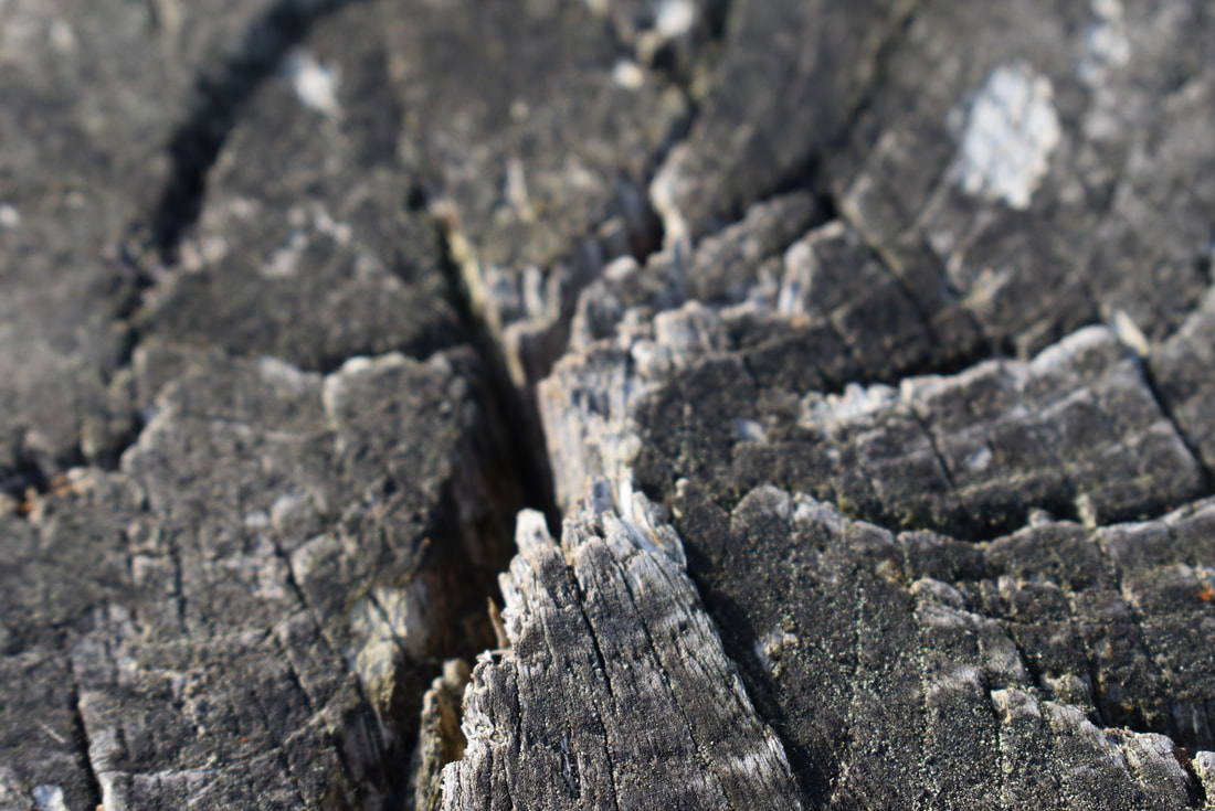
The image that I am analyzing is the one on the right. This picture is named simply "Construction" and was made in 1990. This artwork falls into the established genre of still life, as it is simplistic and is centered on the abstract shape in the middle. Apart from this shape, there are no recognizable objects, places or scenes, with only an array of thin shadows scattered on the floor, with no sense of scale. As far as I'm concerned, there is no clear narrative expressed in this artwork, but perhaps there is a hidden one, personal to the photographer.
The images lines inhibit any sense of fluidity. The black and white helps makes everything seem like it is stone or metal, as those are connotations of the colour grey. 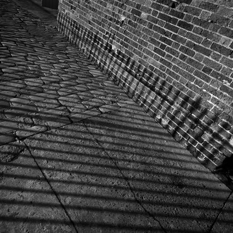
The picture "Construction" is a square, gelatine silver print, with the dimensions 22 inches by 22 inches. The image is completely black and white. Every one of Cohens pieces are square, varying in size. This creates unifies the images, making no image differently shaped from another. In "construction" , there seems to be no centre or main focus to the piece.
Overall, I find the image to be a successful representation of how simplicity can be beautiful, and how lines bring order to seemingly wild and untamed world. |
To me, the image displays an emotion of depression and brings out a response of thoughtfulness. The colour grey usually connotates sadness and being emotionally dead/ dull. Perhaps this is just an illusion or a facade to hide something deeper. Something emotional, or maybe something political. Other pieces of his work are taken in or near Auschwitz and The Berlin wall. These are locations which were once oppressed, but are now free, all in his lifetime. The image above could now be interpreted differently. Perhaps those black twisting shadows can be seen as bars to a cage. Maybe this is all one big analogy to him feeling oppressed.
Auschwitz
|
Lines:
|
|
Analysis:
|
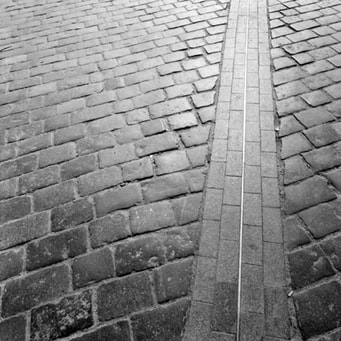
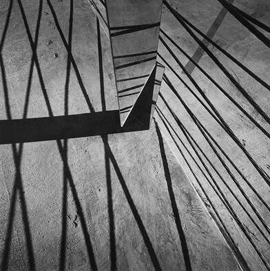
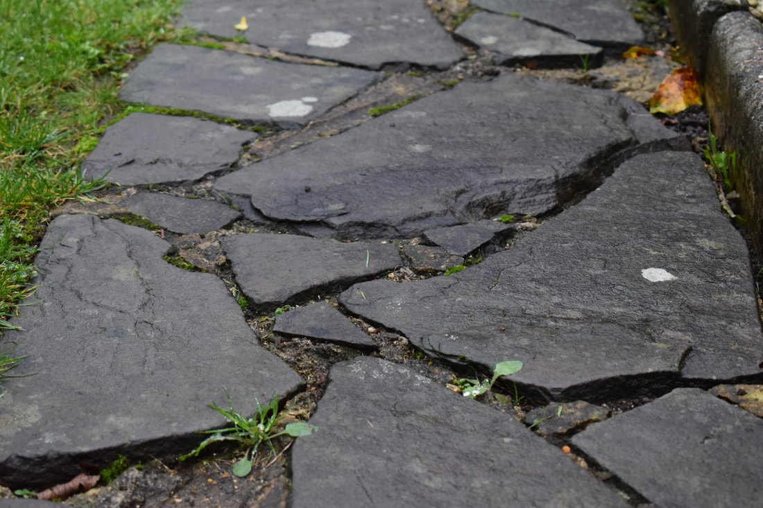
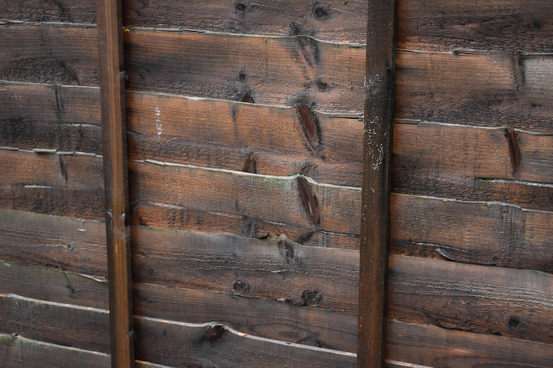
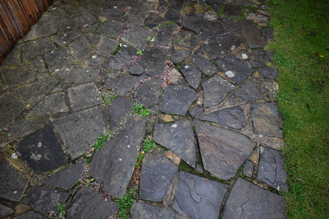
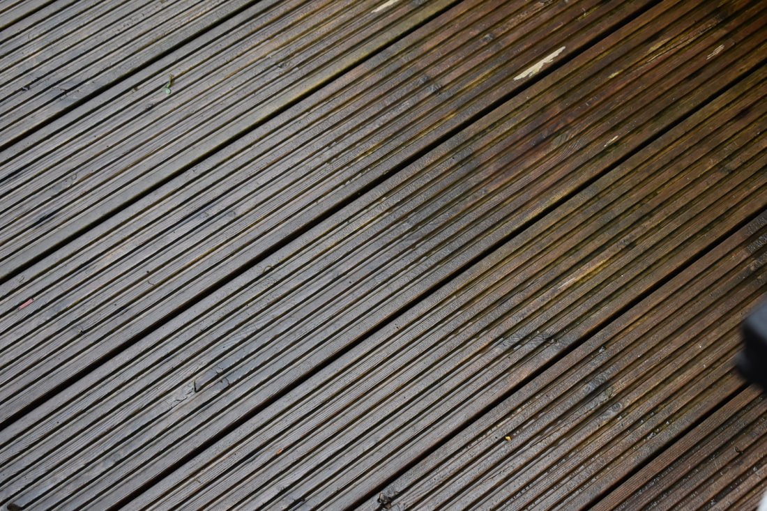
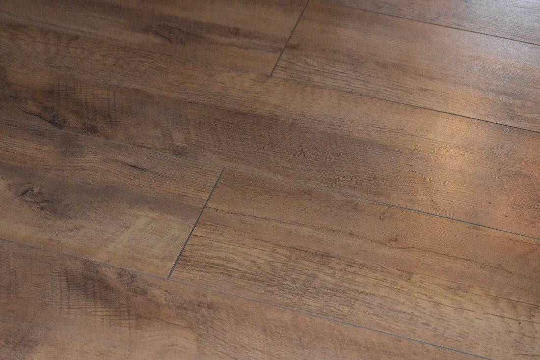
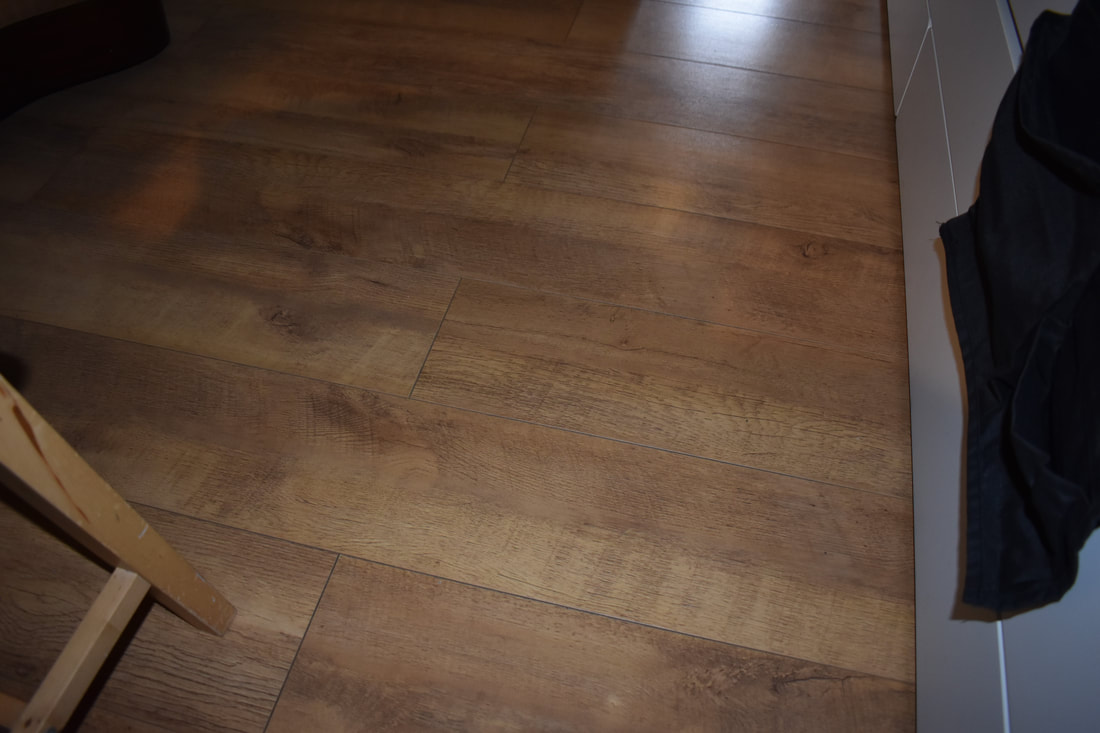
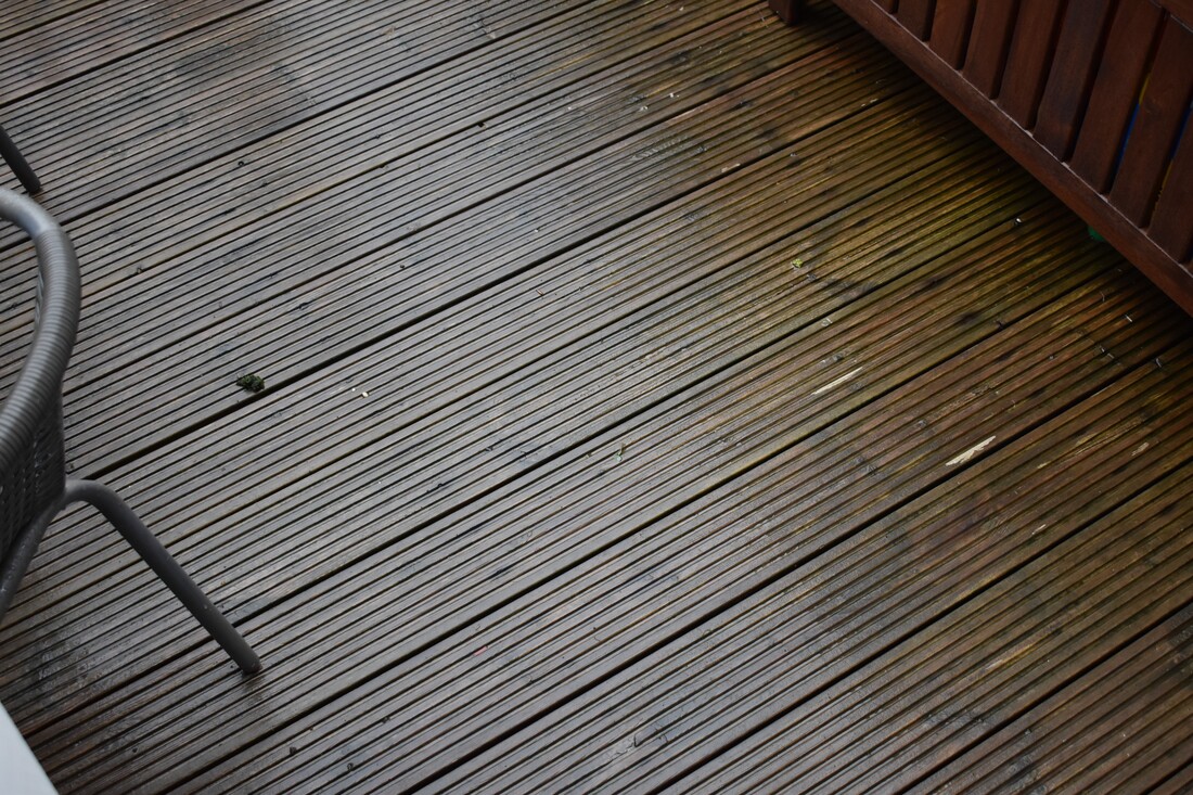
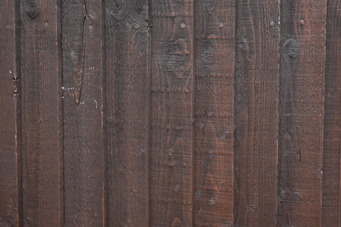
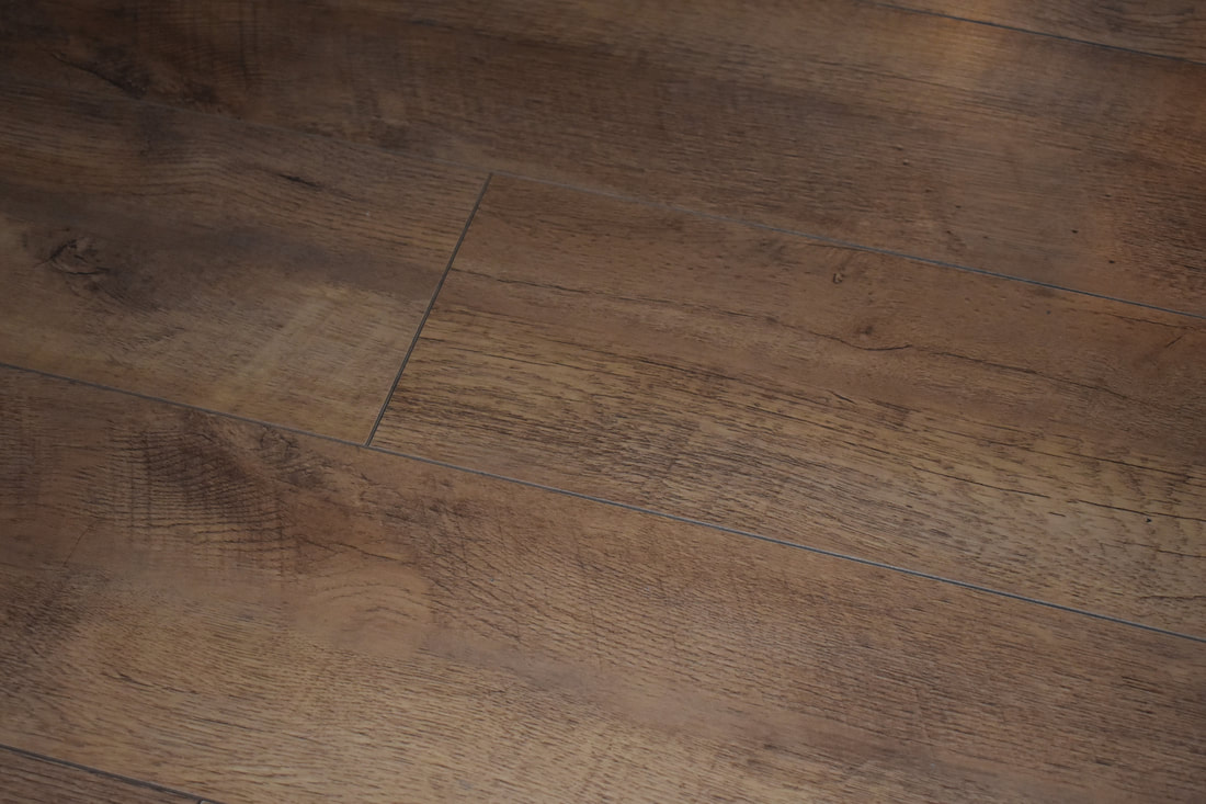
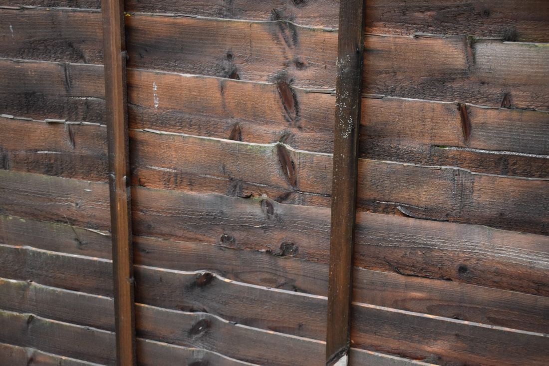
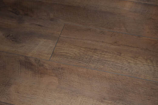
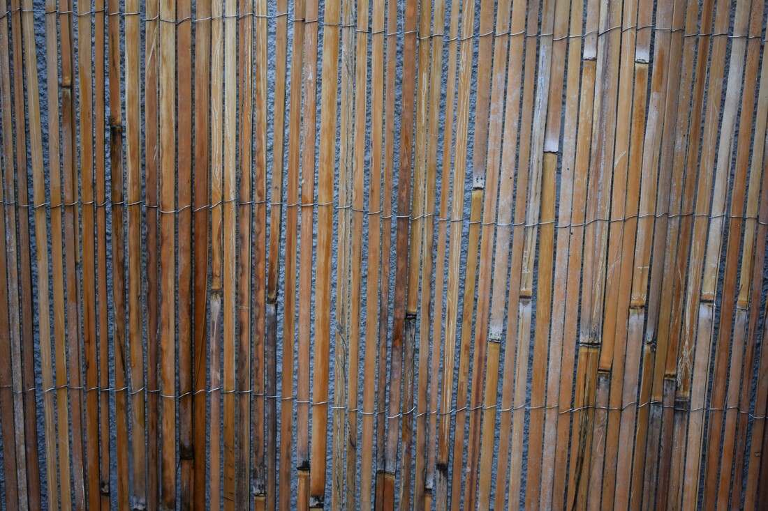
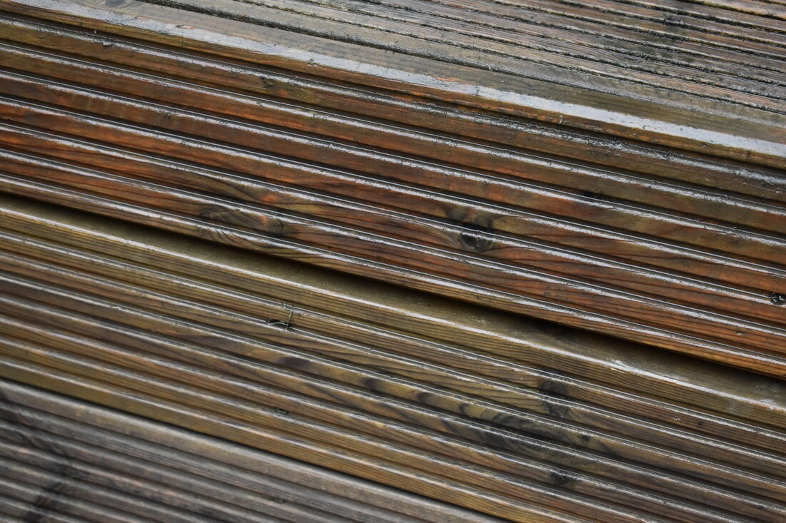
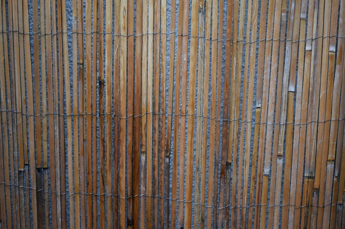
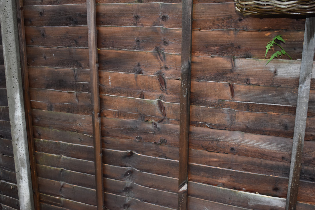
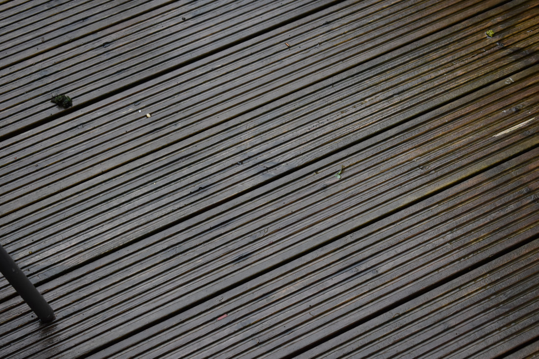
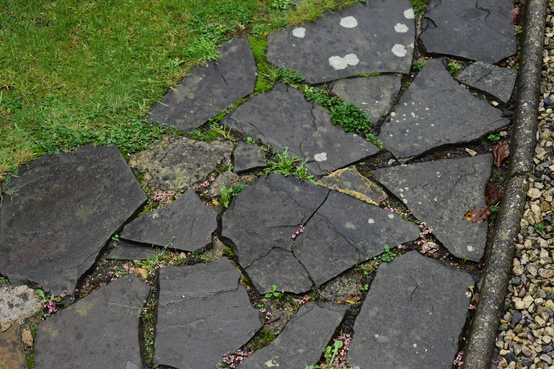
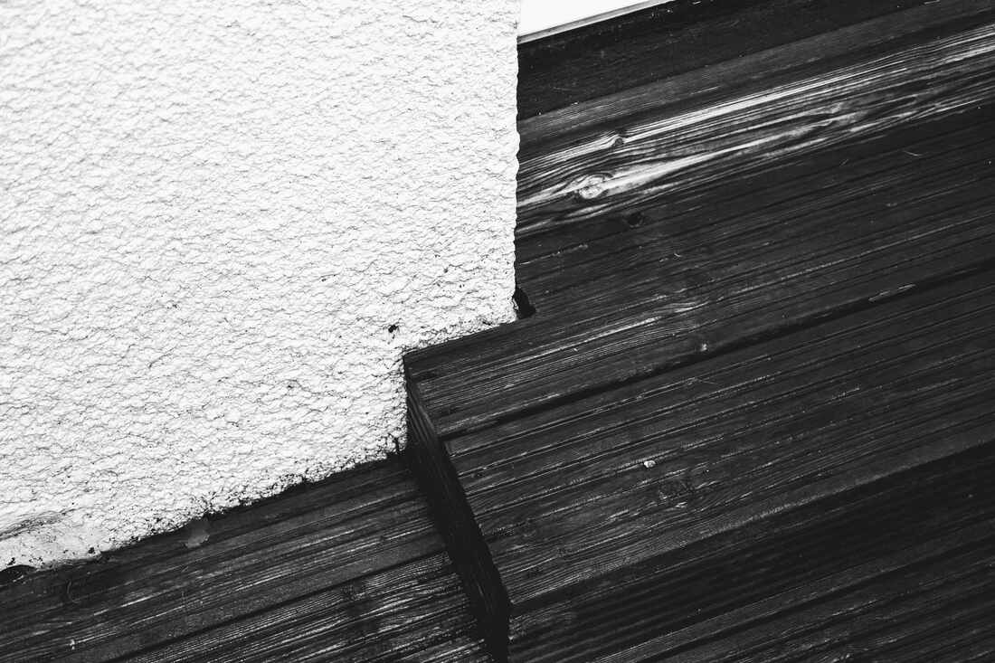
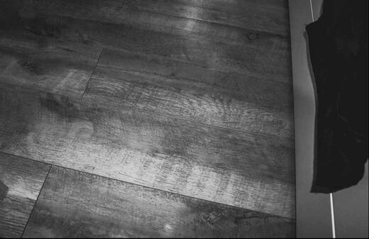
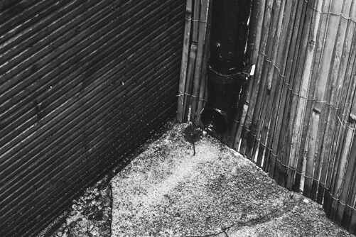
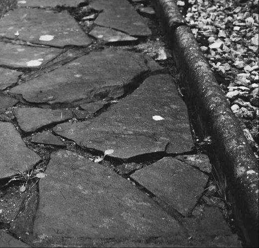
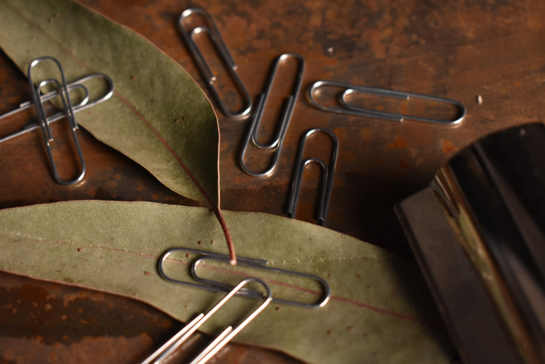
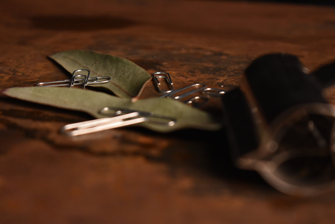
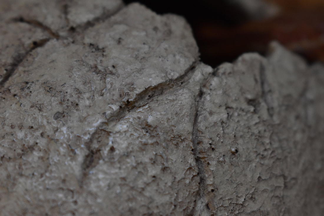
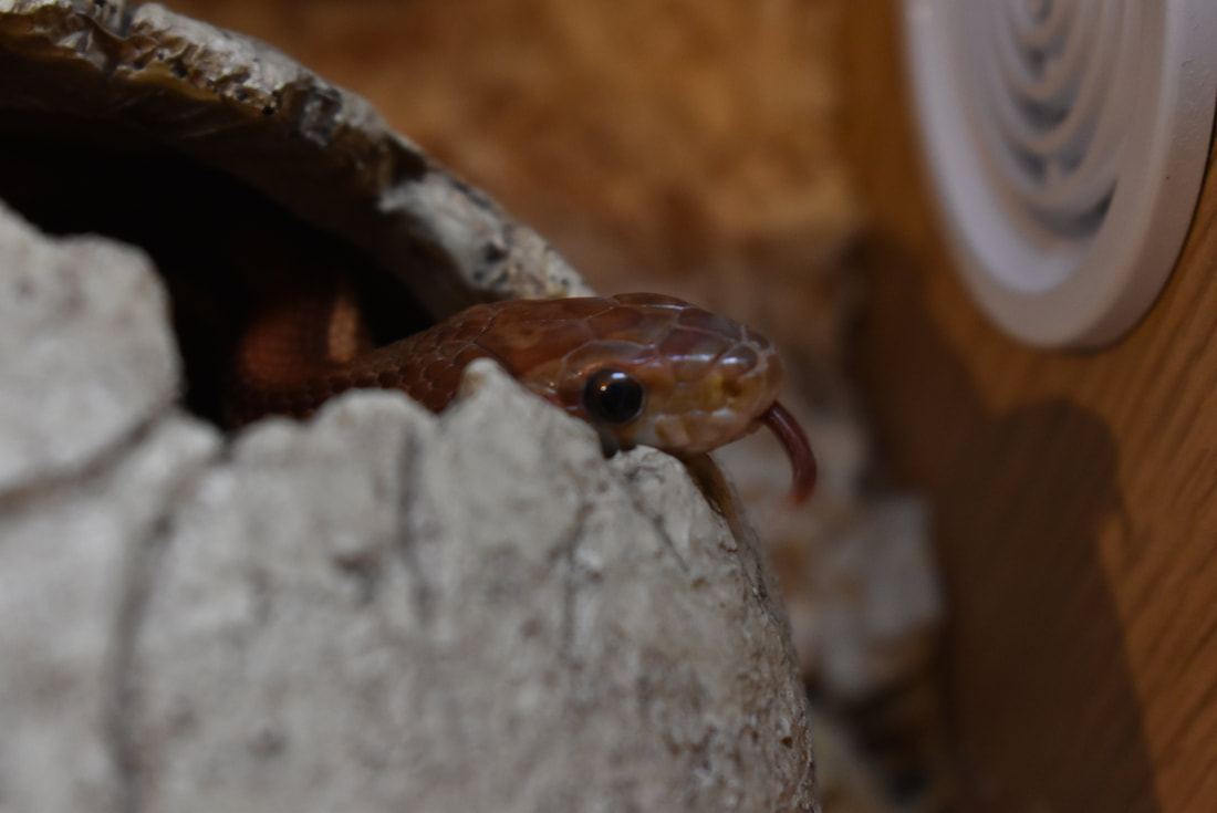
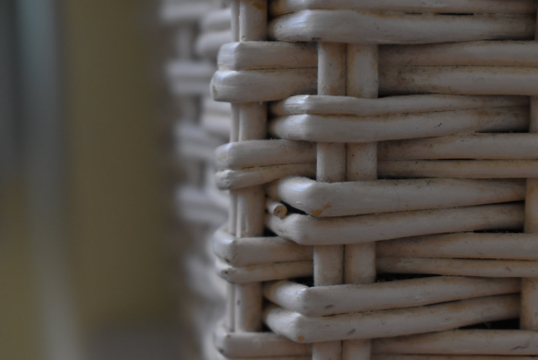
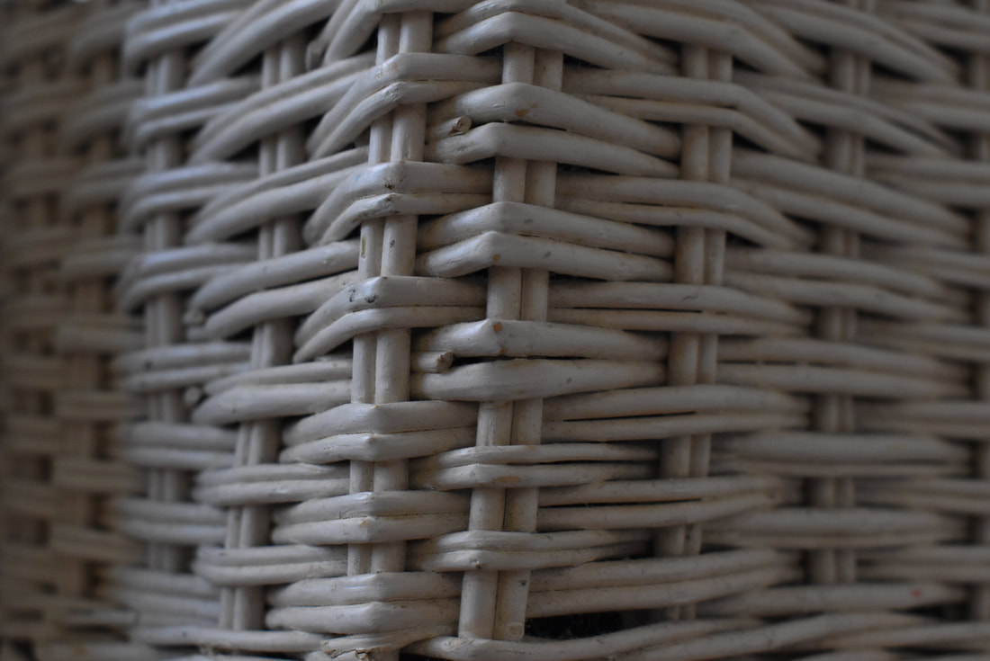
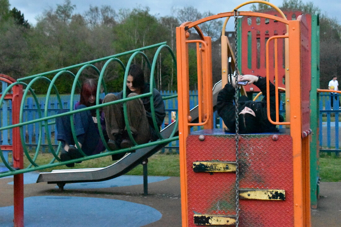
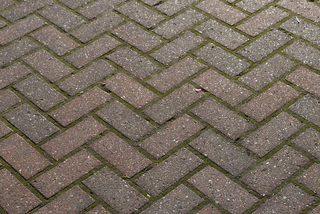
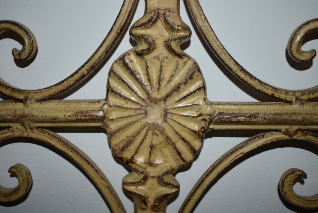
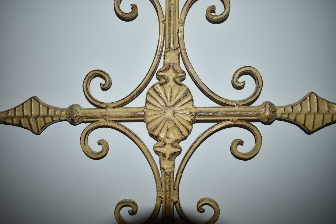
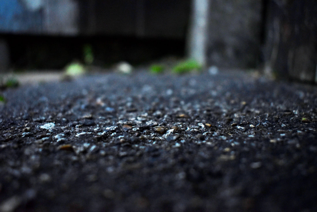
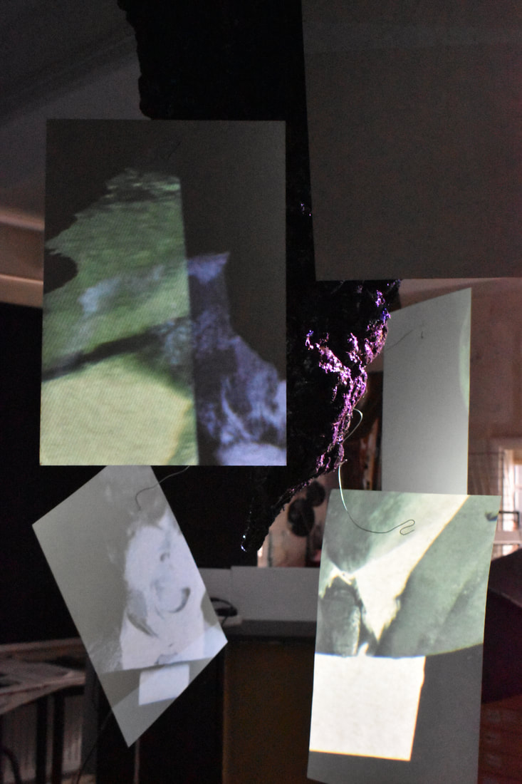
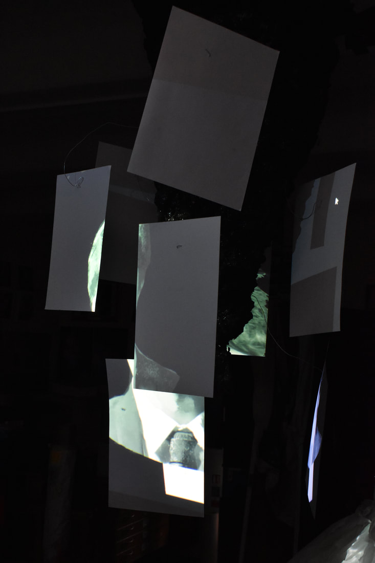
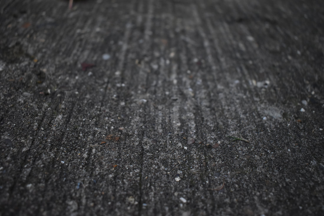
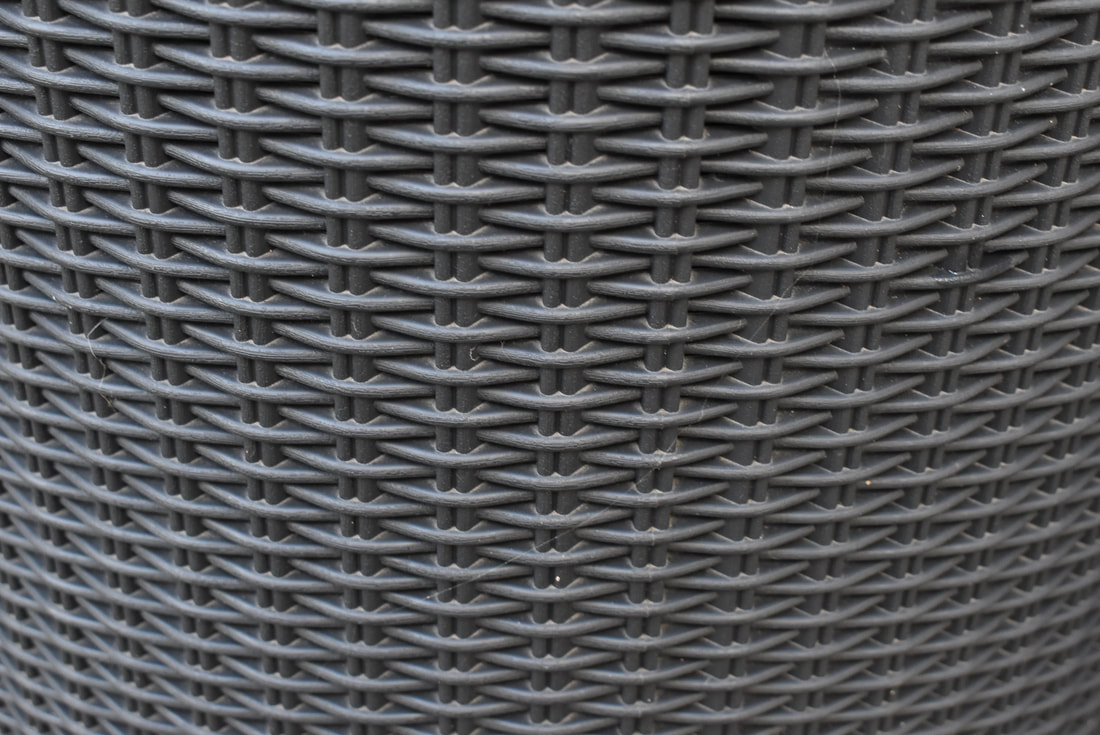
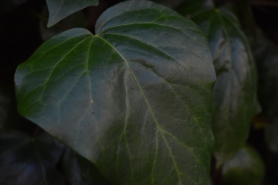
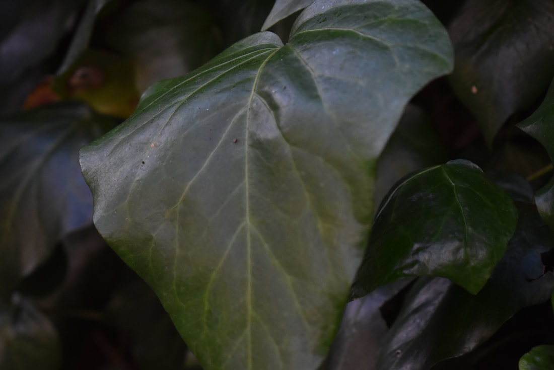
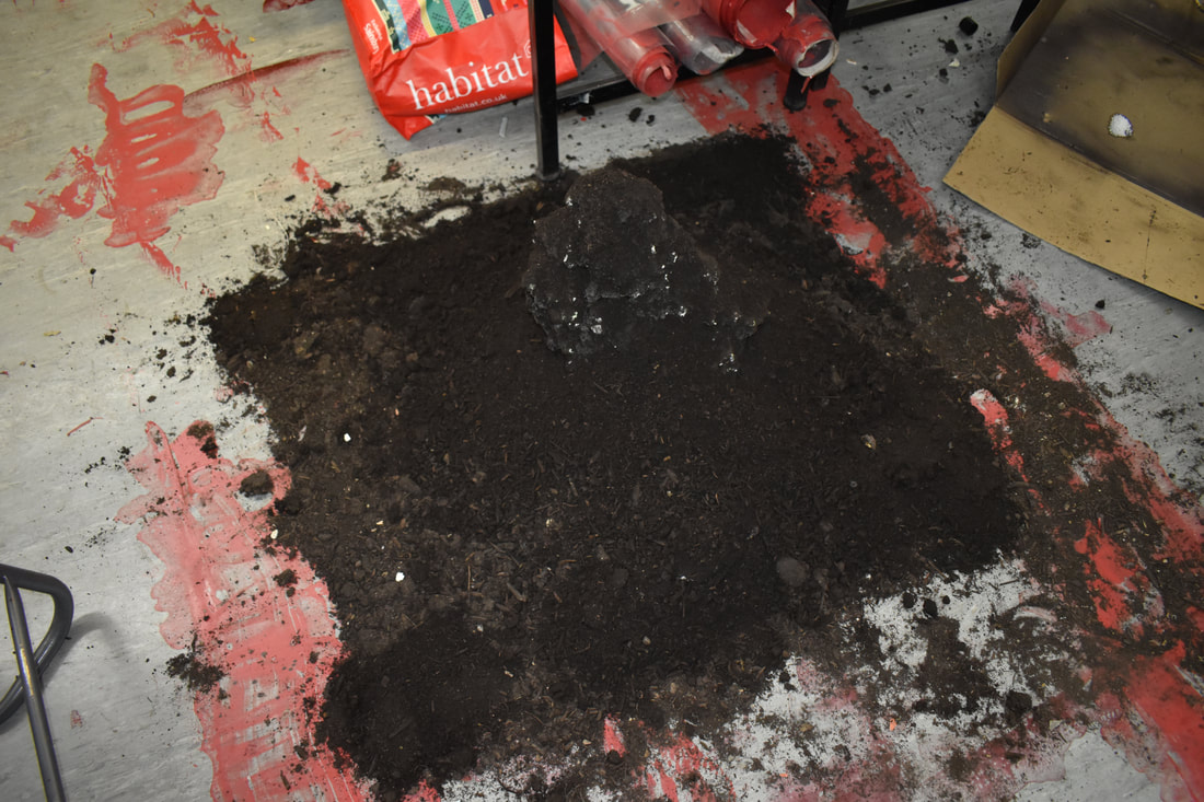
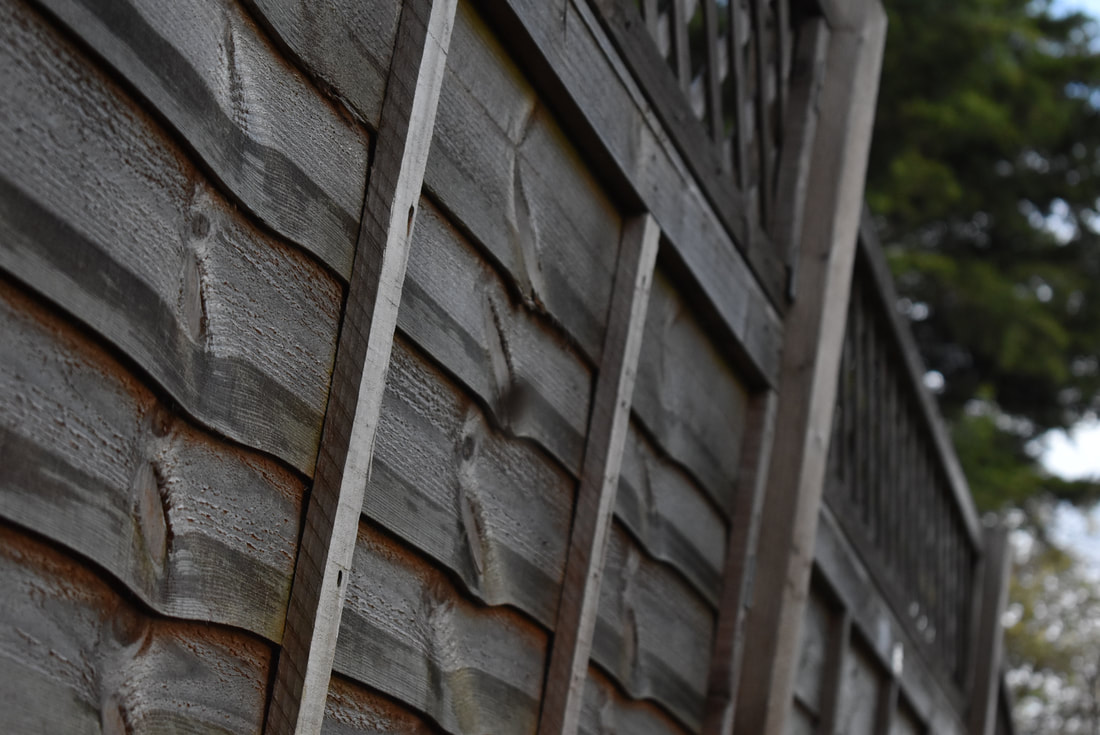
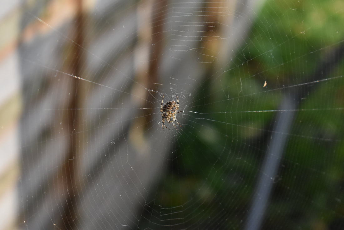
The pictures shown above are my response to the theme formal elements. In looking at photographs with line and photographers who use line I created my very own "gallery". I structured these pictures to be in the style of the photographer Alan Cohen. Every image is interlinked with the theme of lines. Every crack and parallel line line is of importance to the picture, showing the inner workings of our world. In my work I wanted to show the importance of keeping images simplistic, as sometimes less can be more, with no need to overcomplicate things. These images are only supposed to be explanations of how our world is filled with lines, no matter where you look. The photos link to the formal element of line, as they show examples of our worlds strange obsession with the perfection that lines can bring, whether produced naturally or by human hands. These range from floorboards, fences, my decking, to cobblestone, showing that there is a pattern on the most ordinary of objects.
|
Edits:
|
|
|
|
|
|
Edit Analysis:
|
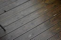
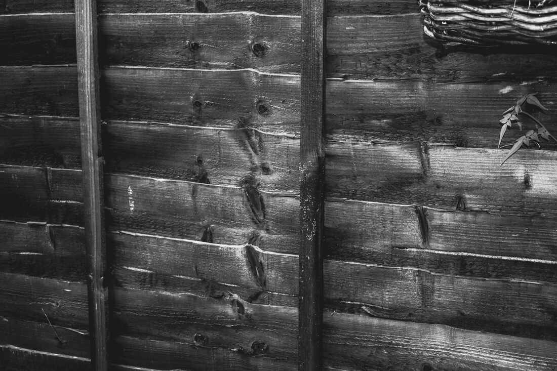
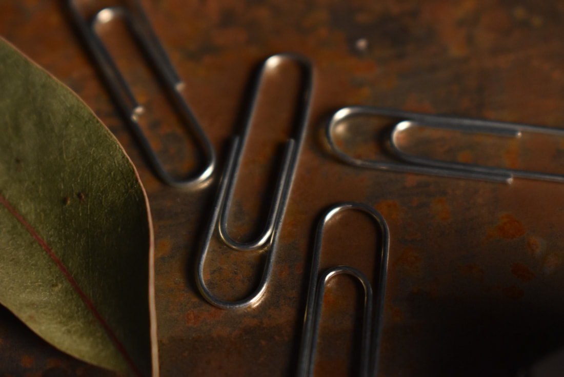
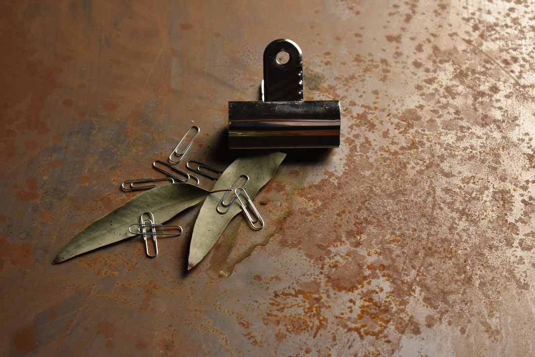
In my edits below I made my pictures look similar to his. I took what I believed to be the 6 best photos I had taken and edited them. First off, I made all the images grey scale, so there was no colour. I then made the whites and blacks bolder as to create this effect of clashing further more. I finally made the image sharper so that every texture shown was more visible. Personally, I believe that I have been successful in trying to create work that uses both line and is similar to Alan Cohen's work. I am pleased with my use of black and white filters, as I did not make the images too dark. The brightness shown only adds to the effectiveness of this "tribute" to Cohen's work. If I could improve one general thing from each edit, I would re take them, in the same angles and with the same effects, but in a way that would emphasize the lines more or draw attention to them more. Another way this could be done is by cropping the original edits more to create this same effect. From doing these tasks and receiving feedback I have learnt that I must use the rule of thirds more often.
|
Formal Elements: Form
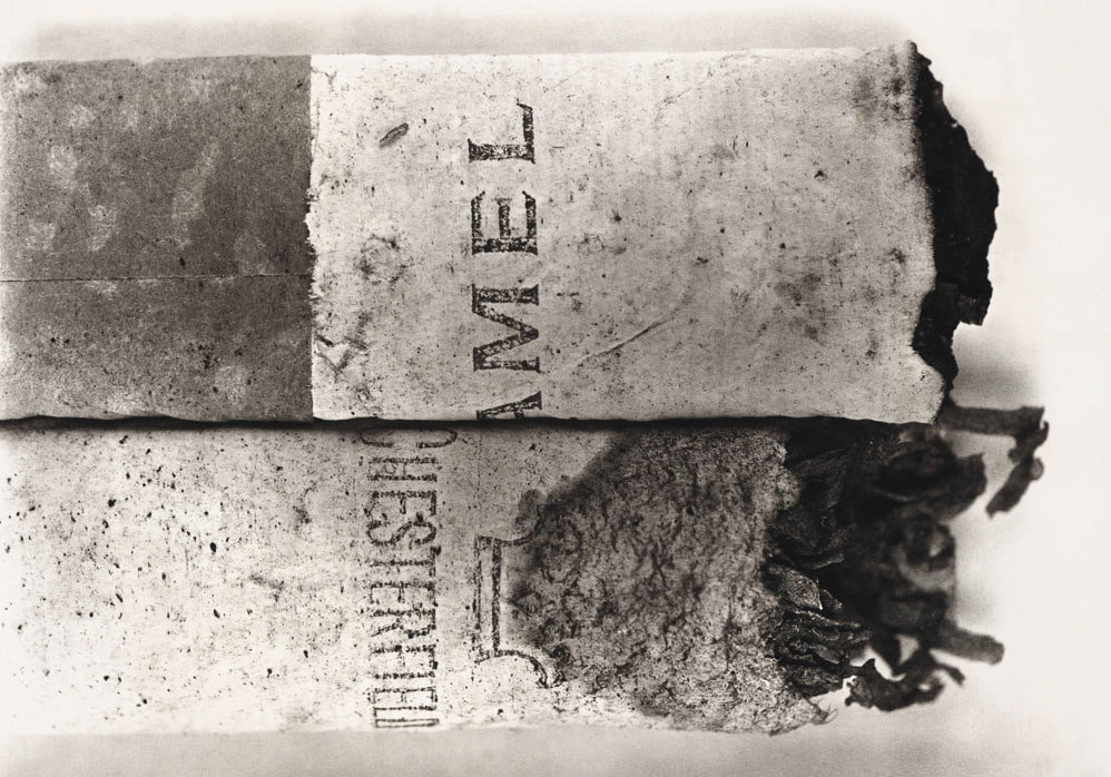
Irving Penn:
|
Irving Penn was an American photographer, working throughout the 20th century, most known for his fashion photography, many still life pictures and work done as an editorial photographer. He attended the Philadelphia Museum School of Industrial Art from 1934 to 1938. After graduating, he would go to Mexico learning to paint and take photographs. When he returned to the US in 1940, he would be offered a job with Vogue, in the magazine art department. He would even go on to take photos of soldiers at camps in India and Italy.
|
Most of his photography is in black and white. There is always a bold contrast, with dark shadows and bright highlights. His photography is mostly on still life. The pictures taken are usually closeups.
|
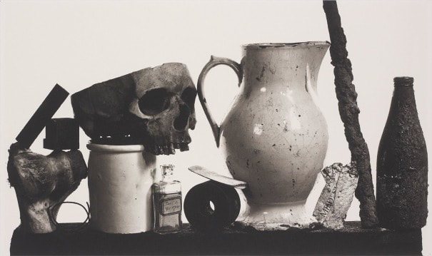
By taking photos of everyday items in closeups , you lose a sense of scale, and in doing so you get to see the detail, shape and form of the mundane items. His artworks consist of turning everyday items into masterpieces.
|
|
|
|
|
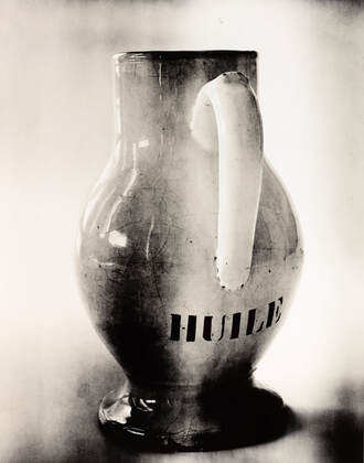
The specific picture I am analysing is the one shown below. The picture is named "Underfoot" and was made in 1999. The artwork falls into the established genre of still life. The picture shows a piece of gum on what seems to be pavement, which tells a story of its own, even if its simplistic. The title "Underfoot" helps us understand the location of the gum. The image shows no sense of movement, and the black and white pigmentation of this helps enforce this feeling that the gum has been there for a while. We associate black and white with the past, hence making this gum seem aged. The piece is a simple but confusing one. There are many other interesting items you could shoot, yet Irving has chosen this one. I believe he wanted to choose a unique item for a still life photograph. Usually you have pottery, fruit, or flowers in a still life, but as seen in his other artworks, Irving does not always use stereotypical items for his still life photos. This specific piece is currently being shown at the Modern Tate gallery. I believe that Irving uses black and white in most of his artwork to help dramatise his pieces, which I think is effective. The actual photograph is not only in black and white, but is also scratched and scraped, looking worn out and aged.
|
"I can get obsessed by anything if i look at it long enough. That's the curse of being a photographer."
- Irving Penn |
|
|
Further idea development:
|
|
|
|
|
|
|
|
|
|
|
|
|
|
|
|
|
|
|
|
|
|
|
|
|
|
|
|
|
|
|
|
|

|
|
|
|
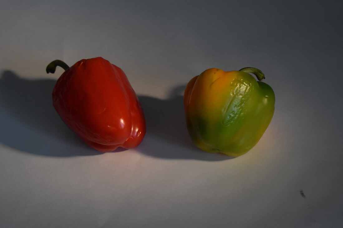
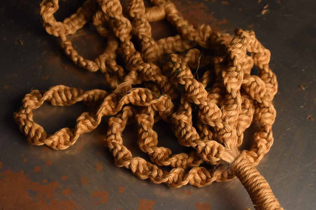
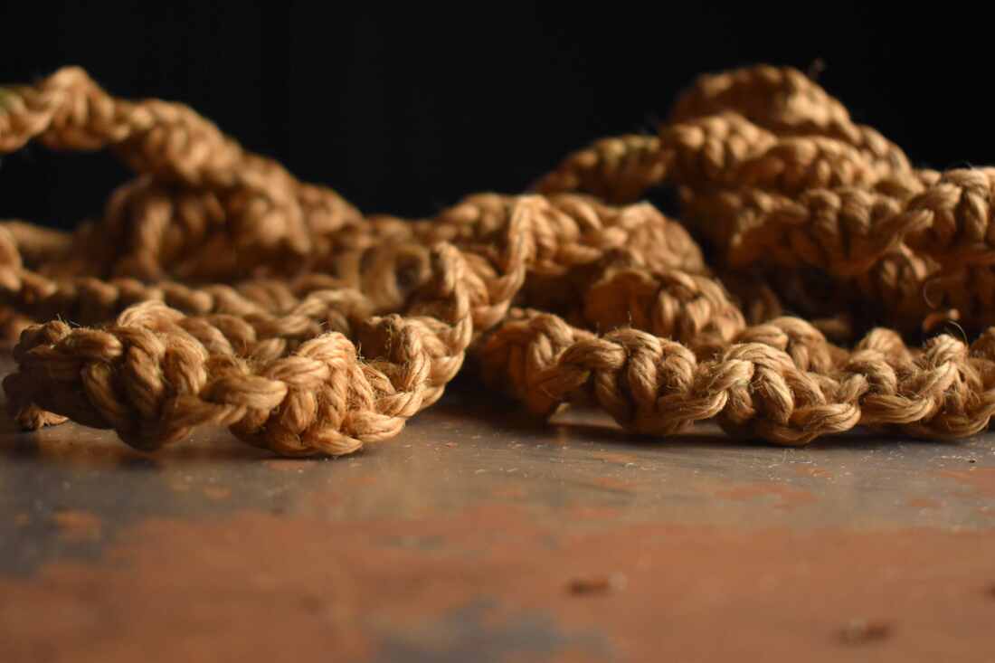
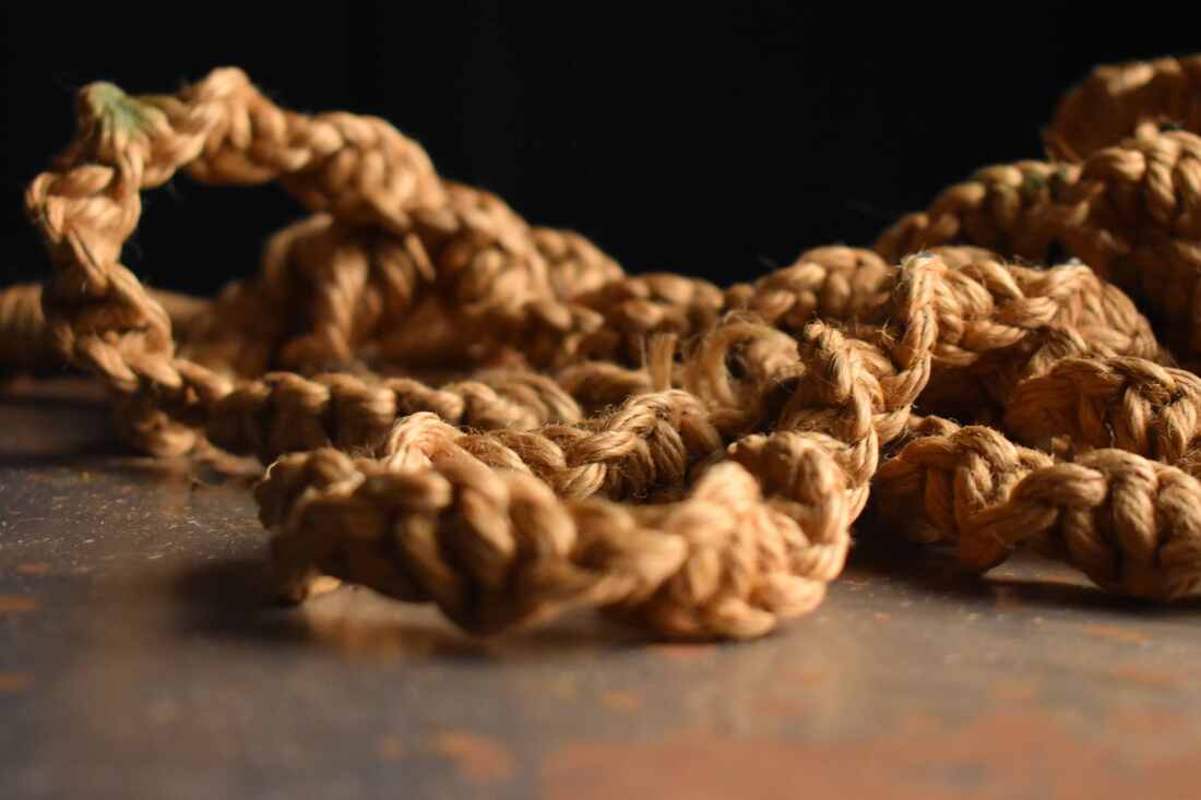
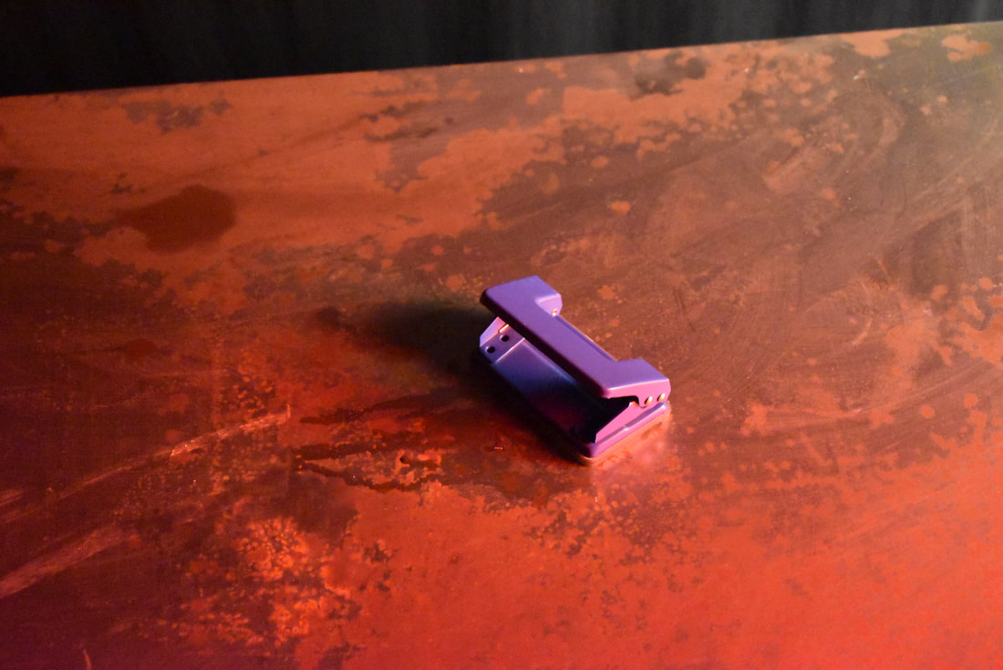
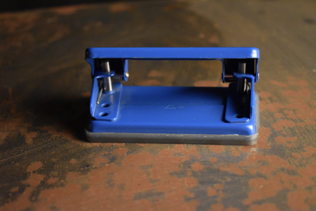
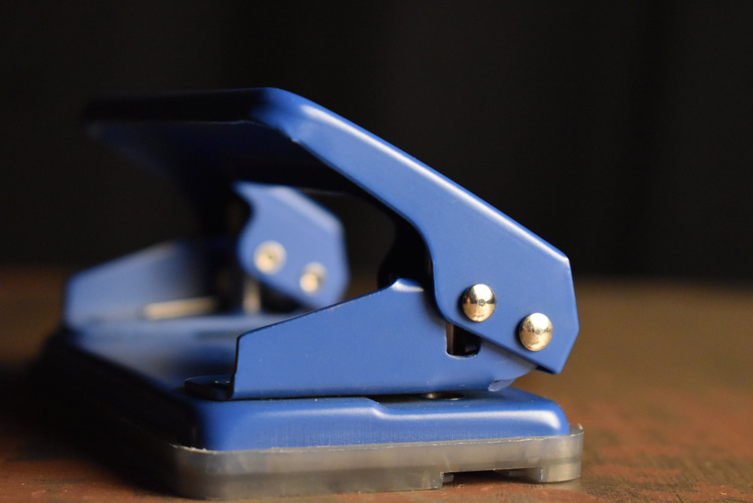
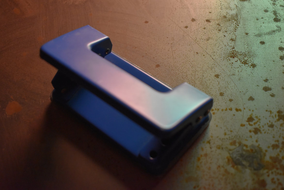
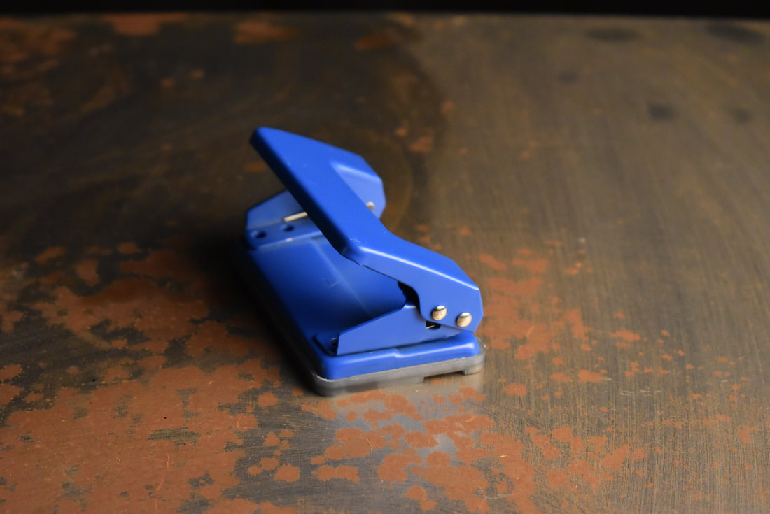
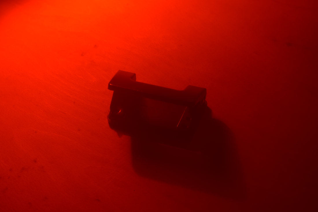
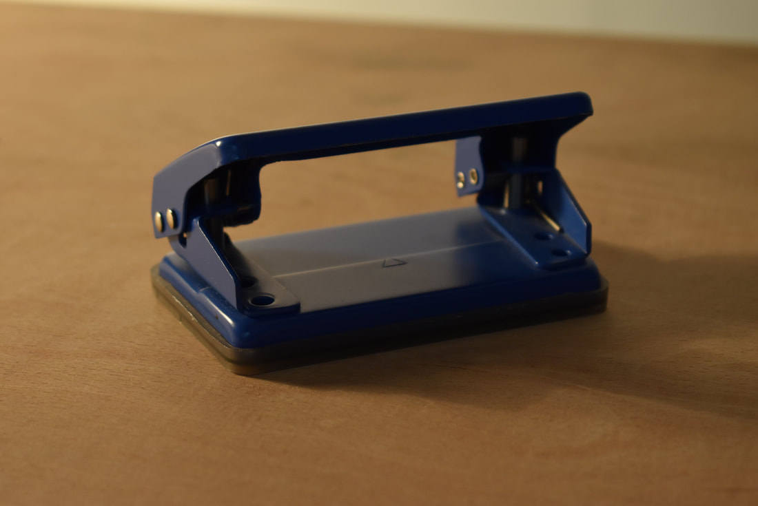
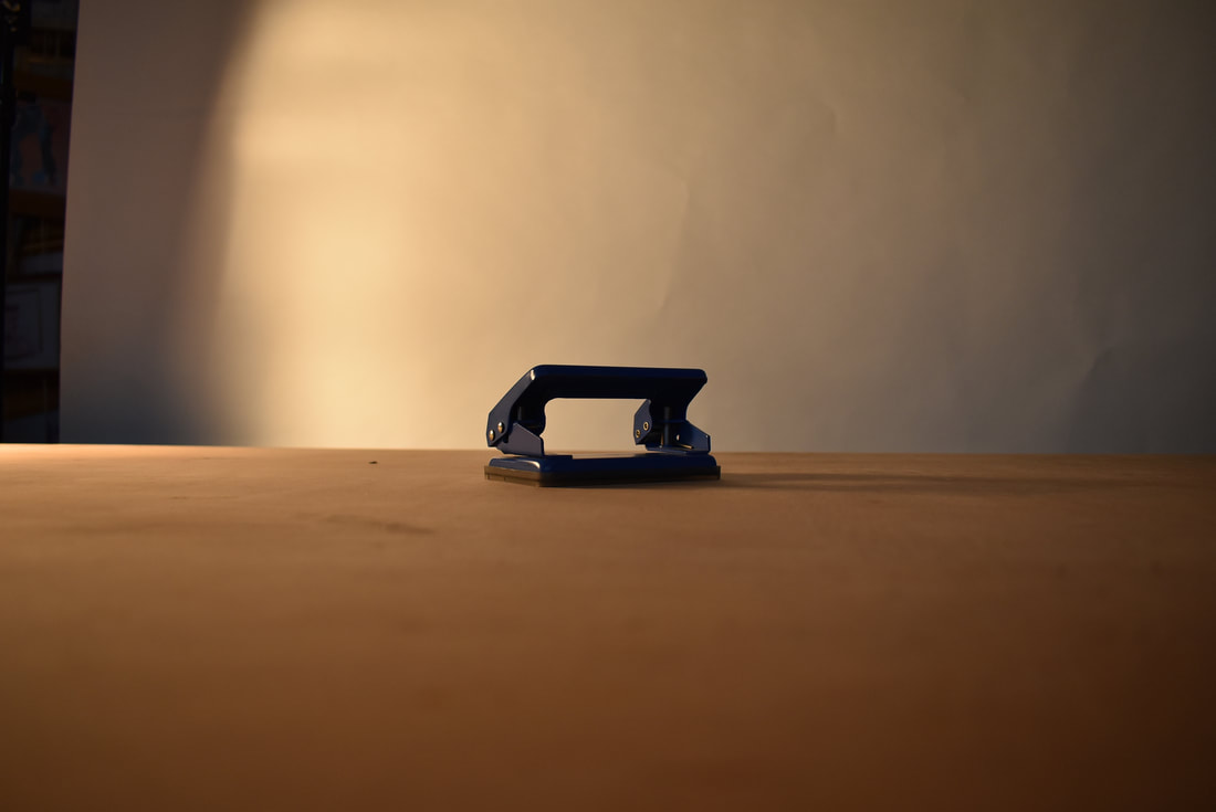
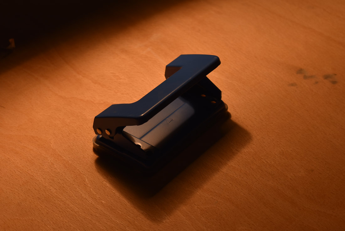
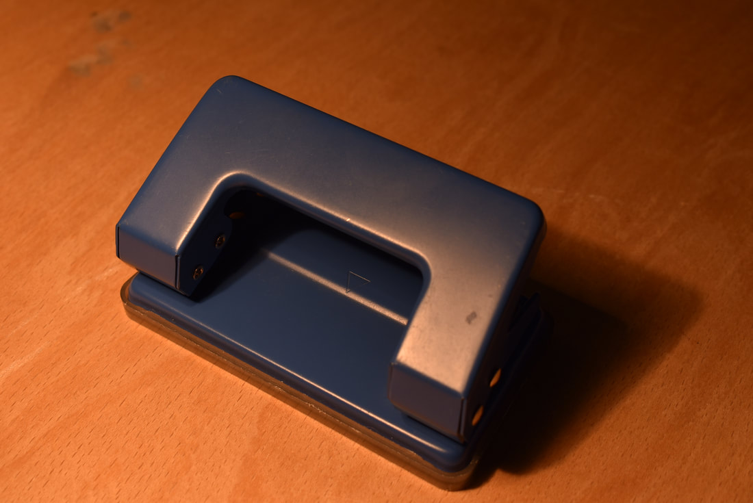
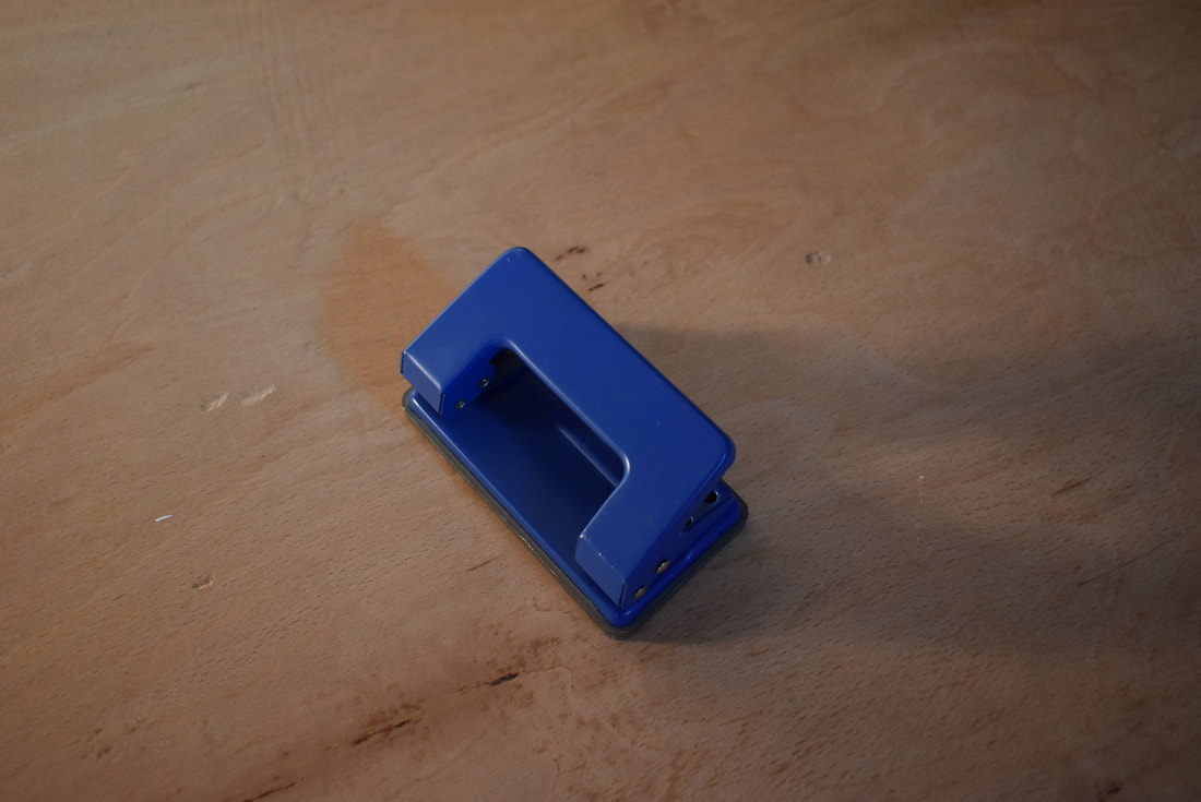
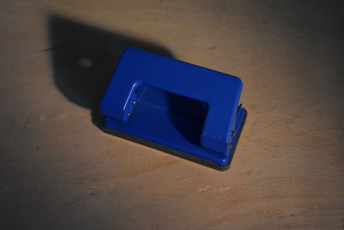
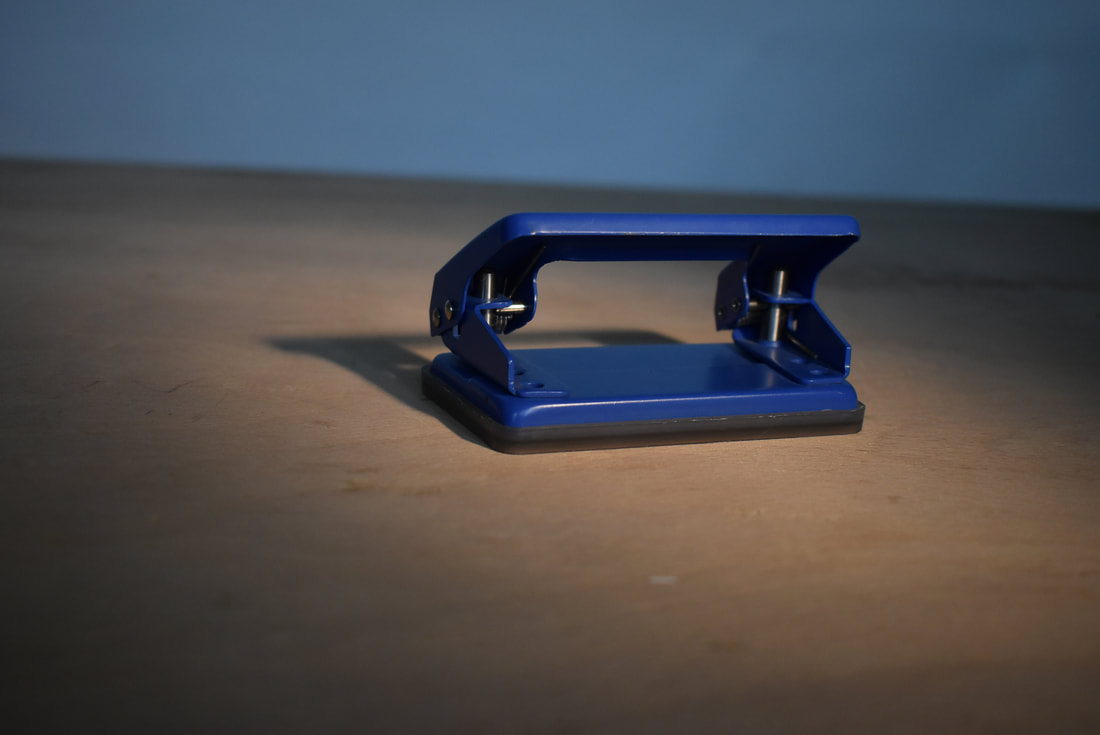
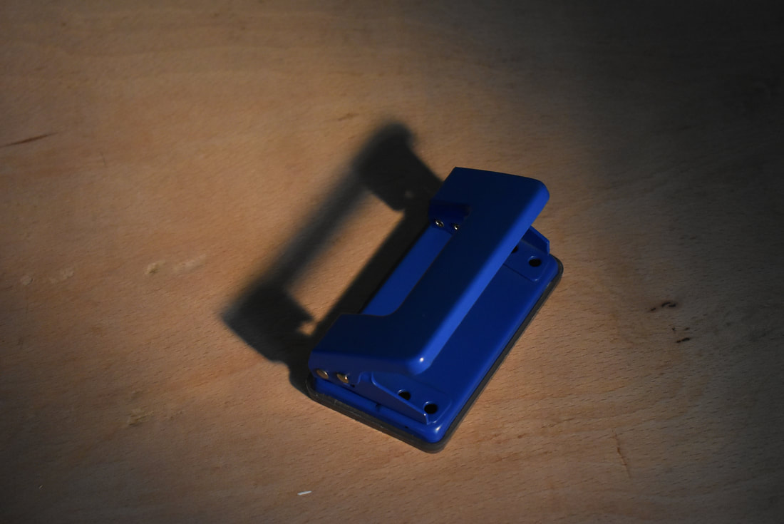
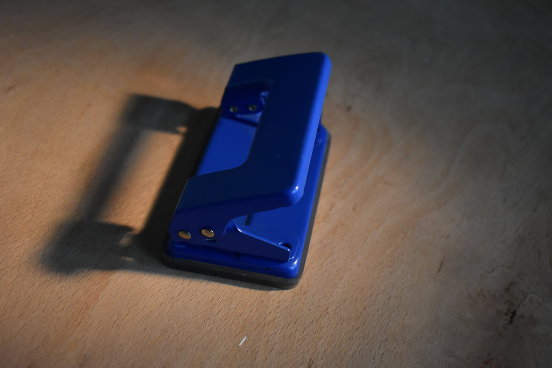
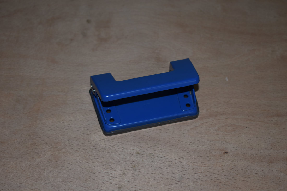
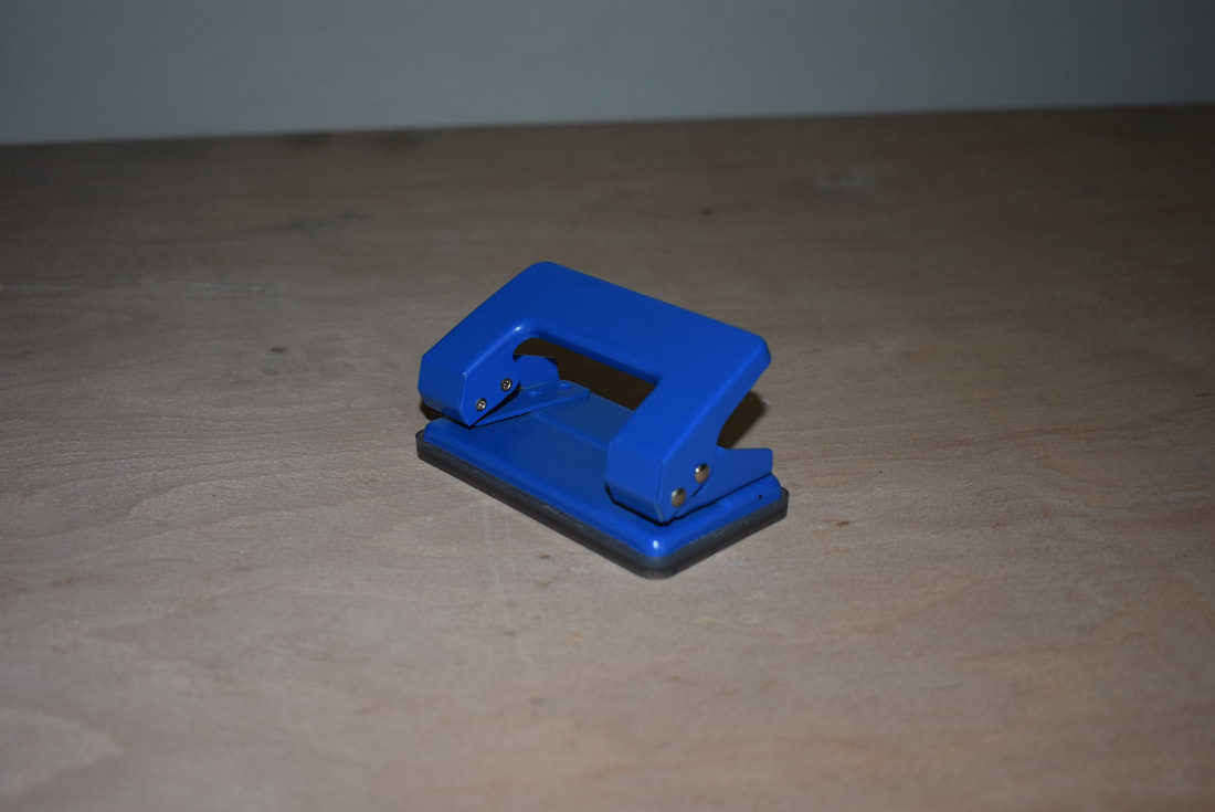
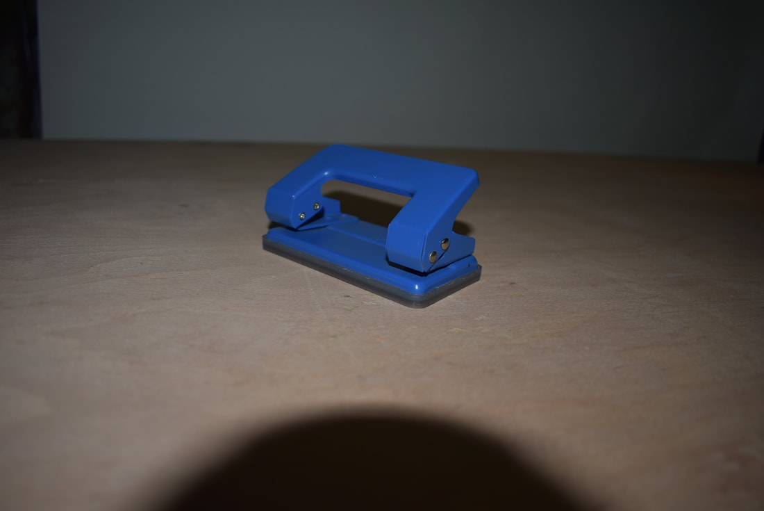
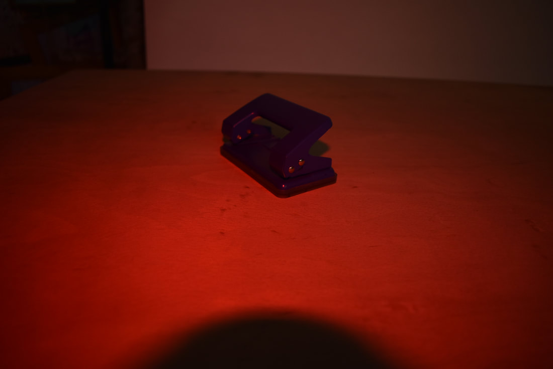
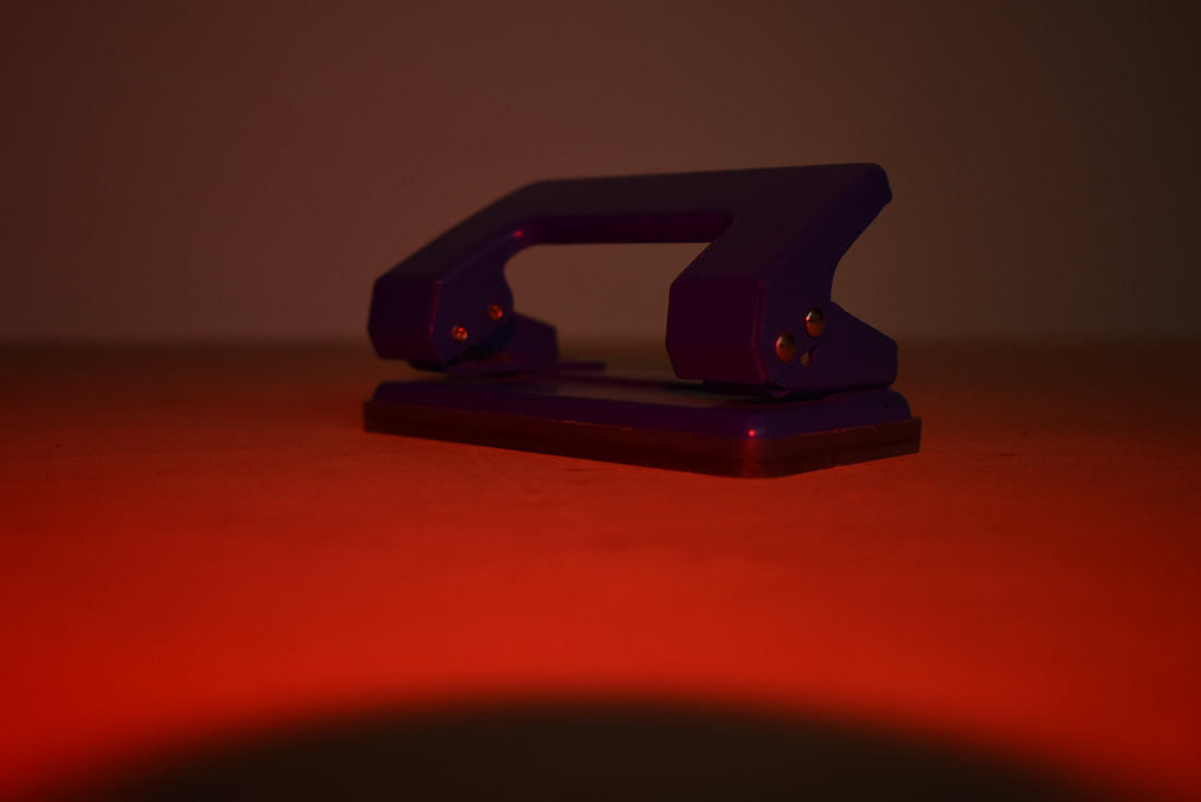
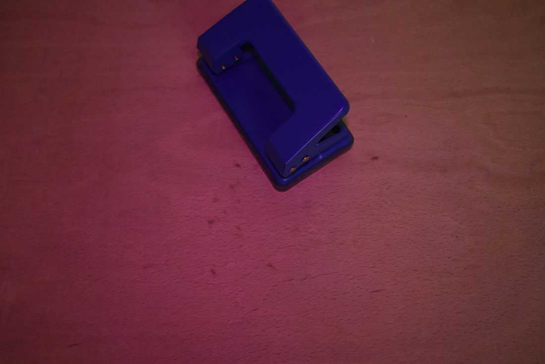
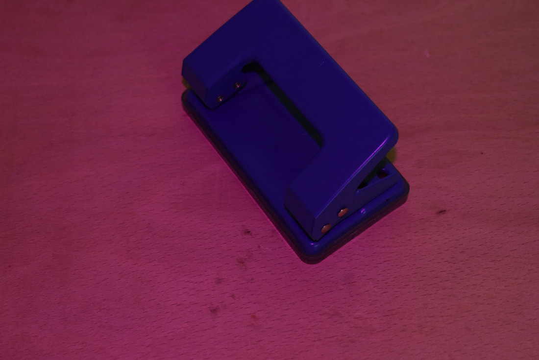
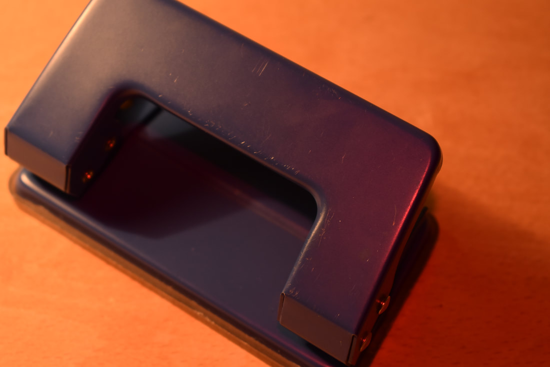
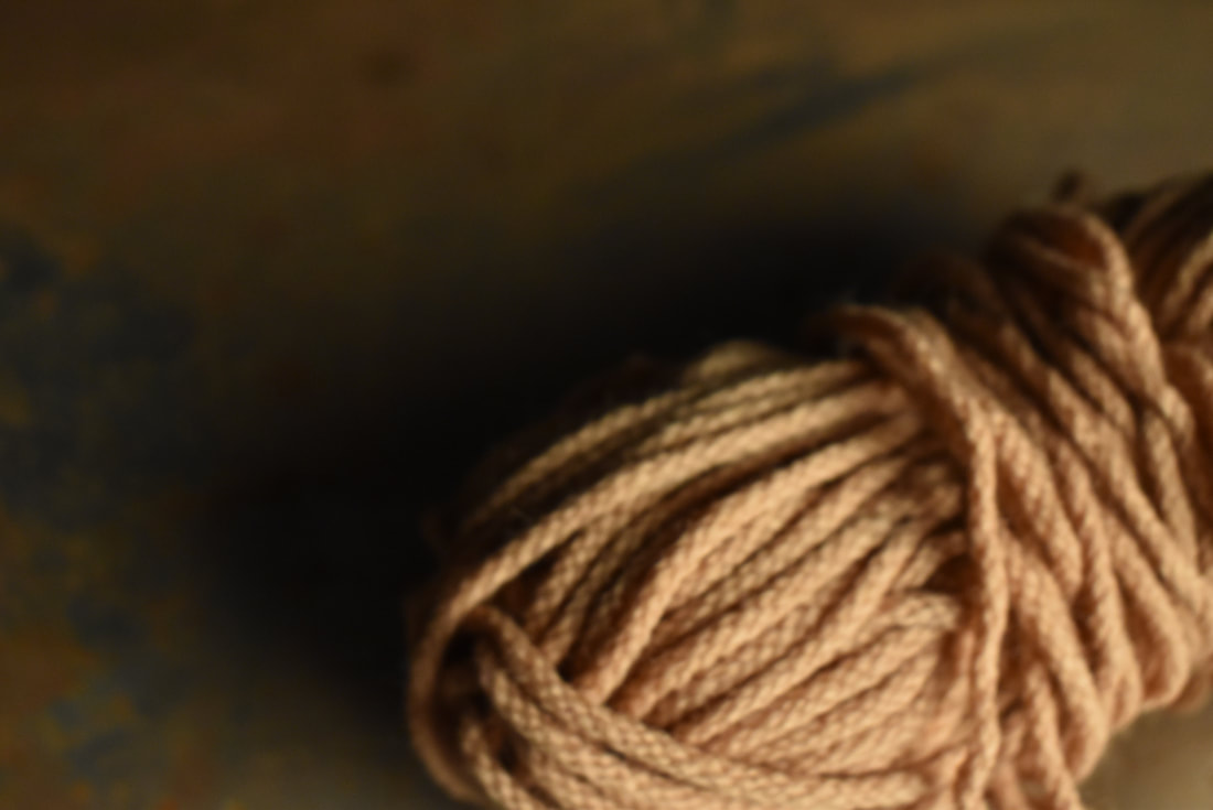
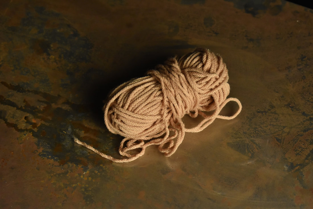
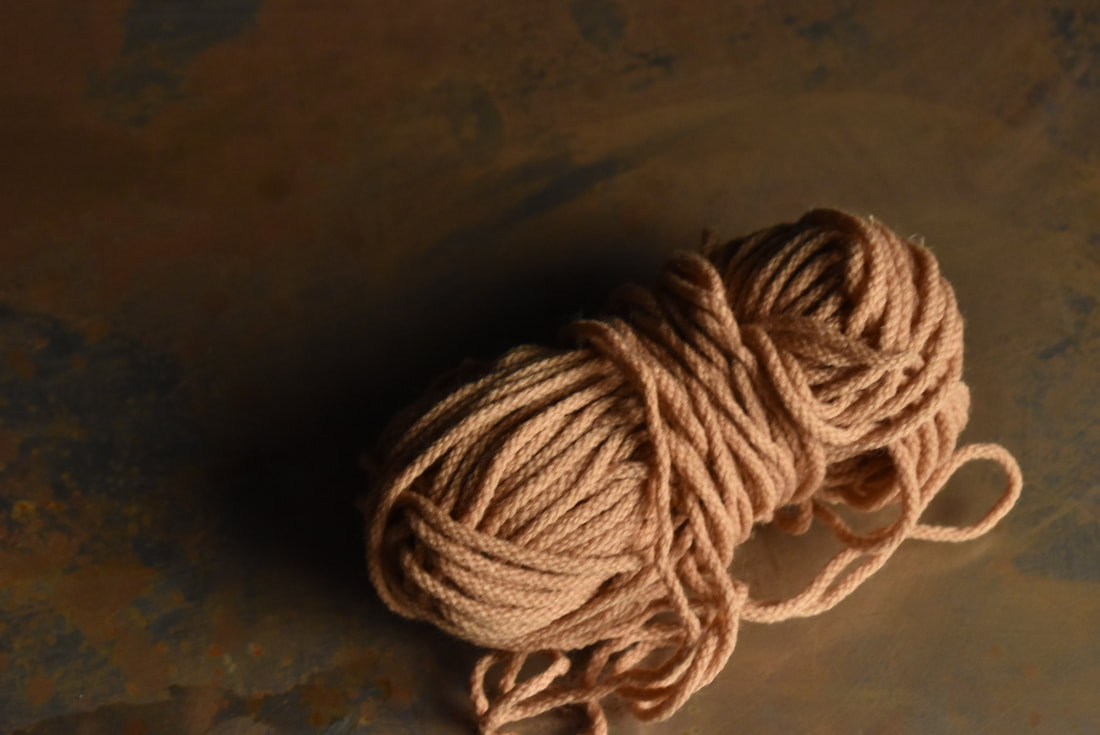
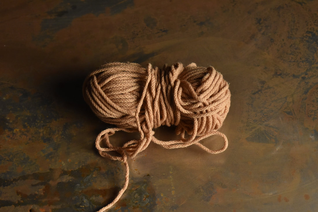
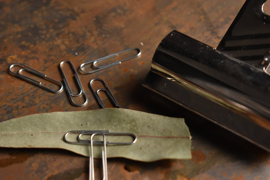
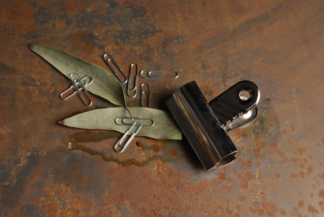
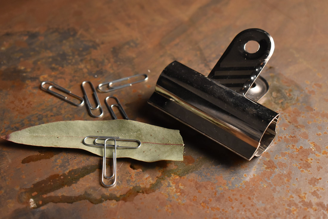
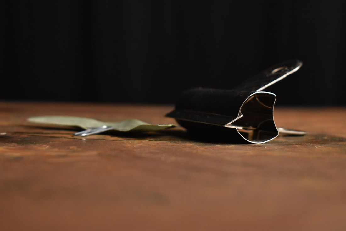
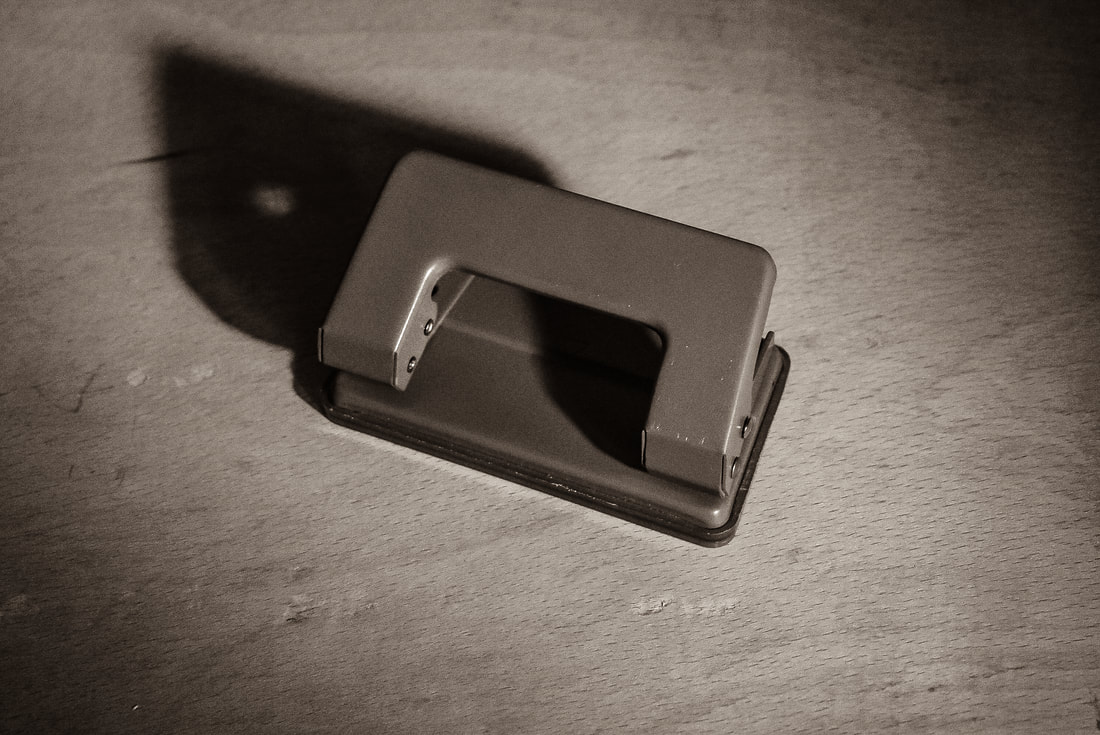
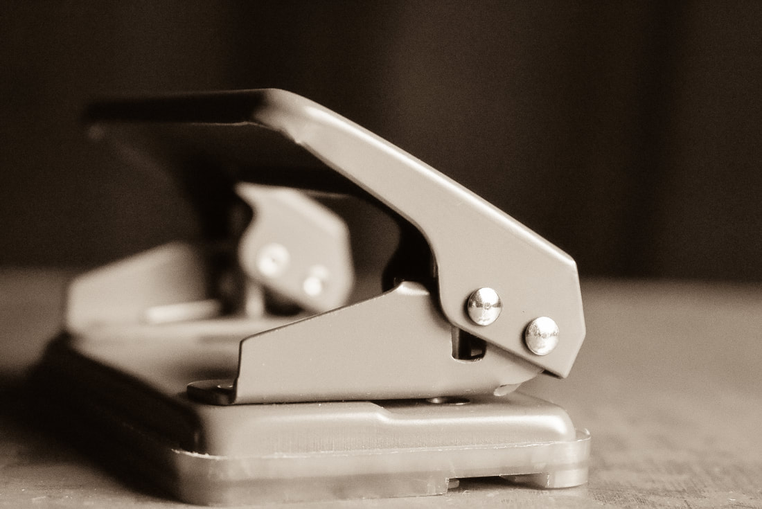
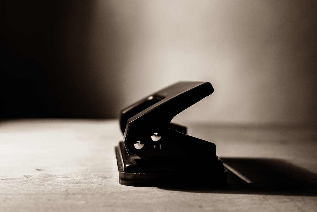
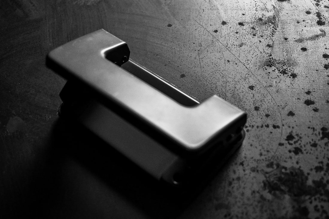
These images shown above were taken in response to Irving Penn's work in still life and form. I was exploring the theme of form and so brought in mundane items that you would see lying around everyday. The items I used consisted of : a green and red pepper, rope and a hole puncher. I really enjoyed positioning and moving the items around to create sets that I thought would not only look good but accomplish the goal of creating inspired 'Still Life' pieces. I used two different approaches to shooting: I used both harsh and defused lighting to create hard and soft edged shadow. Photos shot with harsh lighting were taken in the photography studio against a black cover, whilst defused lighting shots were taken in the back of the art room against a white cover. The mood and tone in these pictures varied according to these two factors. Both variants of the backdrop changed the outcome of the pictures but still kept the fact that they are dark with small splashes of light. In some of these shots I tried using gels to change the mood of the image. One way I did this was by taping a red gel over my cameras built in flash, creating an imagine that was tinted bright red. I liked the effect this created on the set, giving the images created a pink/red hue.
|


Edits:
|
|
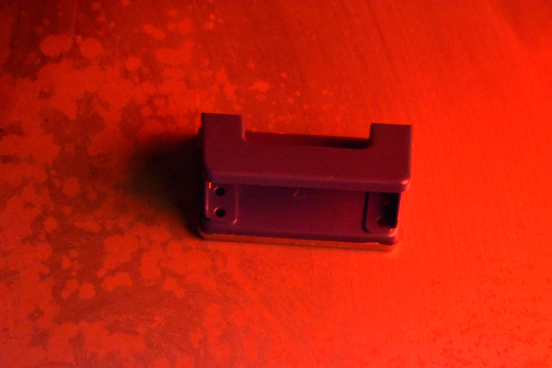
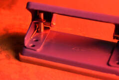
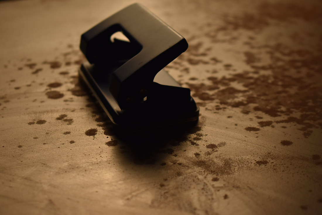
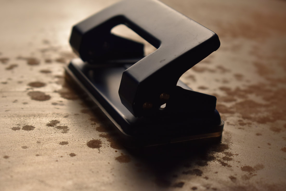
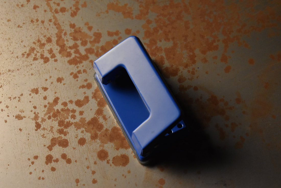
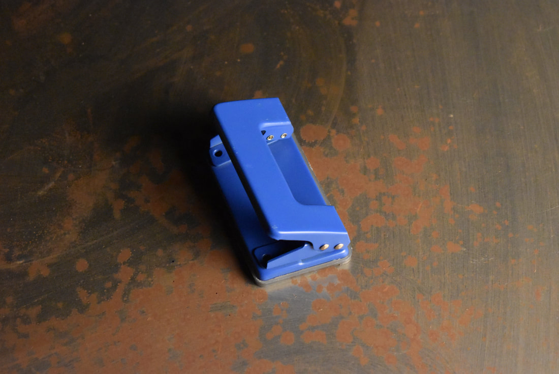
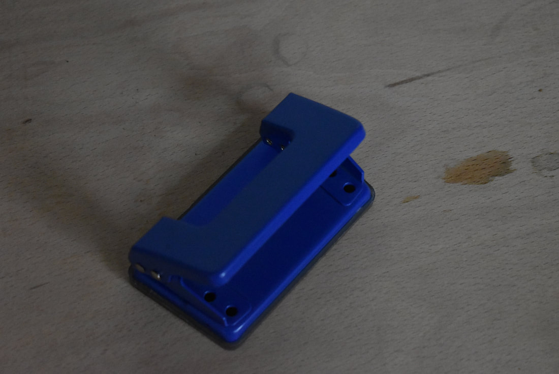
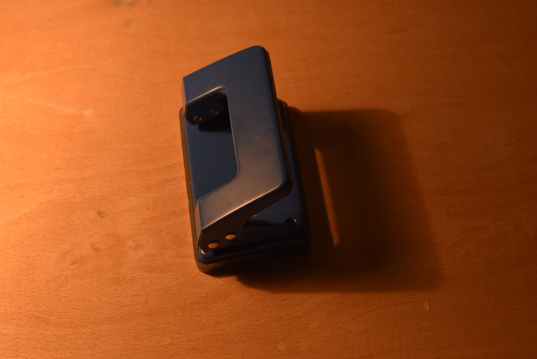
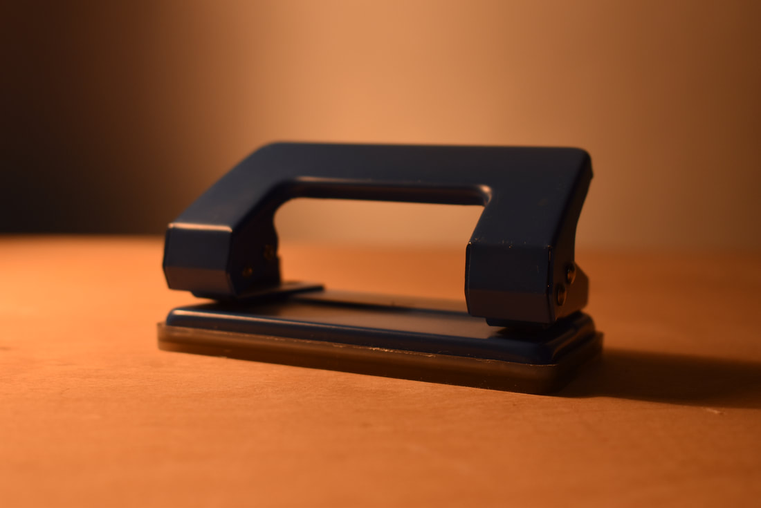
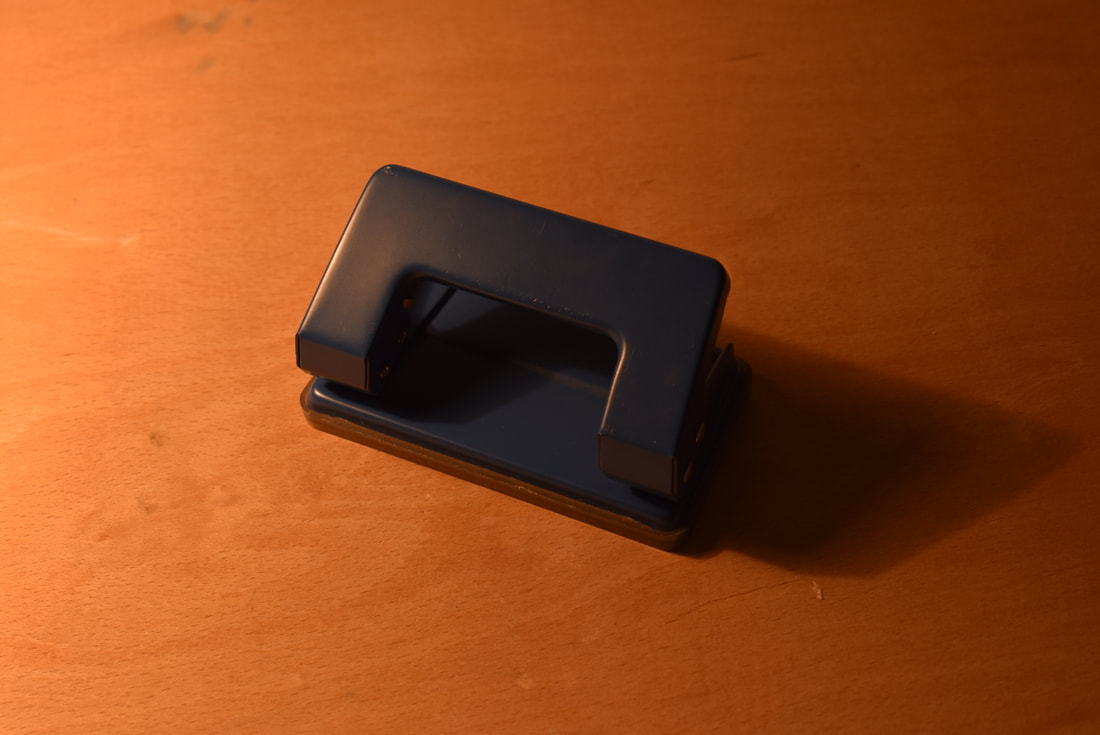
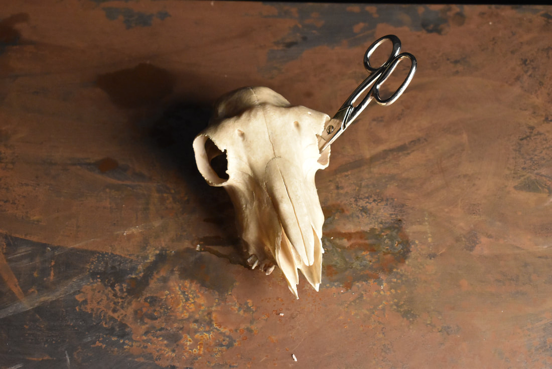
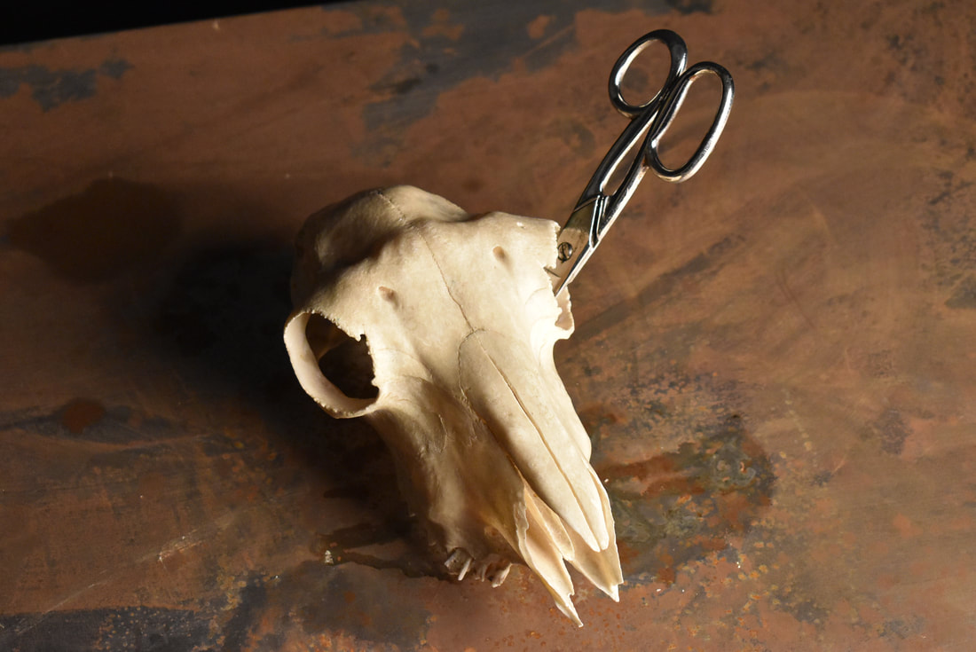
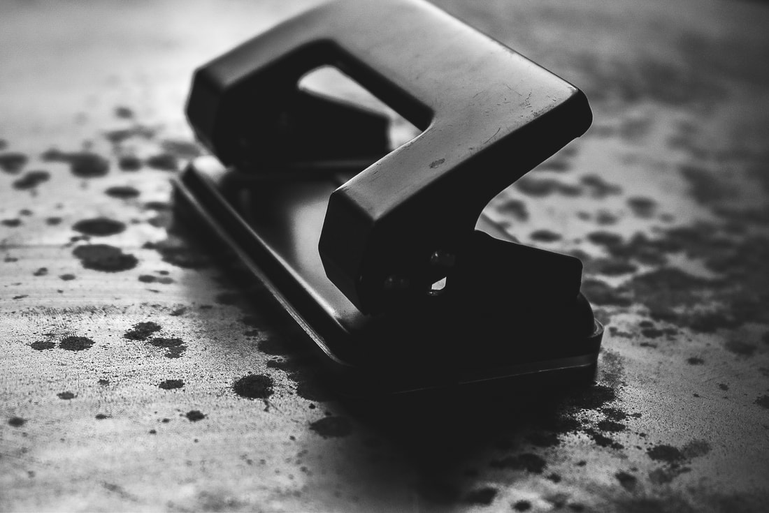
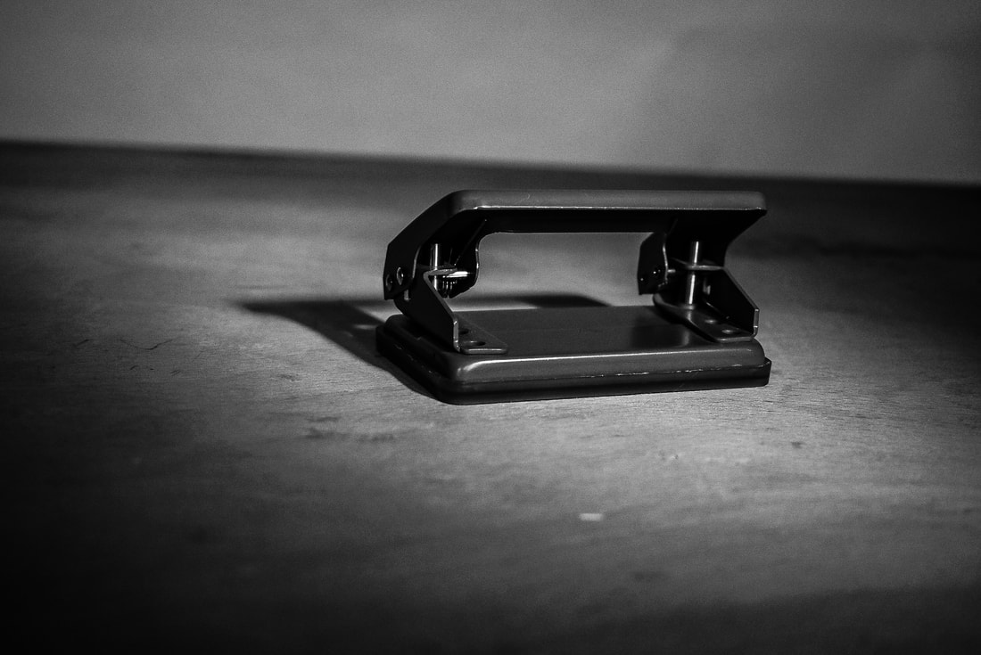
After doing a shoot of Irving Penn inspired still life pictures, I chose the best 6 photographs that I believed were most successful and decided to edit them. The 6 pictures chosen to edit were all of a hole puncher, in different angles and lightings. They're each taken in completely different angles to each other, showing the many faces of the hole puncher. When it came to editing the pictures, I chose to enhance the stylisation and make them obvious inspirations of Penn's work. I increased the contrast to further separate light and dark from one another, creating bolder shadows with more defined boundaries. Furthermore I made every single image black and white, following the style of Penn's work. I believe that the way I edited the pictures makes them look very serious yet simplistic, with the dull tones covering them. The changes made such as increased contrast and tampering with the shadows really highlights the light in the pictures. In one of the edits the hole puncher has a spotlight of some sorts around it, highlighting that the focus of the images is the object. The hole puncher is clearly conveyed as the most important aspect of the images. The hole puncher takes up most of the mid-ground, accompanied by the shadows it creates. To even further exaggerate the importance of the hole puncher, the photos were taken in an extreme closeup, giving them a sense of grandeur, appearing far bigger than they actually are.
Experimentation with light:
|
|
|
|
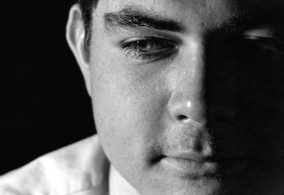
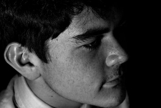
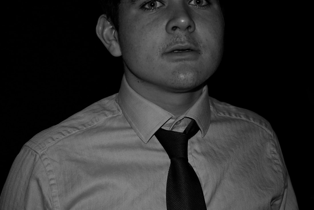
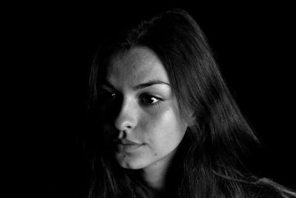
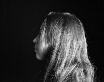
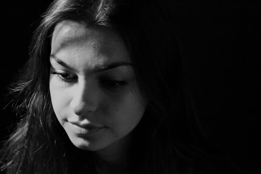
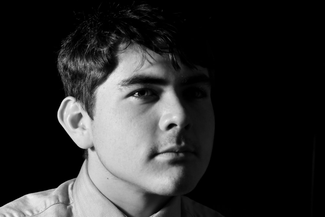
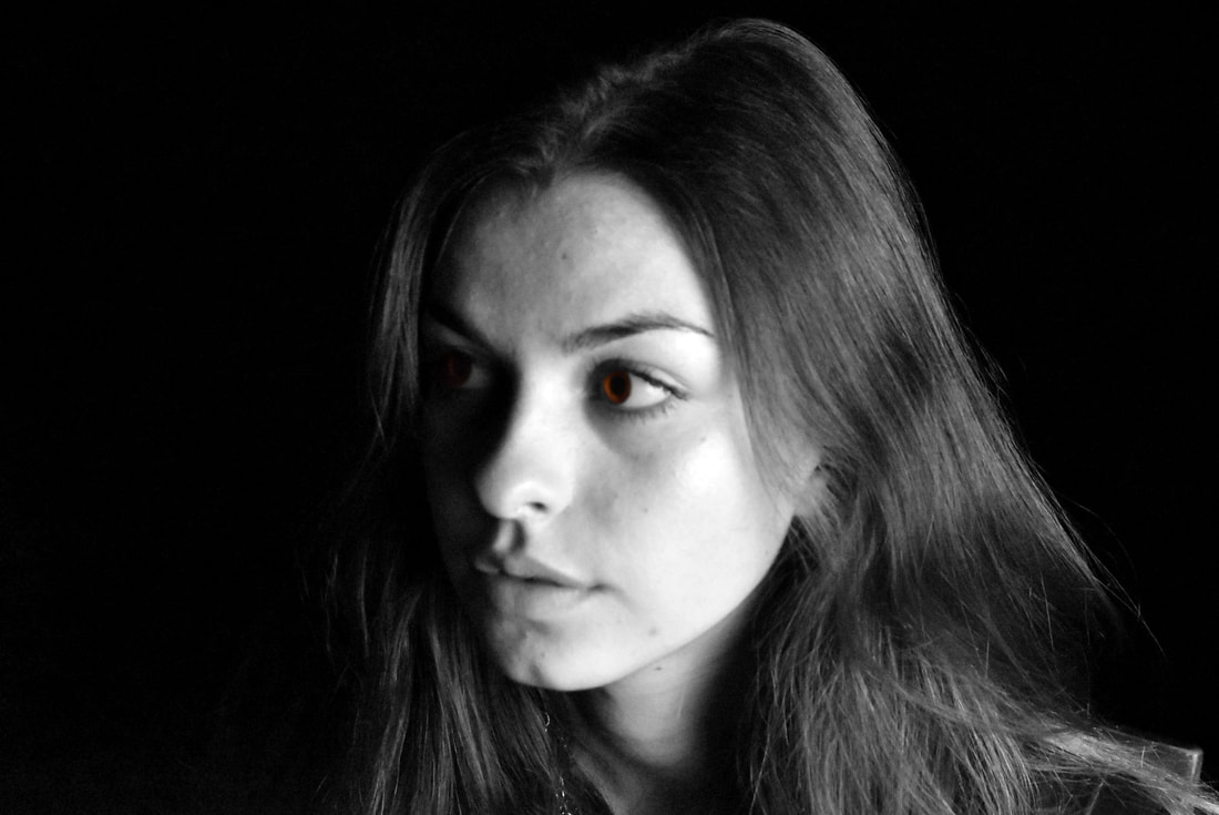
From analysing Penn's work and on further reflection it became more clear to me that I needed to improve my understanding of lighting and the effect it has on a picture. I decided to experiment with light in order to further develop my use of lighting and angles. I decided that I would use closeups of peoples faces to show how light and shadows change depending on angles used. This would be key experimentation to develop my future artworks, giving them figurative and literal depth. I used Christian and Sienna to model against black backdrops with different lighting. The lighting techniques used were variations of Rembrandt lighting and split lighting, playing around with shadows on their faces. Most of the shots either had the subject facing forwards or off to the side, either splitting their faces into two: light and dark, or simply highlighting fragments of their head. When it came to editing these pictures I decided to turn them black and white, whilst turning up the contrast and changing the brightness of highlights and darkness of shadows, all in order to create more dramatic photos. In the end I believe that I was able to uncover new methods to lighting and was able to create edits successful in showing depth and the contours of the peoples faces.
Roxanne Worthington:
|
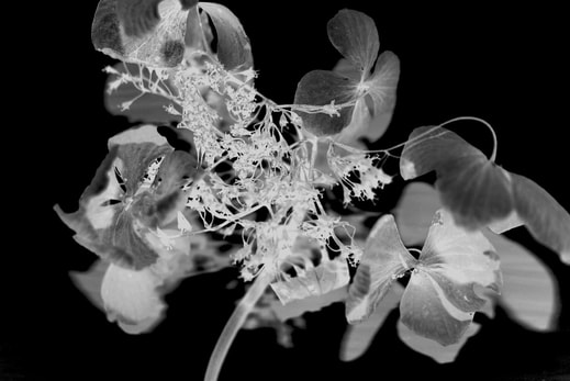
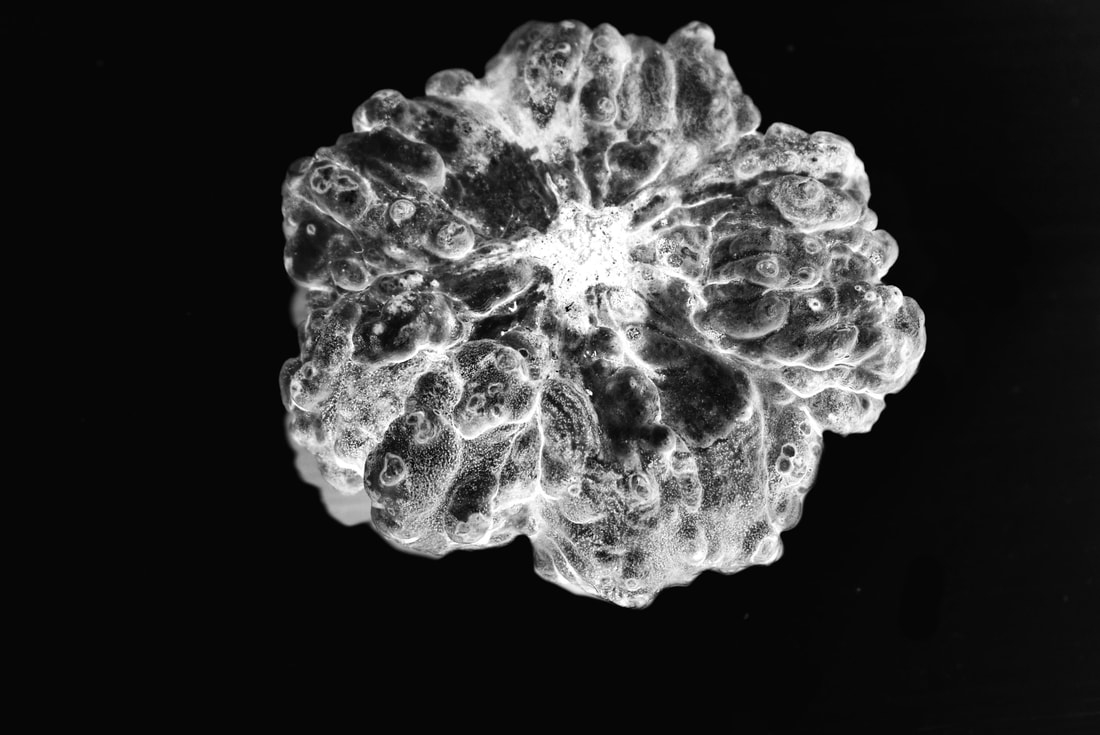
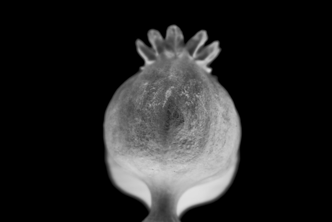
Roxanne Worthington is an American photographer who creates photos from various themes and genres. The photos shown are all from the one "album" she has set up on her website. This series of photos is called Breath. It is a series of 16 images of extreme closeups of many intricate designs and patterns on leaf's and flowers.
|
|
|
|
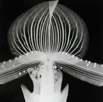
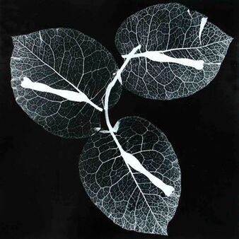
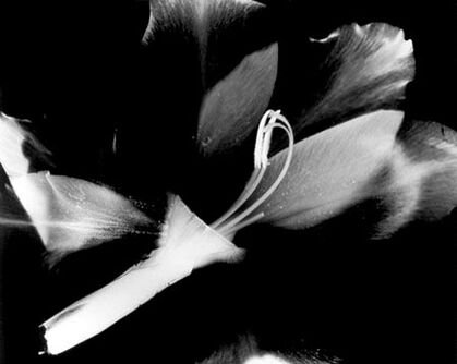
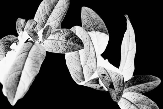
I will be analysing the image to the right. This artwork falls into the genre of pattern, as the leaves have vein like patterns going all across them. The image shows 3 leaves attached to a small twig/ branch. The image has an eerie, mysterious feel to it, since the image has been inverted. The image looks supernatural and ghost-like, with only white areas being shown while the black fills the backdrop. This image feels very intimate, with the leaf's looking bare, like they have had the leaf skin peeled off, revealing the vein like structure beneath. The image seems to have no narrative or hidden meaning to it, being simplistic in the way it is presented. When I first saw this image it intrigued me deeply, with its simplistic layout and effect. The image looks as if it is lit up, creating a light of its very own.
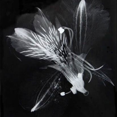
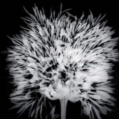
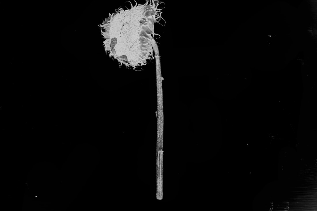
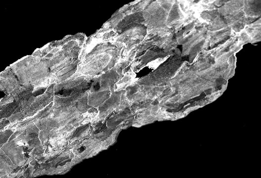
Another image I found to be fascinating is the Dandelion shown on the right. This is one of the many images in the "Breath" series. This extreme close up shows all the detail on the dandelion head. You can vividly see the pattern made by the hundreds of small seeds sticking out. I like the negative colour scheme used, reversing light and dark. The image reminds me of an X-ray, in the way the skeleton is completely white and the backdrop black. The two images analysed both have a serious mood to them. I don't feel like there are any emotion displayed from them. They are plain and dark, the colour black connotating death, fear and anguish, yet there are no obvious emotions shown or explored.
|
"Photography is a medium that allows an artist unlimited ways to express herself. I treasure the fact that I can make all kinds of images, many taken right from my imagination." - Roxanne Worthington
|
Artist inspired edits:
|
|
|
|
|
|
Edit Analysis:
The edits above were made in response to Roxanne Worthington's work. I found her work to be deeply intriguing to me and so decided to create my own Worthington inspired edits. Firstly I thoroughly searched for plant life and vegetation that looked visually appealing, and had some links to Worthington's work. I ended up settling on shooting leaves, rather than flowers, as I found extreme closeups of leaves had much more detail, with veins, arteries, cracks and crevices' that gave them rougher textures. I then cropped the plants and placed them against white, painted backdrops, with the plant centred. I believe the best way to successfully create inverted/negative images was by first turning the chosen images black and white, followed by inverting the colour scheme, thus making light colours dark and dark colours light, resulting in the negative images shown.
The centre of each edit is the plant, as pointed out my the darkness around it making them the only thing you can focus on.
The centre of each edit is the plant, as pointed out my the darkness around it making them the only thing you can focus on.
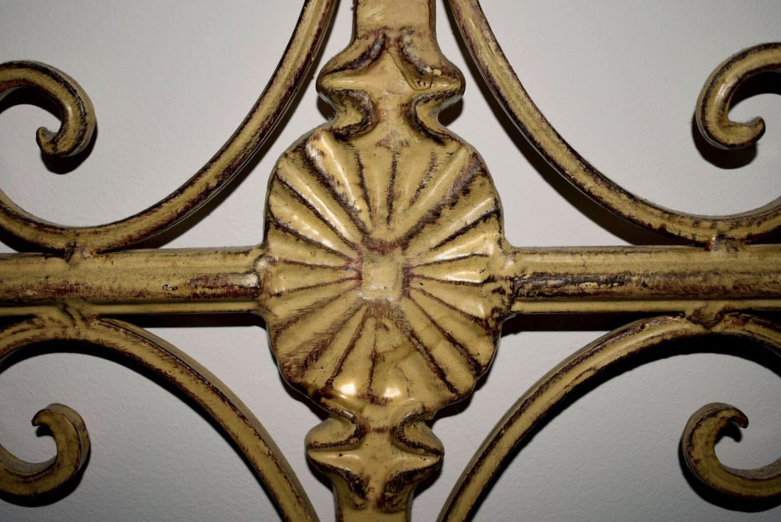
Exploring Texture and Pattern:
|
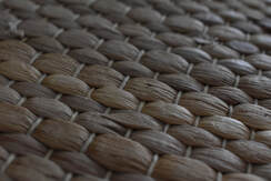
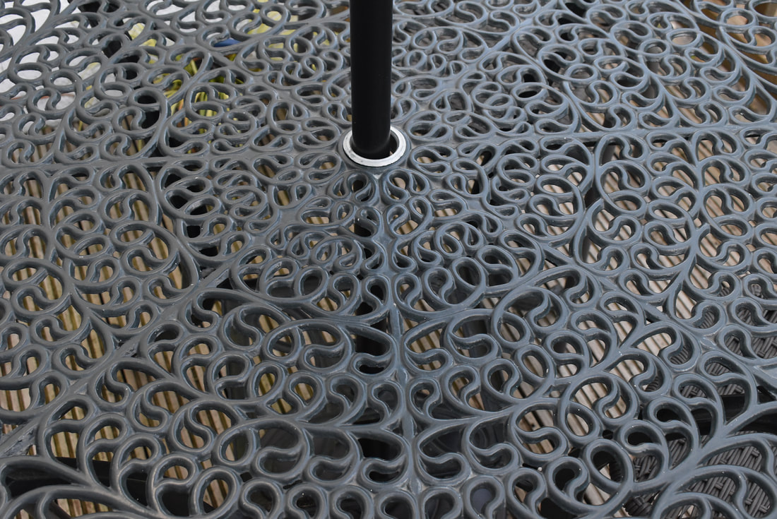
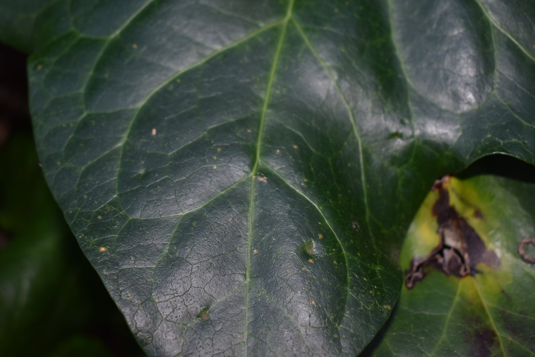
Pattern is another key formal element used in photography. Pattern is used to excite and intrigue. Pattern brings order and structure to a picture uniting shapes on a surface. Pattern can be symetrical or abstract, as long as it has some form to it. Pattern and Texture go hand in hand.
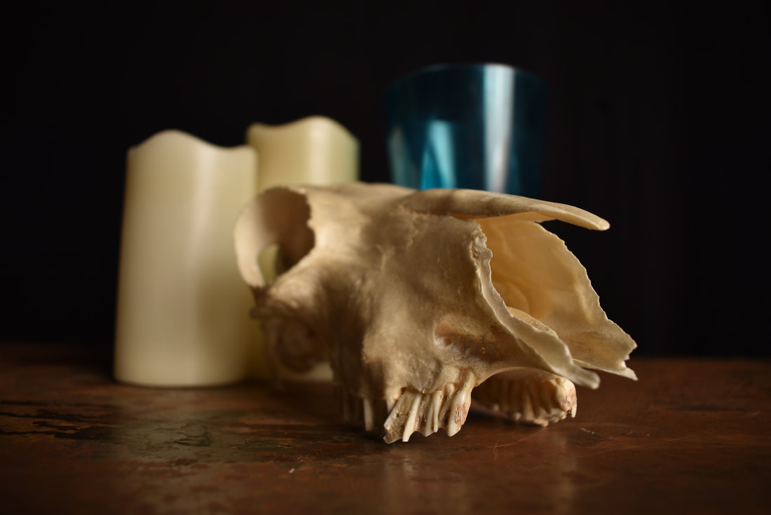
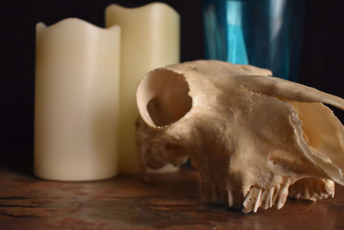
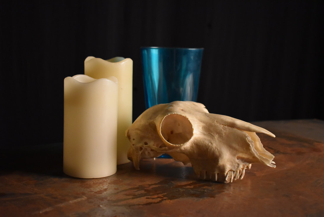
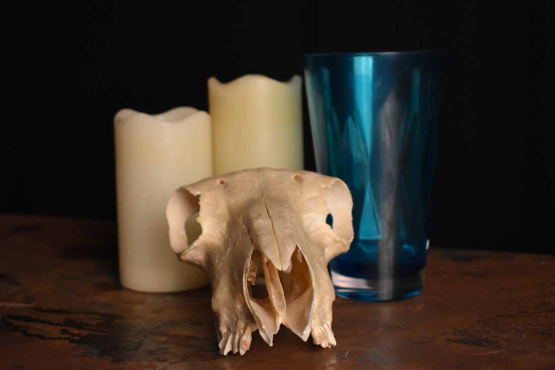
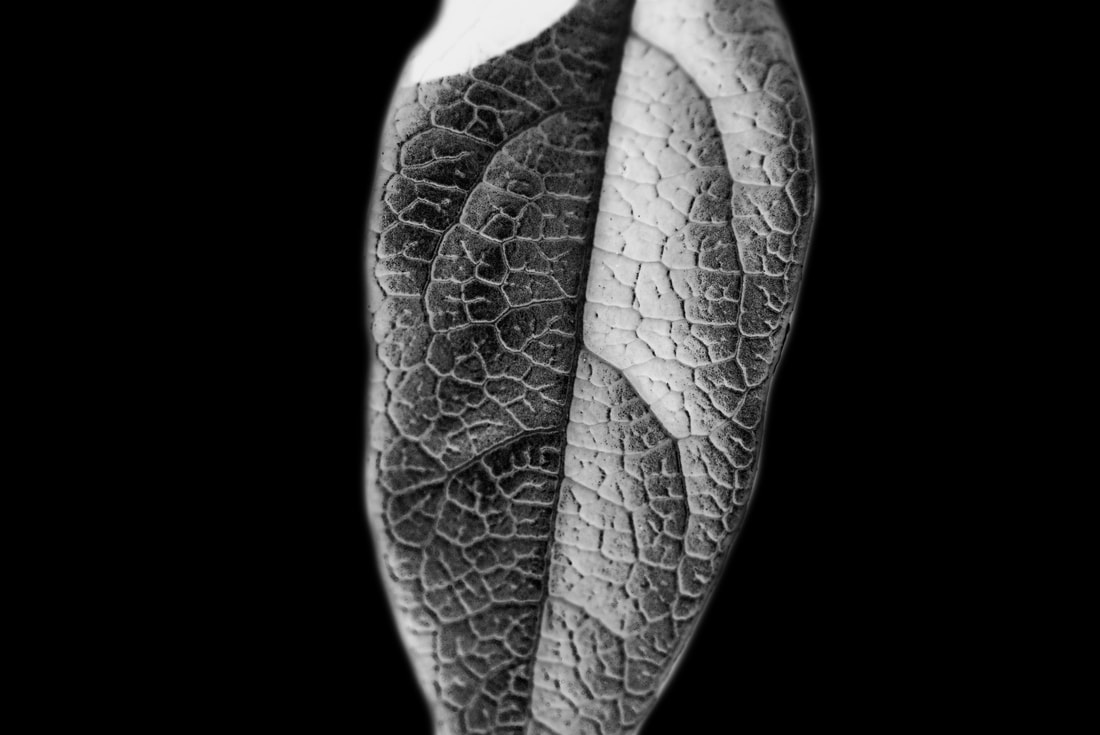
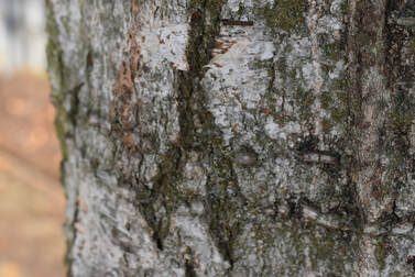
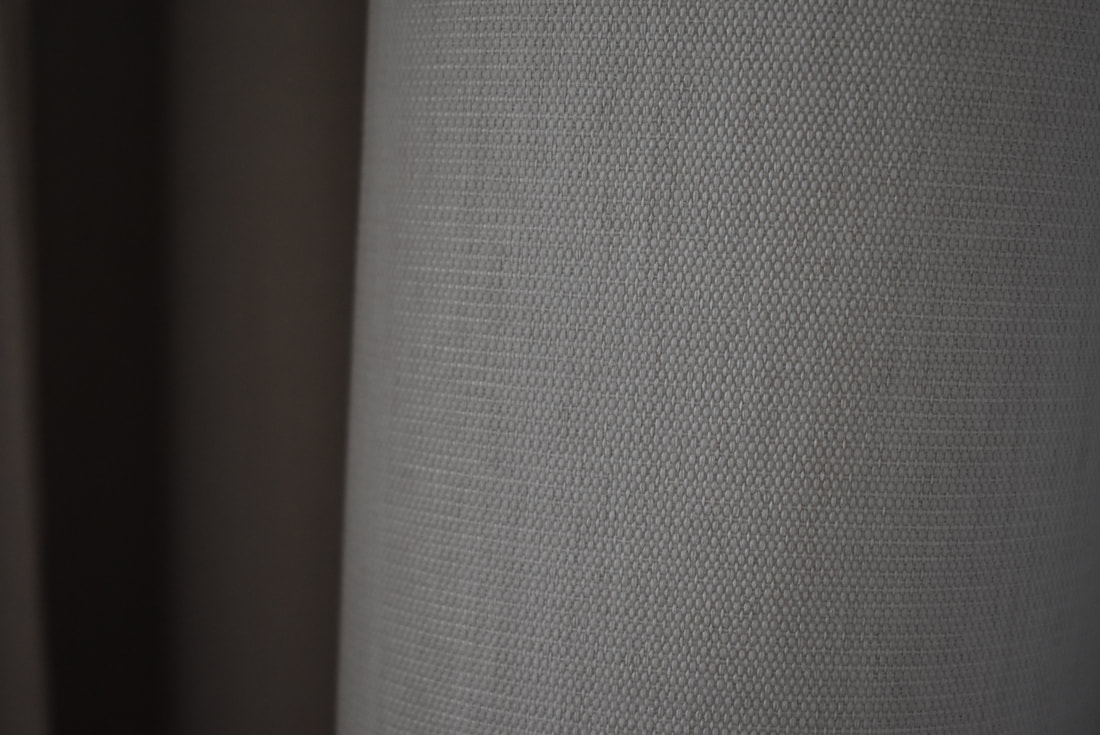
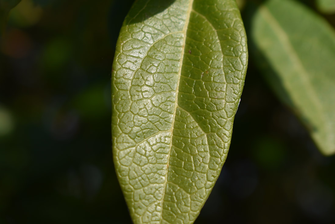
Texture is a key formal element in photography. If used properly it should invoke an understanding of what the object/ scene in a picture would feel like. When texture is properly shown, it helps create a sense of 3-D . Without texture this image to the right would be unrecognisable. We can only tell it is a tree by seeing the cracks and space between showing the bark.
|
|
Contact sheet:
|
|
|
|
|
|
|
|
|
|
|
|
|
|
|
|
|

|
|
|
|
|
|
|
|
|
|
|
|
|
|
|
|
|
|
|
|
|
|
|
|
|
|
|
|
|
|
|
|
Analysis :
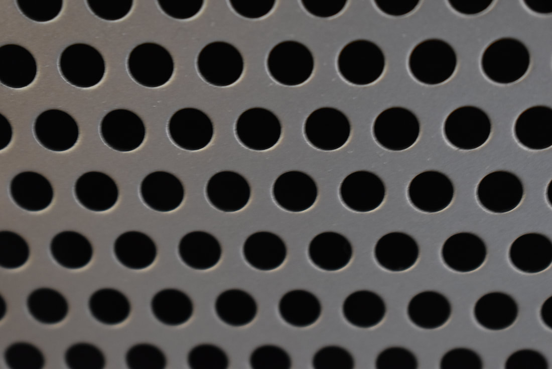
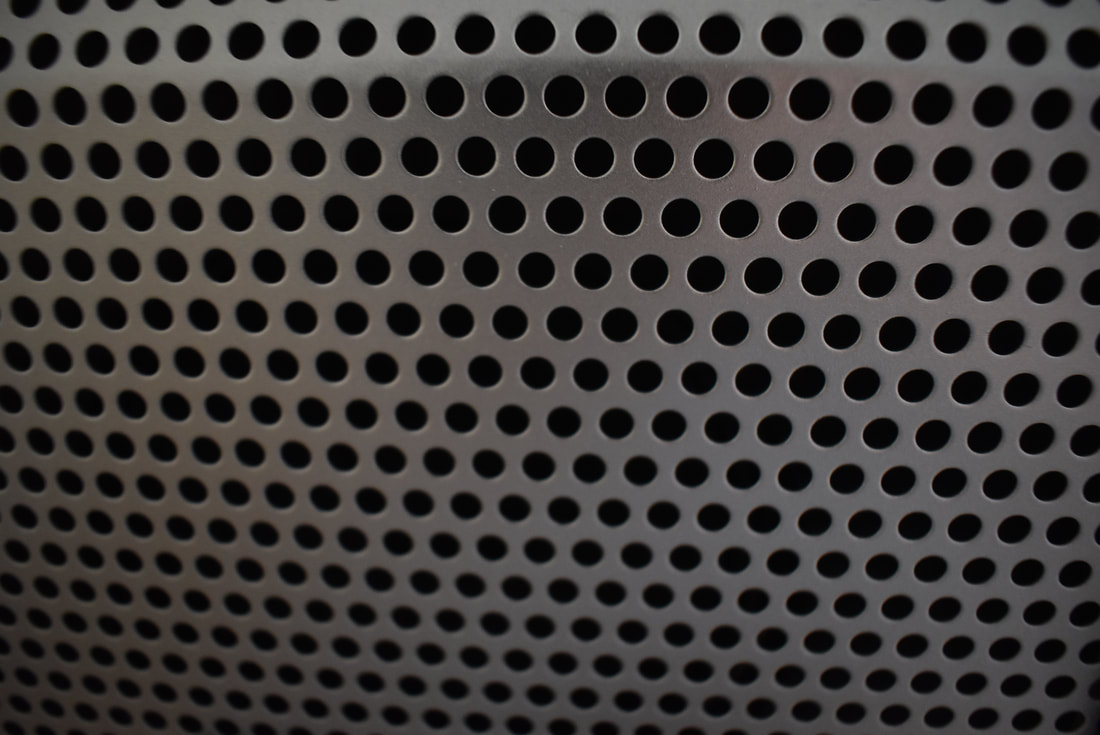
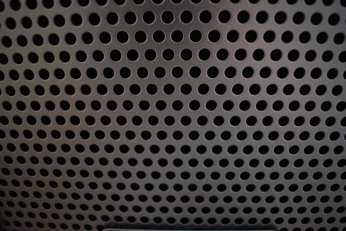
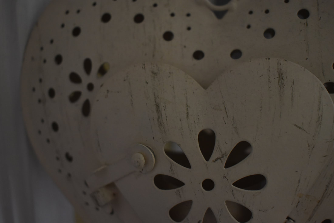
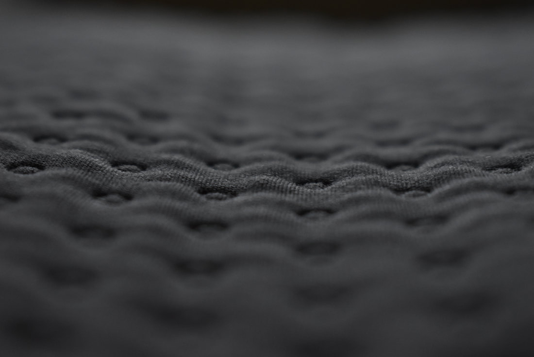
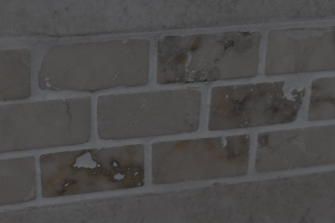
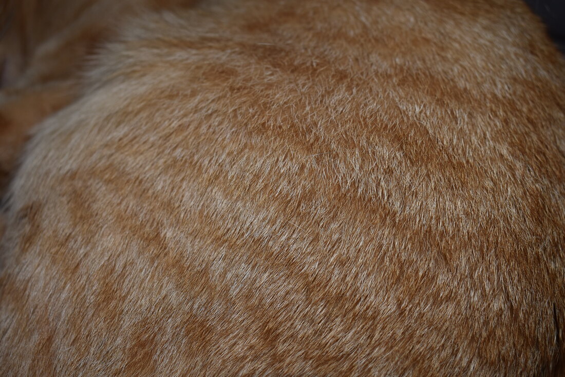
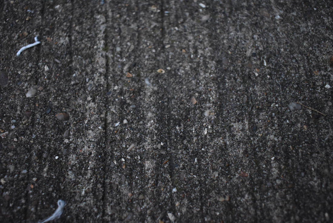
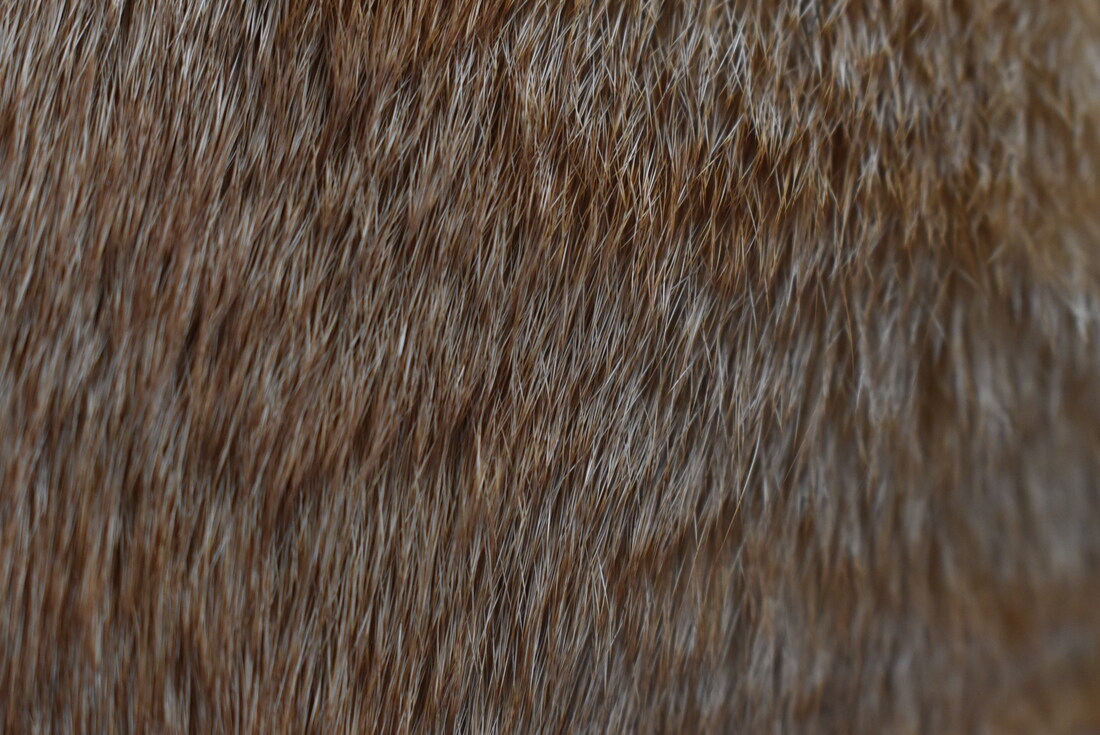
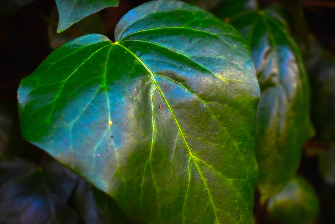
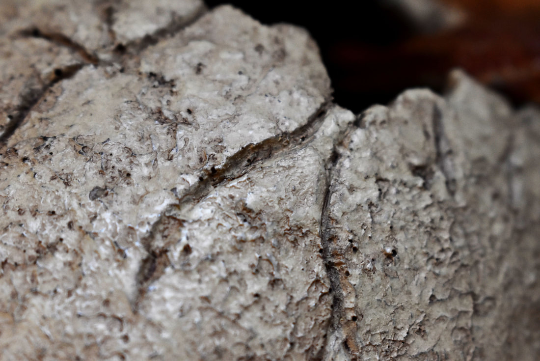
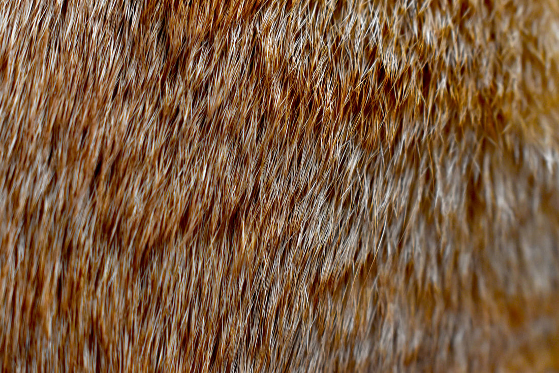
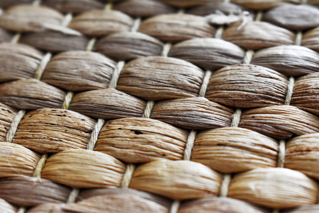
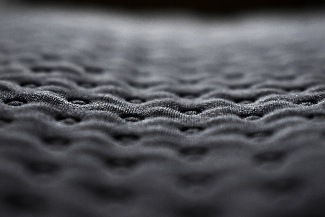
The pictures shown above are in response to the the theme of texture and pattern. After looking at examples of pattern and texture in photography, I shot my own pictures, trying to capture the two formal elements. I learnt that Pattern is used to intrigue and Texture is used in a way to make the viewer understand how a picture "feels". Many photographers successfully send this message/ reaction through. When I started looking for pictures to take, I realised how many different textures and patterns were in my house alone. These were all objects that I had overlooked, as I passed them everyday with any notice. The pictures taken consisted of bathroom tiles, ornaments and, pillows and different plants. After taking all of my pictures, I selected some of the best and most effective ones and edited them. When I began editing, I wanted to brighten the image, turning up the exposure and contrast, to make the shadows darker and bolder. Another aspect I changed was the saturation. By turning up the saturation, the images became a lot warmer looking. The images chosen for editing are all extreme close-ups, as to get the different textures and patterns in extreme detail. I think I have edited the image to a satisfactory level. There is a variety between the different edited images. They range from hard to soft and simple to complicated. One thing i could improve is taking more photos outside.
Edits:
|
|
|
|
|
|
|
|
Edit analysis:
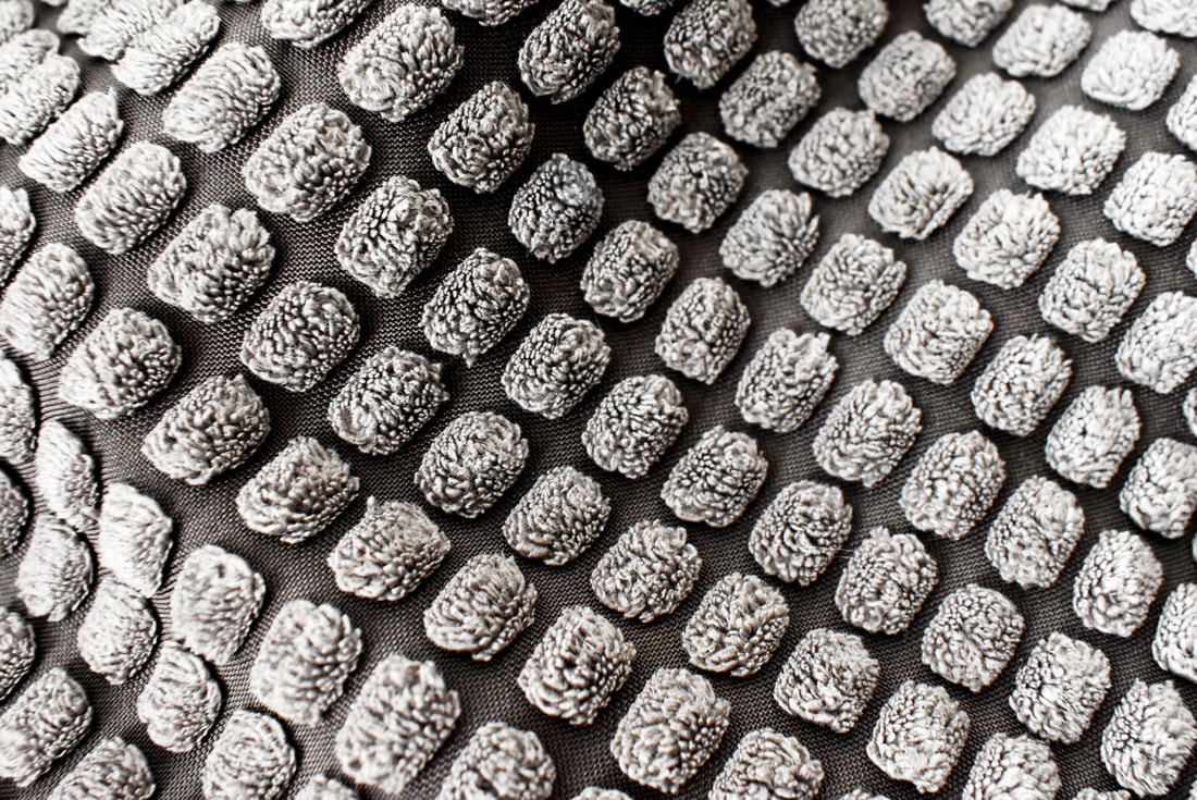
After I had finished my shoot, I chose the 6 best photos to be edited, a blend of texture and pattern. The images taken were all extreme closeups, revealing small details, such as cracks and crevices, which would be great to edit. I decided to play with the contrast to make the patterns have more depth and to be fully revealed. The focal point of the edits are the patterns. Even when the image is supposed to display texture, at its very core it is a disorderly, borderless pattern. Most of the patterns showed are linear or shaped together by lines holding each shape together, whether that is a circle, square or other shape. I find the resulting edits to be entrancing as they are enhanced to reveal the minute details that we don't usually see. We are often drawn to the unknown or unfamiliar and therefore intriguing to us. I made this effect even bolder by changing the contrast to give the pattern and texture more 'shape'. On the bottom two edits I decided to use the blur tool to follow the rule of thirds, by diving the images into 3 sections. The centre piece is in focus and therefore shows the significance of that area. The patterns are monotonous and repetitive, so why not have one point to focus on, enhanced to have more defining details.
What I find interesting is that I decided to edit the most mundane everyday objects such as blankets, tarmac, pillows, animal fur and leaves. I though that the entirety of formal elements is a tribute to understanding seemingly boring aspects of our world and society when in reality they are masterpieces of their very own, so small and insignificant that they're often overlooked. I took this natural rule of our world and made small adjustments to give them an unrealistic appearance. I changed the look of the edits to make them saturated and smooth, a waxy, plastic feel as a way to show that texture and pattern is important changing the viewers perspective as I had changed mine.
What I find interesting is that I decided to edit the most mundane everyday objects such as blankets, tarmac, pillows, animal fur and leaves. I though that the entirety of formal elements is a tribute to understanding seemingly boring aspects of our world and society when in reality they are masterpieces of their very own, so small and insignificant that they're often overlooked. I took this natural rule of our world and made small adjustments to give them an unrealistic appearance. I changed the look of the edits to make them saturated and smooth, a waxy, plastic feel as a way to show that texture and pattern is important changing the viewers perspective as I had changed mine.
