This page is to be a testament to all my work done during my quarantine in the summer lock-down. This is to be my transition unit page, where I will present my very own images, gallery visits and short descriptions of my sub sections and the work within them.
Theme 1 : Inside

|
|
|
|

|
The image shown here is of a shower head in my bathroom. This photograph was taken from a slightly tilted angle, so that I was able to capture more of the side and bottom of the shower head. I thought this would create a more effective image if i showed this angle. Its just one example of an item that everyone connotes the concept of "inside" .My favourite part about this image is where I have done editing and inverted all light areas and turned them dark. This is why the image has such a supernatural look to it. |
Theme 2 : Leading lines


|


|
These photos all display items and surfaces that show some form of lines. In this case I was specifically searching for parallel lines within my house. I found it shocking how many lines there were dotted around my house, in almost every space that I could see. It was only once I was specifically searching for these Lines that I realised how many there were and how prominent they were. Its the fact that our lives are surrounded by lines that makes us forget and not realise how many surround us. This is shown through the pictures displaying these mundane, everyday objects varying from radiators, bed frames, tiles and the side of a coffee machine. These are just some examples of leading lines in a common household, showing the significance of lines. In many ways they hold our world and society together, visually and literally, the perfect shape.
Theme 3: Window Worlds


|


|

|

|
This photo shows a dark room with 2 visible curtains, slightly parted so that they let in the sunlight. I really like this image as its a view I see everyday when I wake up. I took the image with my camera straight on so that I could have some camera flare in the image. My artwork displays the theme window worlds without actually showing a window, as it is a curtain covering this "window world". I thought that I could play around with what counts as a window, hence why there are so many curtains, teasing the existence of the window behind them. After taking the photo I increased the brightness and contrast so that the light and shadows were divided and bold, with clear cut differences, able to define each as complete opposites. I believe that this gives the pictures much more serious appearances, seeming more mysterious. The common factor between every photo is that the view through the window is never shown, emphasising the importance of the window, rather than what it shows. This was one of my favourite pictures to take within this project.
Theme 4: Extreme Close Up


|


|

The photograph shows a closeup of grass, in my back garden. I took the picture facing upright , rather than looking down on the grass, so that I could create a more meaningful shot. I do this to capture the grass in a better angle, where it can be seen more clearly and in better detail. I wanted to explore a vast, hidden world, where the singular blades of grass look like bulking green tree trunks. I wanted to turn a miniature landscape into artwork. I made this shot by placing my camera directly into the grass so it seems like you are truly there between the grass. I made the centre in focus, whilst the back is out of focus and is blurred. I turned up the saturation when doing minor edits to the picture. By doing this and turning up the contrast I made the picture look a lot less dull and made all the colours more vibrant. In doing so the darker and lighter colours become more contrasted, creating more depth to the image.
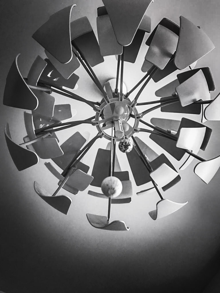
Theme 5 : Looking Up


|
|


|
We live our lives staring straight ahead or at the ground. This causes us to never look up. seeing, understanding the wonders that surround us. In this photoshoot I made a contrast to the famous "Birds eye view" and decided to what it might look like for an ant or smaller animal to look up. This made small or regular sized objects and locations appear massive. I wanted to see the beauty that can only be revealed by 'looking up in awe', something we rarely do anymore. |
Theme 6 : Playful Constructions


|

|

|

|
This photoshoot was where I could try and expand my view of all things around me. This section made me use my creativity to turn everyday objects into creative art pieces. This was more than just taking a photo now. I was actively creating my own pieces, my very own sets which I was able to manipulate and change whenever I liked. This would be a small taste of what would be to come later on in photography, a chance to dip my toes in the water. Much differently to art GCSE I am now able to create my own projects, controlled by me and pushed in the artistic direction I want to go in.
Theme 7 : Thoughtful Experiments

1)
This picture shows a face split into parts on a rose which has been ripped into 3 sections. The image is about our human emotions and how gentle they are. Our emotions and feelings are soft and gentle like a flowers petals and can be broken easily. When we feel under the weather we feel as if we are broken, like shards of glass. I created this piece by cutting out a woman's face out of a magazine and cutting it into glass like parts, sticking it onto a torn up rose. in-between the cracks I used oil pastel to dirt the crevices, representing the bad emotions we have that break us. I believe that one way I could improve is by smudging the oil pastel better over the entirety of the image. 
3)
This picture shows an image of the left side of a woman's face spliced with the right side of a baby sculptures face down the middle with oil pastel smudges all around. A large smile has been added with red oil pastel across the sculpture and woman's lips. I tried to create a hidden meaning, that being that we all hide behind stone cold faces, whilst in reality we have our own identity, hidden away to strangers. When searching for eye catching pictures in the magazines, faces always caught my attention, because I feel that a face tells a story and can be tampered with to become artwork. I believe that I should have made less changes to the piece, applying less oil pastel, as to simplify the work. |

2)
This image shows a woman placed between 2 grey scale curtains and the same 2 curtains in colour behind her. She is completely hidden and covered by the curtains from all sides. Curtains hide and block out all light, and in a similar way, she is being blocked out. Everyone has a talent of some sort, hidden behind insecurities and judgement. Everyone is special and are the silver lining in the clouds. I made this image using 2 versions of my own previous work and an image of a woman, who I thought looks mysterious, with her own poker face. I believe this is a successful image for it sends a certain theme of mystery towards the viewer. 
4)
This picture shows 2 of my own images taken, with an additional image of a hyena taken from a magazine forged together to become a new piece. Its all been formed together simply, with not much change. When using parts of magazines to use for artwork I would rather tear the pieces out, as opposed to cutting out parts neatly with scissors. I much preferred the look of the edgy white paper being shown on the outskirts. After putting all the pieces together I scrunched it all up, so it had folds, creases and tears where the ink wore off. I wanted to show art can be made to look simple. The piece is a testament to all work that has been made in a simple looking manner. |

|
5) This picture is many images taken and used from magazines to make a whole new art piece. Its a combination of a tree with different media and props/ items scattered on the base. The piece is supposed to have a deeper meaning about how when you use old "scrapped" photos you can create and give life to new artworks. This piece links to the theme of experimentation as its all about creation and testing what works. The way I created this image was by gluing various images varying from houses to articles on North Korea. If I could improve the image I would add more images to the top to make "branches" so it would look more tree-like. Perhaps I could've used a better lighting when documenting this work. |
Stage 2
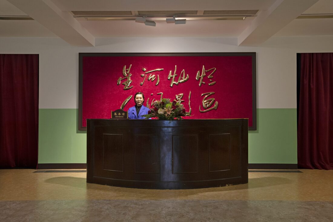
Gallery visit 1 - Cao Fei @Serpentine Gallery, Kensington Gardens
|
This summer I visited Cao Fei's exhibition : "Blueprints", using the virtual gallery in preparation for my A-Level studies in Photography. I was restricted to how I can view galleries and artwork as there was a quarantine. I was able to find this specific gallery through the help of teacher resources, that being the website "GalleriesNow", which gave me access to free virtual Exhibitions from various artists and photographers.
|
"Virtuality is a means to express myself, to understand reality, which is what I'm interested in..."
|
|
"...I use writing and film too, but we are living in an age of rapid technology and in this context, we need to know that virtuality has changed the way reality works..."
|
When I saw the thumbnail for Cao Fei's gallery it instantly caught my attention with the Mandarin on the wall behind her. I've always had a unexplained interest to Asian countries such as Japan or China. Being raised in England, I've always thought as China as a whole different world, with different cuisine, music and architecture. The neon lights shining and lighting up the Cities at night, like the Capital, Beijing. Fei comes from one of the many cities so this style of City life is reflected in her artwork.
|

|
Throughout her various artworks one thing is constant. small, dark rooms, only being lit by the projector playing her artworks. Each room in the gallery is empty and spacious. This is done to instantly make the artwork the center of attention.
|
|
In almost all of her artwork shown in this gallery, there are bright colours shown, mainly deep blues or purples. There is a deep contrast between the colours and the darkness in the pieces. The blacks and greys are bold and define the pieces, leading your eyes to the most important part of the work. This is done by increasing the colour saturation up, so that this natural contrast is made.
|

"...And to do this we need to be part of it" - Cao Fei
|
In the image on the right,contrasts is used in various ways, such as blue and pink aligning together between where the two buildings meet up, directly between the two people. This creates the effect that there is a border between the two people. It makes me curious as to what the meaning behind it is. The lighting in the photo is artificial, which helps make the people look like statues, with unnaturally blank faces. They show no emotion, yet there is a very strong feeling of tension between them.
Everything in this picture is made to help the viewer focus on them. The picture is set in what looks to be a city/ tower blocks in China. The background has been blurred so that the high definition areas (the people) are made bolder and more important than the mysterious buildings in the back.
Everything in this picture is made to help the viewer focus on them. The picture is set in what looks to be a city/ tower blocks in China. The background has been blurred so that the high definition areas (the people) are made bolder and more important than the mysterious buildings in the back.
|
Overall this artist has inspired me to start making a focus point in my artwork, one specific spot where the viewers eyes are instantly lead, completing my piece an making it whole through having a centre for every artwork.
|

|
Gallery visit 2-Don Mccullen @Hauser & Wirth Somerset, Bruton
|
Another gallery I visited this summer in preparation for my A-Level studies in Photography was Don McCullin's exhibition :
"The stillness of life". The reason I chose this specific gallery is because it stood out from the others. Every gallery was abstract or modern and I just wanted to find a "traditional" photographer. Upon looking through many galleries I found McCullin, an 84 year old British photographer, most famous for his war photography. |

|

Black and white photos have fascinated me. They always have a very serious undertone. We always relate black and white photos to the past, since we are now able to take pictures in colour. This evolution has taken away some of the meaning and impact pictures have. If an image of a landscape was bright, with green grass and a bright blue sky you would say its a happy image or positive image opposed to an image of a landscape with a dark grey sky and swampy green coloured grass, to which you would say its a negative image, a sad one at that. If you were to take all that away you'd have no instant emotion shown. The images mood would be based off what is actually shown, rather than its colours.
And this is what I appreciate about black and white pictures, the fact that they express their selves. Over An image that caught my eye was the one shown on the right . It shows a dusty/ sandy looking landscape with man made pillars. The ruins are scattered across the entire picture. The closest portion of the pillars and sand are shown clearly but the further back the pillars and dunes are, the more blurred they become.
The brightest areas shown are at the bottom of the image, with the darkest part being the sky. The contrast shown between light and dark is immense. The shadows are all dark and long, suggesting that this photo was taken at on a sunny day, some time in the afternoon. This natural lighting works effectively and just like the rubble/ ruins shown, shows little change, little intervention. Overall I like the simplicity of this artist and they have inspired me to not over-complicate future artworks. |
Ironically the most "ordinary" looking gallery was the one that caught my eye. I really enjoy viewing landscape photography. Pictures with no hidden meanings, no political opinions, just artwork admiring nature and landscapes.
I like the simplicity of these type of photos, nevertheless black and white ones. "Photography isn't about seeing, it's about feeling. If I don't have some kind of feeling for what I'm shooting, how can I expect the person who looks at it to feel anything?" - Don McCullin

"Photography is the truth if its being handled by a truthful person" - Don McCullin

|
