
My Coggle:

Ryuta Iida Analysis:
An artist I have chosen to analyse and base my work on is Ryuta Iida. His work links to my overall theme of visual chaos within the abstraction unit. When looking at pixelation and distortion photographers and artists, searching through Google and "Art2Day" I finally found artwork that peaked my interest and fascinated me. I was immediately drawn to Iidas work and style of presentation.
Ryuta Iida was a haiku poet from Yamanashi Prefecture, born on July 10 1920 to February 25 2007. Throughout his lifetime he worked as a rice farmer, journalist and librarian, before finally becoming a creative writer/poet in 1954. He took an active part in the so-called Modern Haiku Movement. In 1956, he won the Yamanaki Literary Prize and later in 1957, the 6th Modern Haiku Association Award for his haiku. In 1960, he was made a columnist in the local newspaper "Mica", for which he had been writing articles since the end of the Second World War. After his fathers death he would take over his place as editor in the magazine "Unmo". In his lifetime he wrote and published many books and poems, here being a few examples: "One hundred noodles", "People at the foot", "The way of spring" and "Shadow of the Mountains". Although he lived most his life as a poet, he would become a member of the Japan Art Institute in 1984. These are the artworks I have been looking and will be analysing specifically.
Ryuta Iida was a haiku poet from Yamanashi Prefecture, born on July 10 1920 to February 25 2007. Throughout his lifetime he worked as a rice farmer, journalist and librarian, before finally becoming a creative writer/poet in 1954. He took an active part in the so-called Modern Haiku Movement. In 1956, he won the Yamanaki Literary Prize and later in 1957, the 6th Modern Haiku Association Award for his haiku. In 1960, he was made a columnist in the local newspaper "Mica", for which he had been writing articles since the end of the Second World War. After his fathers death he would take over his place as editor in the magazine "Unmo". In his lifetime he wrote and published many books and poems, here being a few examples: "One hundred noodles", "People at the foot", "The way of spring" and "Shadow of the Mountains". Although he lived most his life as a poet, he would become a member of the Japan Art Institute in 1984. These are the artworks I have been looking and will be analysing specifically.

|

|

|
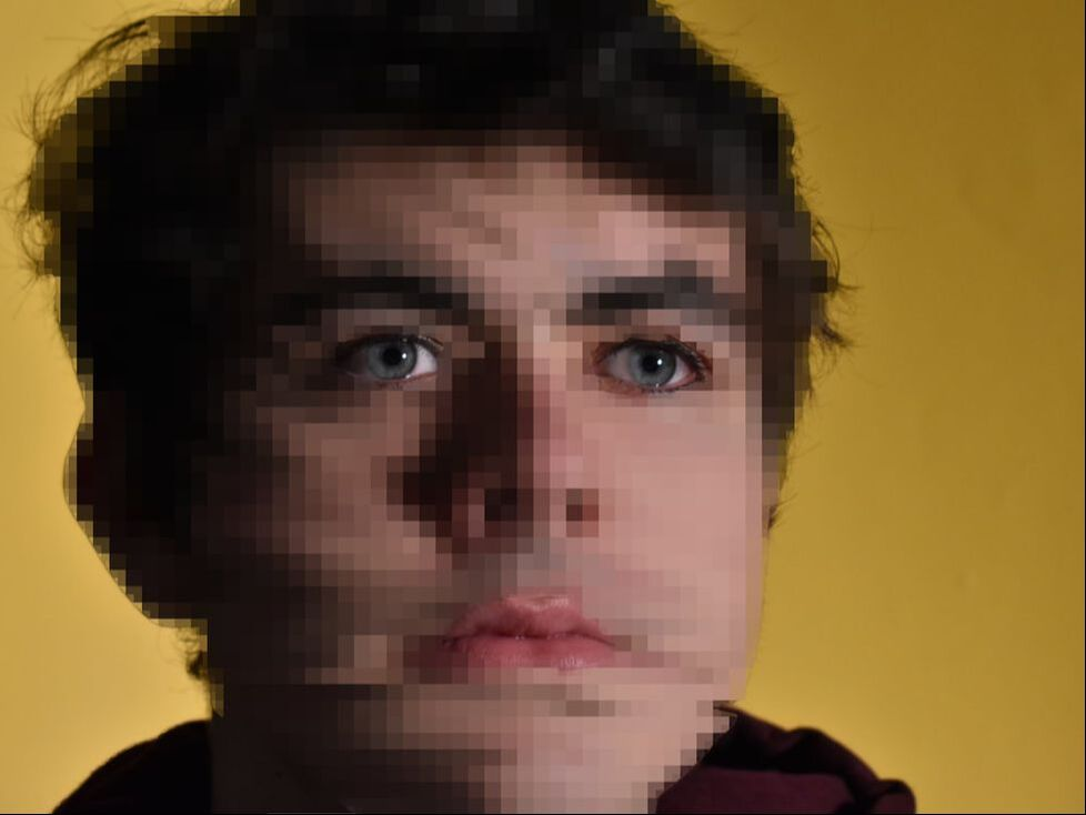
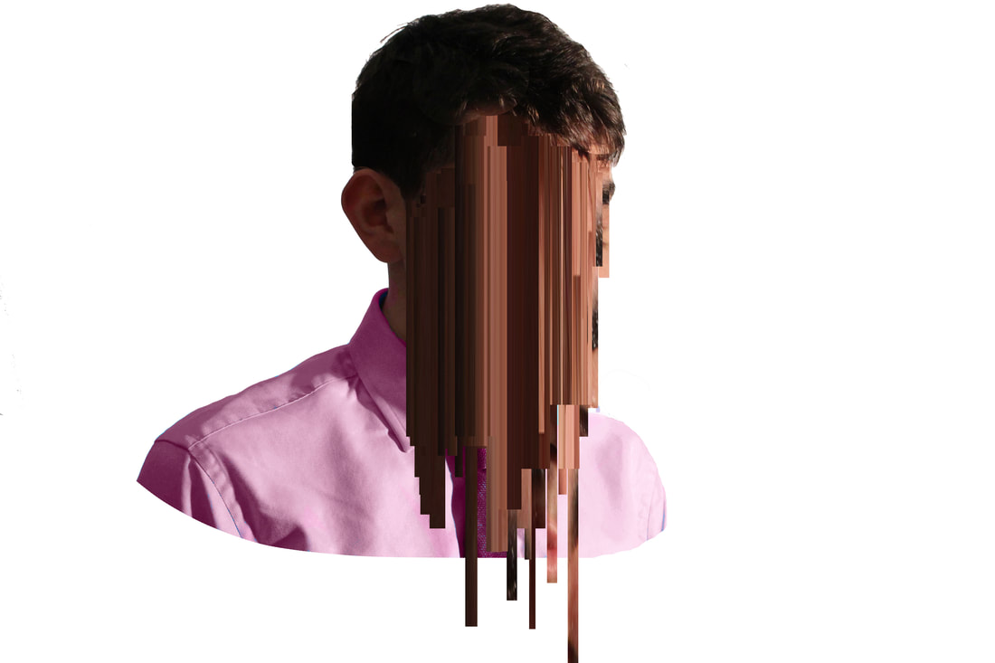
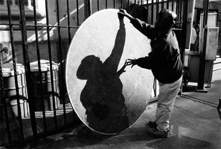
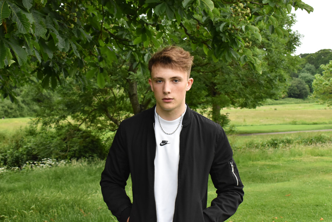
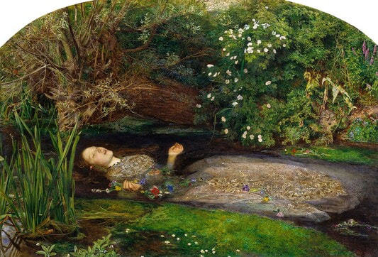
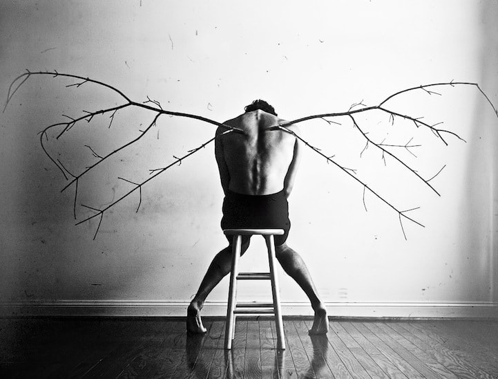
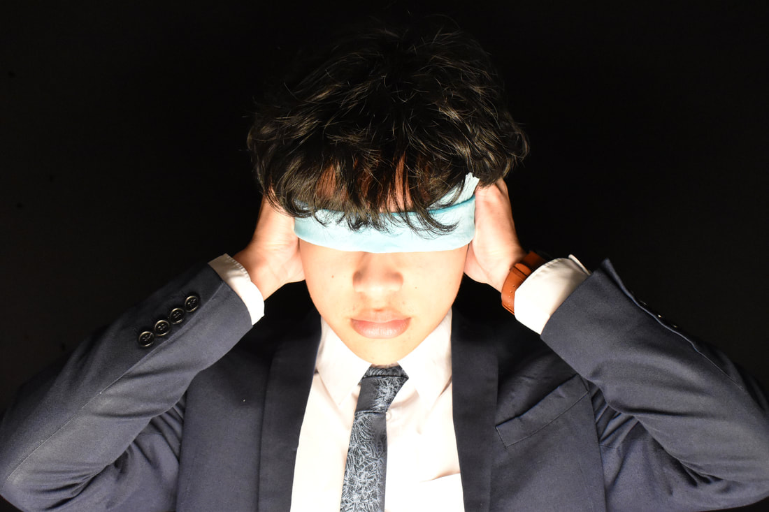
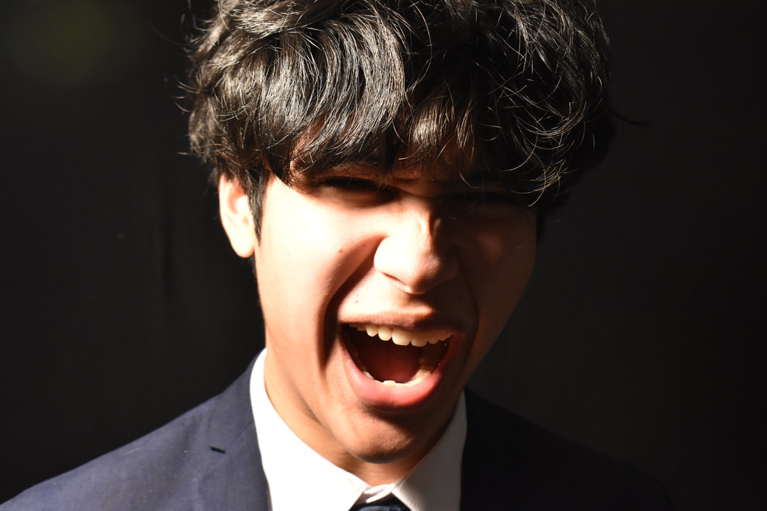
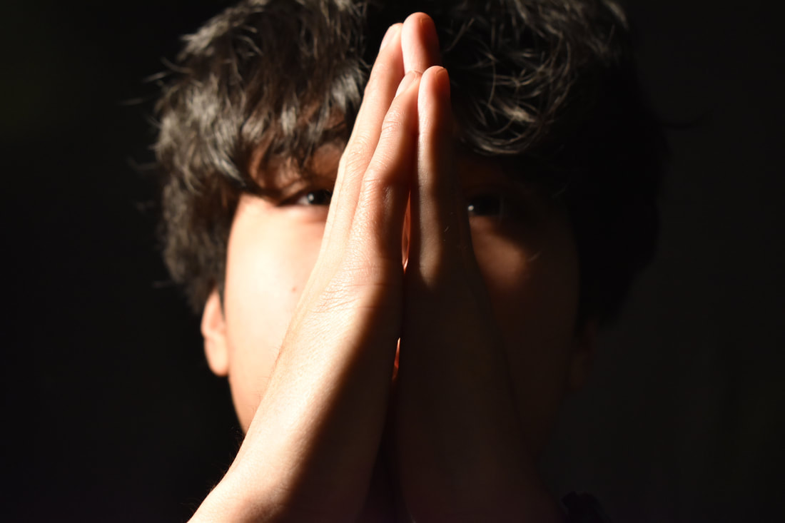
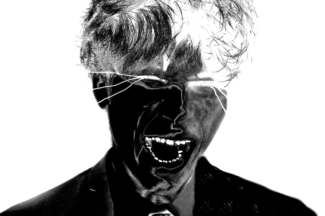
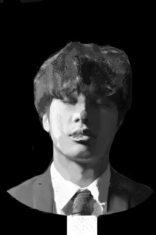
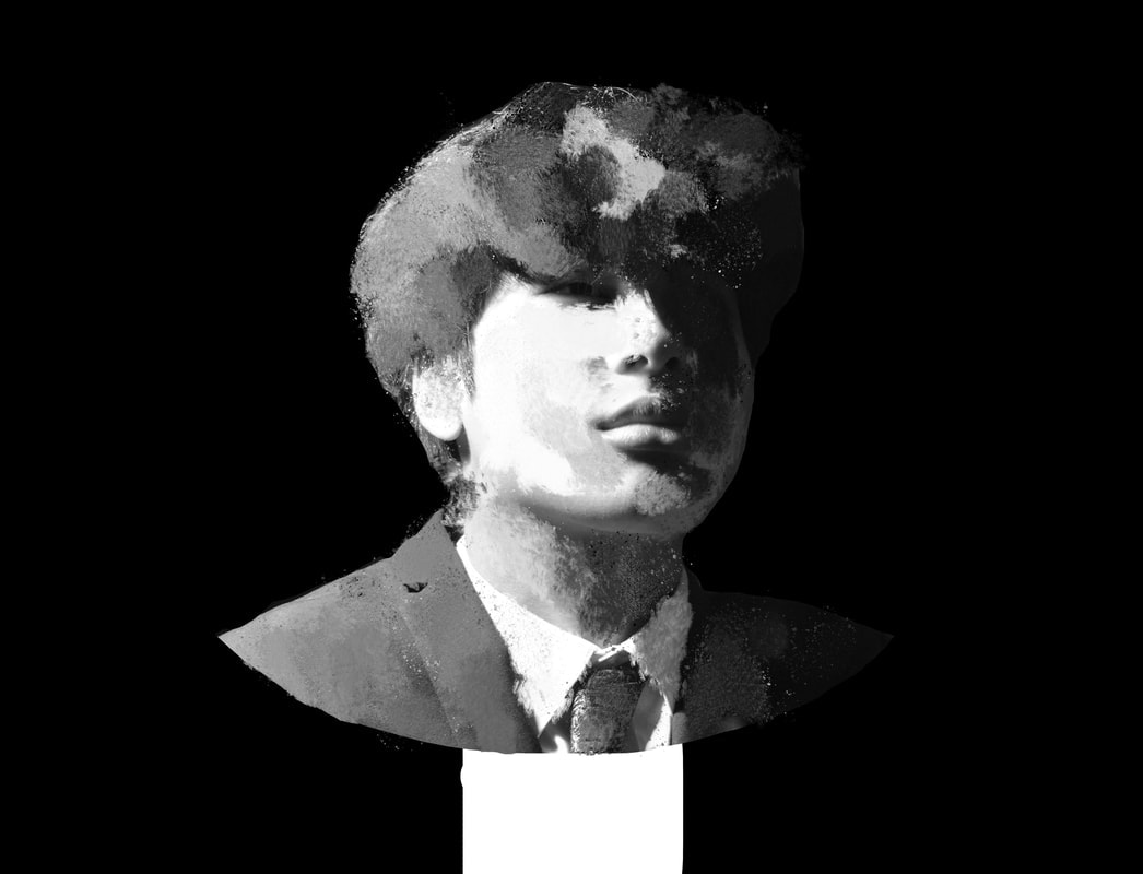
I'll be analysing the centre image as it is the artwork I first saw and believe is the best amongst the other portraits. This is a portrait of a man which falls into the genre of abstraction. It has no apparent location to it, with only the mans distorted face being the focus. The man’s main facial features are still identifiable, such as the colour of his hair, colour of his skin race and so on. Other possible small features have been lost between the strips distorting his face. The original image may have had no sense of motion, but the version that we see feels like it is moving as its shredded.
The image has a repeating colour within it, which is black. The man’s hair, eyes, and top are all black and make up a lot of the image. This was no coincidence, but rather a way for the artist to communicate a serious, mature tone and a melancholic mood to the viewer. This repeating colour of black is unique to this piece alone as the rest in the series have no obvious pattern that they link to. In the other piece, the people are smiling or look to be smiling, however this is the only piece that looks sad or negative. As mentioned, this is not a stand-alone piece, and comes with 9 over volumes, being the first and last artworks created by Iida. The fact these pieces are in a series shows that they all tell a story or narrative of some sort, showing
The idea of this piece having movement is quite ironic as the way it was created was by taking dozens of pictures per minute for 3 minutes, whilst the models were told to stay as still as they could. Once the images were all taken, they would each be printed off and stacked on top of each other, with parts cut out to reveal the previous image. This shows the artists ingenuity as at the time they had no way to use digital editing and had to improvise to create what they envisioned. Although there is no symmetry, there is a sense of balance in the image as the vertical columns are all evenly spread out, finding order in a place that is not obvious to most. Overall this piece brings me a sense of understanding as I like the idea of simplicity and careful placement.
Ryuta Iida Chaos Edits:
|
|
Edit Analysis:
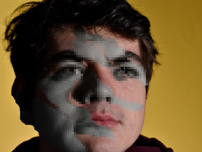
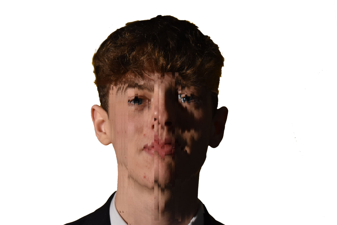
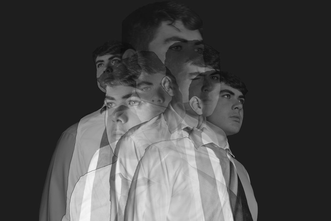
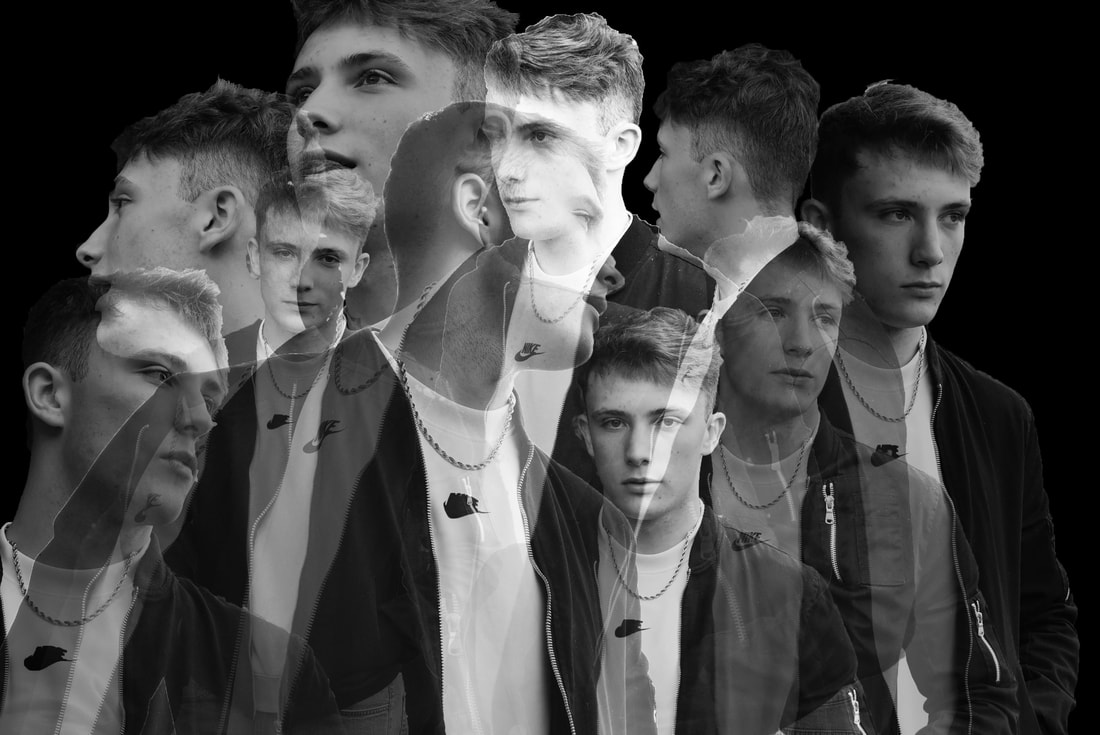
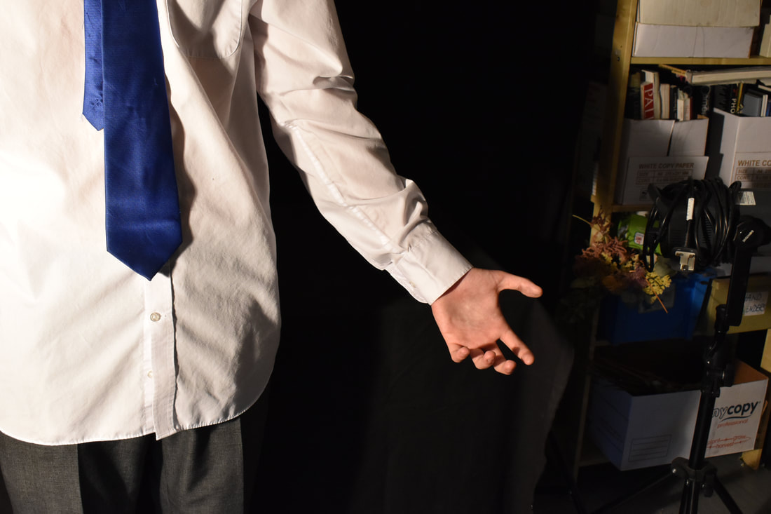
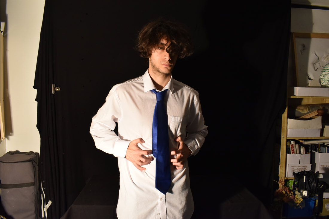
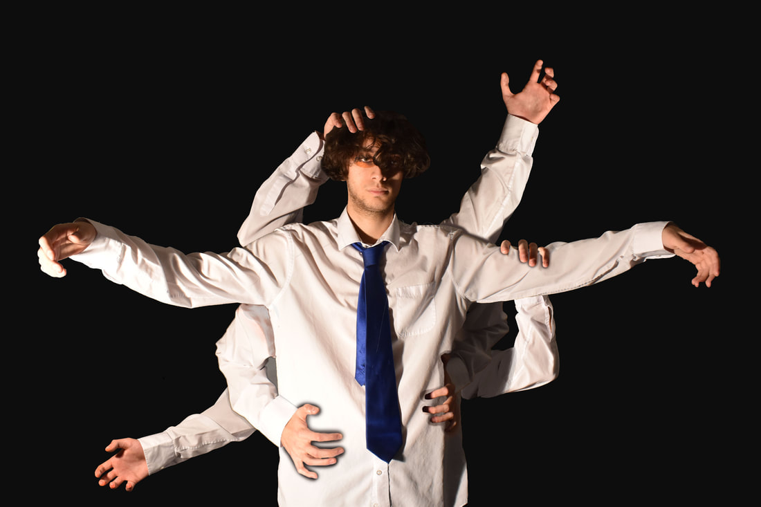
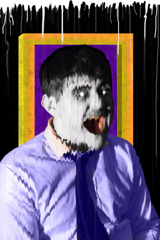
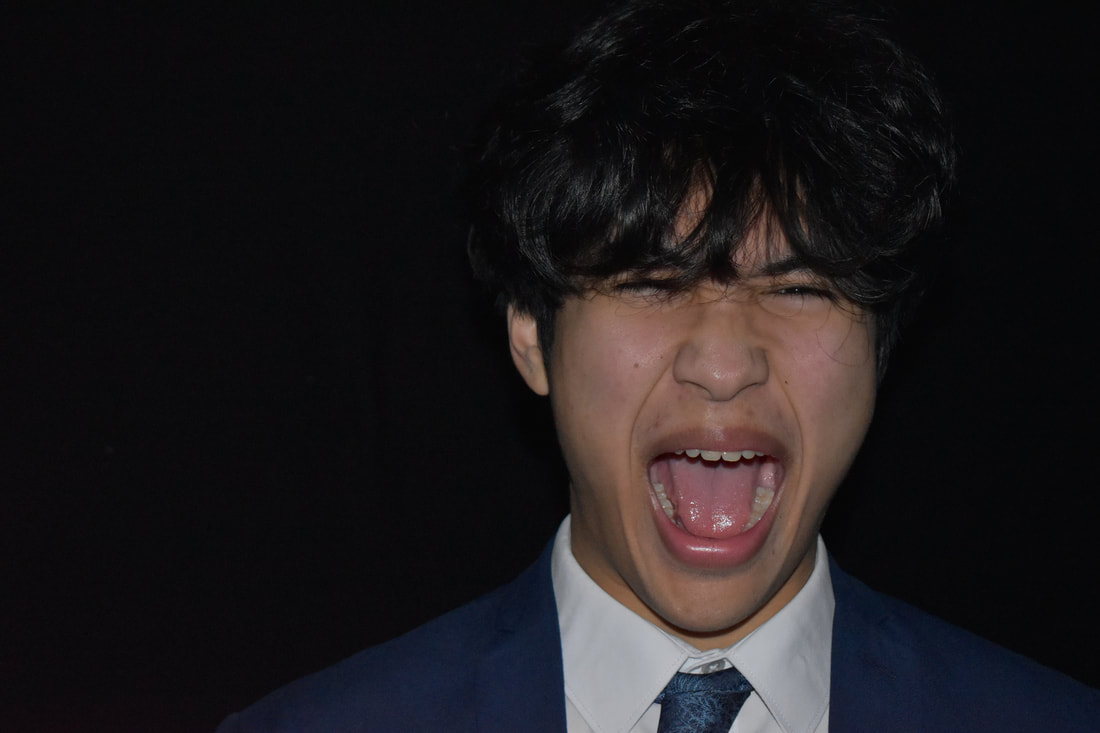
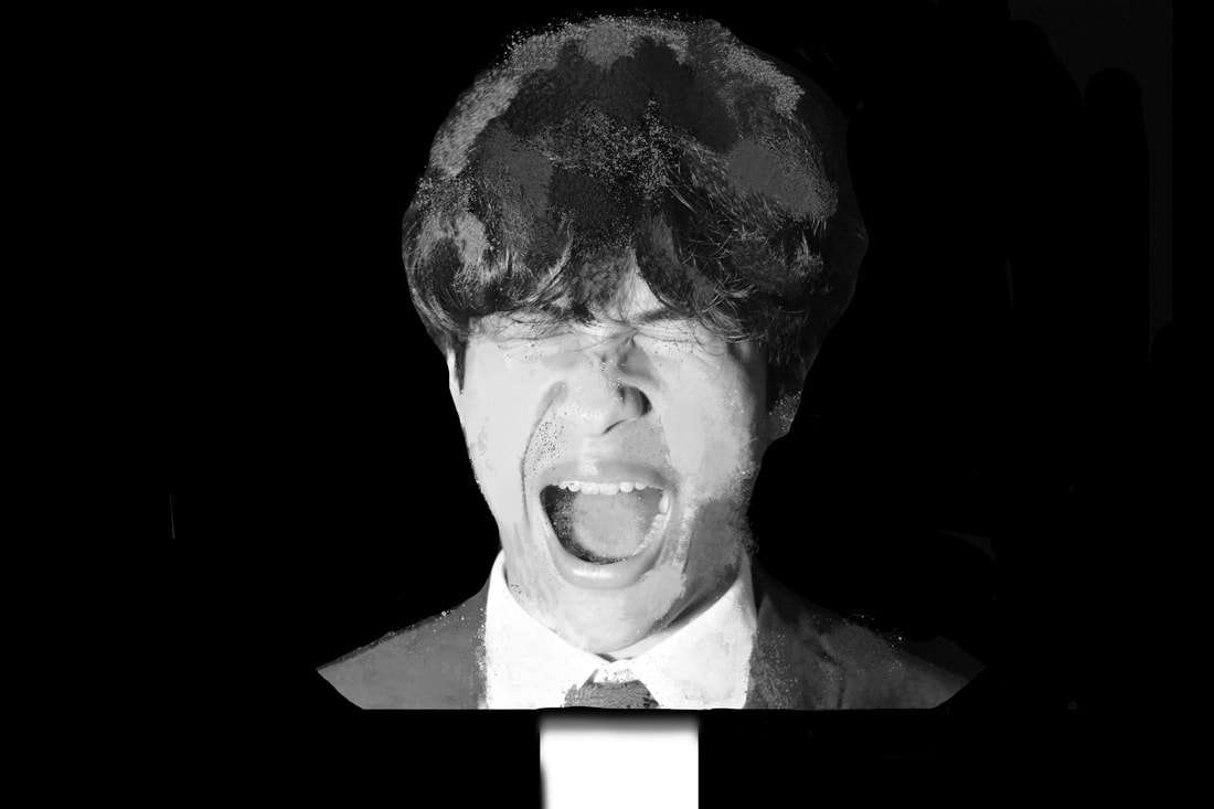
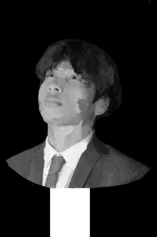
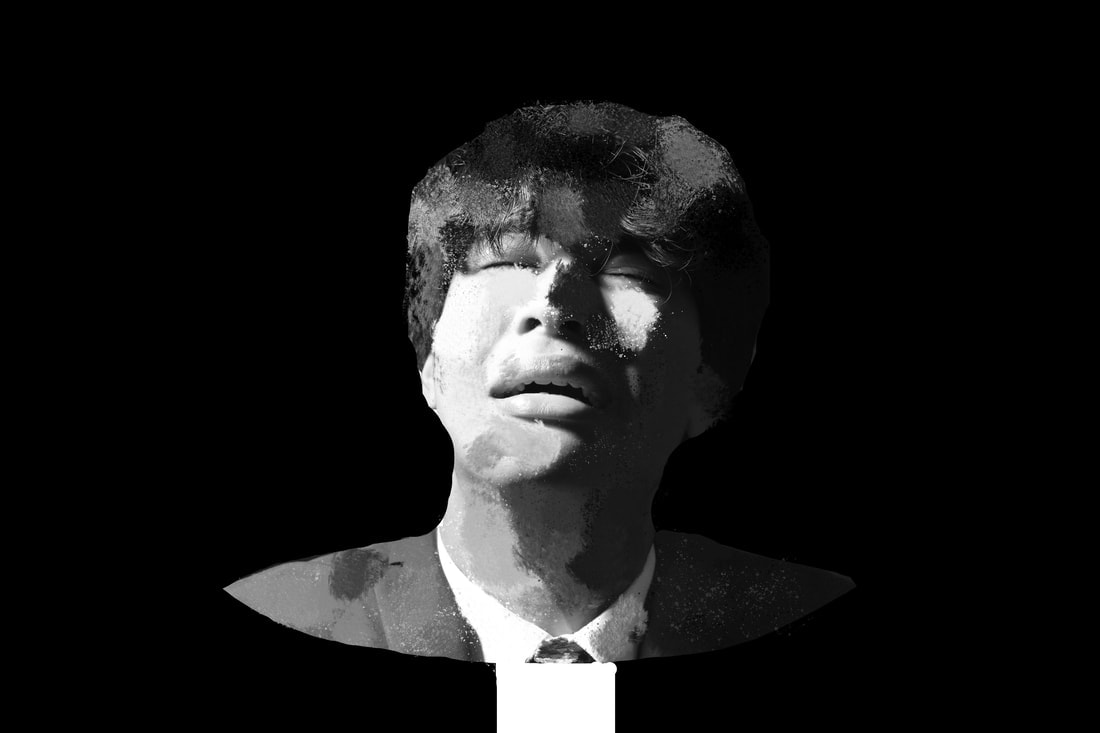
These edits were created in response to Ryuta Iida, sampling aspects from his artwork and putting them into my own work. These pieces were done successfully as they improved on my experimental. In the work directly above I used selection tools to select specific parts of their faces and elongating them into slivers that are spread across the face, until there are no immediate recognisable facial features. This process keeps the face familiar, whilst encrypting it, where the viewer is able to identify the race, gender and age range of the persons face, without knowing who they are. The use of slivers creates a sense of movement as it appears as if the face is melting off, like plastic in extreme heat. In the image above this one, I have taken Max's face and "shredded" it into different components and moved the parts up or down, creating a janky row of rectangles. This creative design was inspired from his works and a desire to make it own individual piece.
Moving on:
Studying Iida helped me realise that I wanted more freedom with my edits and the shots I wanted to take. It was clear to me that I liked the key concept for Iida's work however I wanted more stylised work, with greater potential to create perfect abstraction inspired work. Not wanting to branch off too far from the original concept, I searched for artists who had similar work that I felt satisfied my hunger for a more "complex artwork". The artist I chose was Sabato Visconti.
Sabato Visconti Analysis:
Sabato Visconti is a Brazilian-born artist and photographer based in Western Massachusetts. He obtained a Bachelor of Arts in Political Science from Amherst College in 2009. Sabato has been experimenting with glitch and digital media since 2011. Since then, he has sought to explore how imaging practices have become absorbed by digital processes. Sabato Visconti’s work are all related. They range from gifs, to animation, to photography. They share a common theme which is “glitches”. Sabato says he was inspired by this when he had an old broken camera that would add Zeros to the coding, adding slashes and bars of pixels dragged across his pictures.
I chose Visconti as my next artist as he was the most suitable person to move onto from Iida. I chose Iida partially for the fact that his artwork was somewhat glitch related, with the lines pulling the art apart. When searching for another glitch photographer/Artist to move onto, only Sabato Visconti caught my eye. His artwork was more colorful and "creative". He was the most suitable artist since all his work was glitch related and fit into the ideal image I had in mind of "glitch photography". Iida's art was simplistic and its colour range was dull, the original images not being changed drastically. The same could not be said for Visconti who changed the colour scheme and positioning of the images, in a way that was visually appealing to me.
I chose Visconti as my next artist as he was the most suitable person to move onto from Iida. I chose Iida partially for the fact that his artwork was somewhat glitch related, with the lines pulling the art apart. When searching for another glitch photographer/Artist to move onto, only Sabato Visconti caught my eye. His artwork was more colorful and "creative". He was the most suitable artist since all his work was glitch related and fit into the ideal image I had in mind of "glitch photography". Iida's art was simplistic and its colour range was dull, the original images not being changed drastically. The same could not be said for Visconti who changed the colour scheme and positioning of the images, in a way that was visually appealing to me.

|
|


For Visconti’s work ill be analysing this image. The image is from a series of similar edited portraits of a single woman, in various poses on a beach. The image I’m looking at is abstract and heavily modified, varying from the original colour scheme. The specific image I’m looking at depicts a woman covering her face. The only colours used are red black and white, changing the way the image appears. The woman looks distressed, in pain or melancholy. In all variations of the image, the woman does not make eye contact with the viewer and this is true with the image I’m analysing. This makes the woman seem mysterious. It raises many questions to the viewer, making them wonder who she truly is. From the specific colour scheme and 2-dimensionality of the image, it is hard to infer what the backdrop is, it being a flat colour with no depth. In the backdrop there are “glitches” that pull colours and objects apart and stretches them in a small area. This gives us a sense of motion as it looks like wind blowing or a stream of water.
When I first saw this work I found it looked quite intriguing. I liked the abstraction used in a glitch like manner. The piece looks dark and menacing, which is something I like. It has a sort of “edgy” mood to it, as the woman looks like she is in agony. The whole piece seems to display pain, and mystery, as the woman’s face has been hidden even more than before. This creates a sort of tension and an eerie feel to it. This piece has been modified through editing techniques to achieve the glitch-like final look. This artwork was chosen since it linked to “glitch photography” within my entire them of visual chaos.
This is a digital artwork, positioned in landscape form. The size of the image is of a typical rectangular photograph. The artwork is shown on Visconti’s website, in a symmetrical format on one of his pages. This image does not specifically use the rule of thirds, breaking the rule and using its own positioning. The way the woman is positioned within the bottom left, yet is still facing down, makes it seem like the viewer is being looked down upon. In one way, using flat colours made the image less 3 dimensional, yet this angle used gives it a sort the viewer a sort of understand of the woman’s position in the original image.
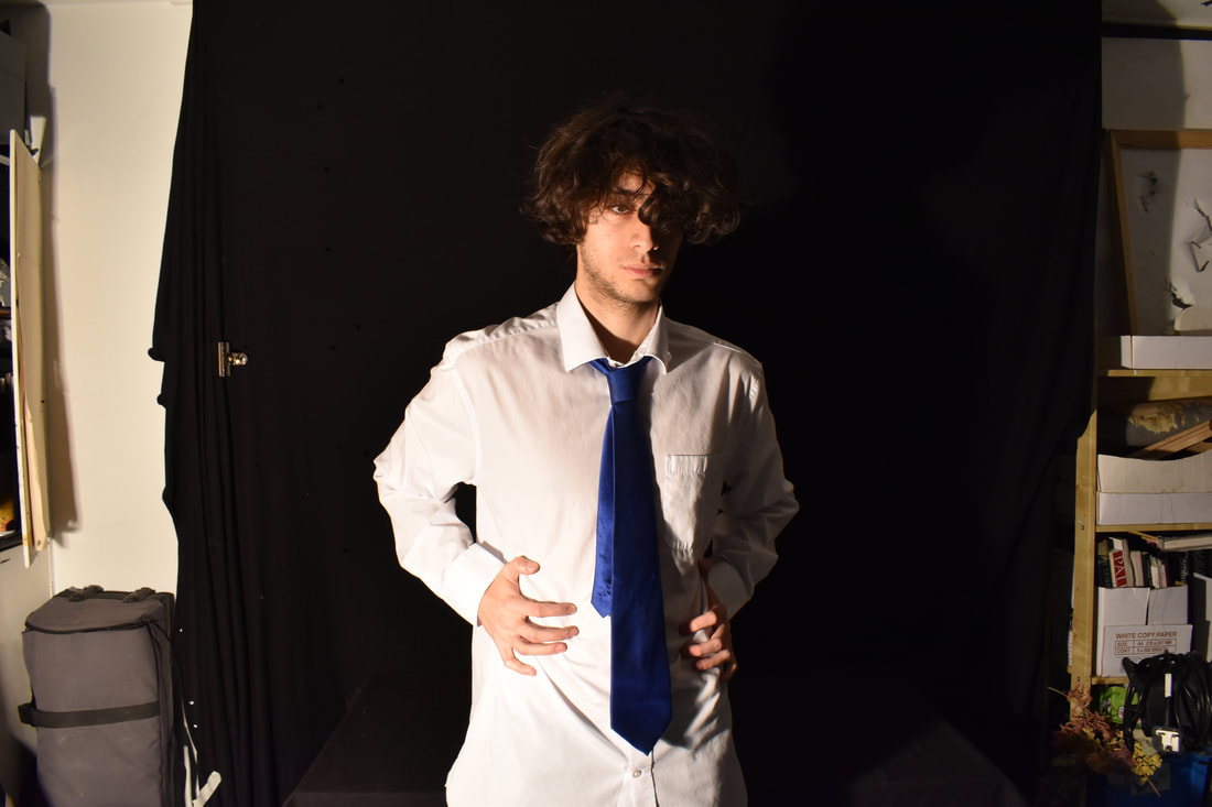
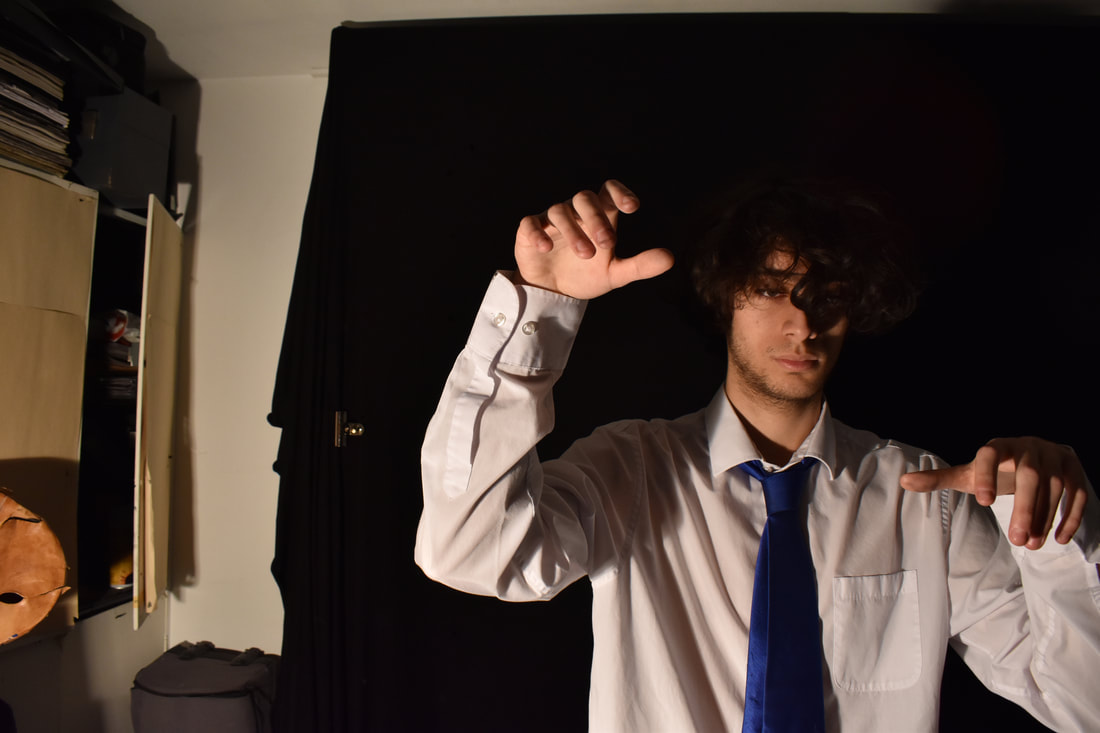
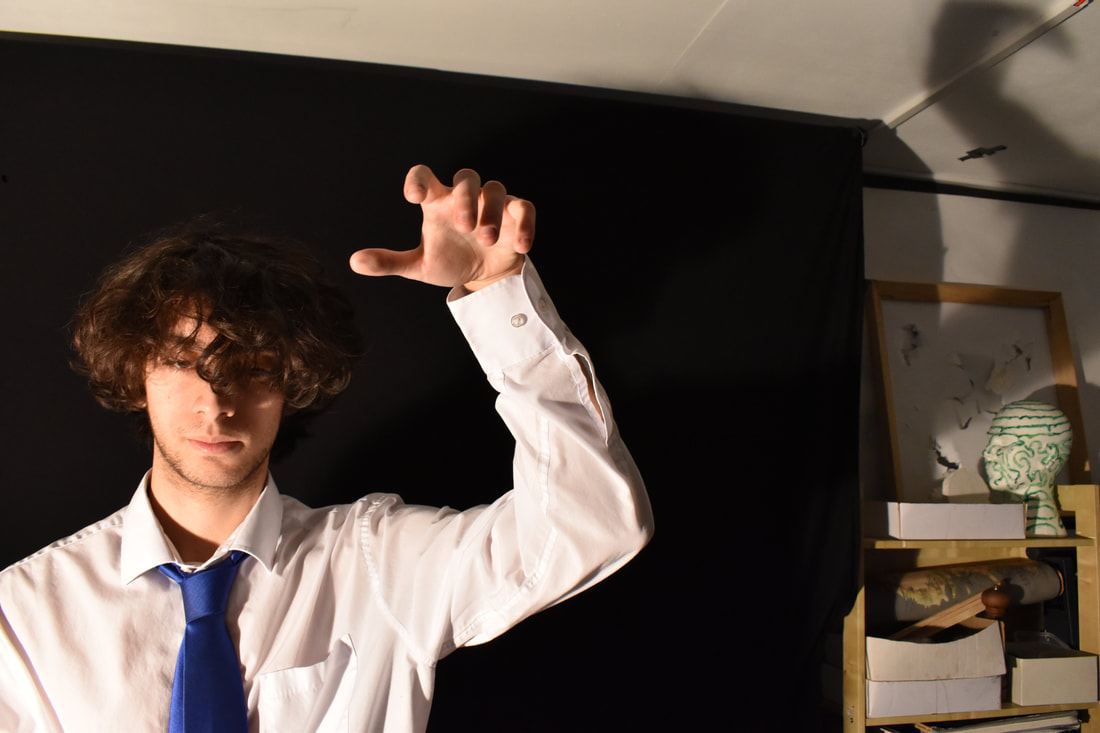
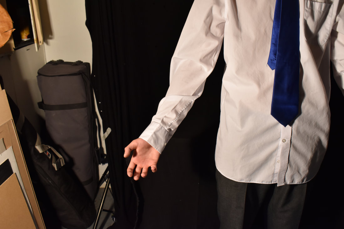
Visconti Shoot:
|
|
|
|
|
|
|
|
|
|
|
|
|
|
Visconti Response Edits:
Edit Analysis:
These edits were made in response to one of Sabato Visconti's artworks called "Jules in June". I believe these edits were successful in sampling the original piece whilst making it my own with a circular frame and varied colour scheme. To show progress and variation, I made an edit of both my Mum and my Dad.
The edits started off with a shoot similar to Jules in June, with both the people looking downwards, on a sunny day, looking up at them. After choosing the best images of my parents, taking them to photoshop. I used the paint bucket to fill in areas of their body. As the bucket fills in all the areas that have the same colouration, the paint would spread wildly around. As i did this i would change the colour in the bucket, to create depth to what is a rather two-dimentional image. I carefully chose the appropriate colours and their placement as to keep important features such as eyes, hair, their noses and mouths. The body could be flat, as long as their faces remained similar in shape so they are recognisable.
The edits started off with a shoot similar to Jules in June, with both the people looking downwards, on a sunny day, looking up at them. After choosing the best images of my parents, taking them to photoshop. I used the paint bucket to fill in areas of their body. As the bucket fills in all the areas that have the same colouration, the paint would spread wildly around. As i did this i would change the colour in the bucket, to create depth to what is a rather two-dimentional image. I carefully chose the appropriate colours and their placement as to keep important features such as eyes, hair, their noses and mouths. The body could be flat, as long as their faces remained similar in shape so they are recognisable.
Moving On:
I decided to take the idea of distorting a persons face and identity and reproduce it in another way. Through searching I found a photographer I felt did this. Lee Friedlander shows a figure in his pictures but never reveals the identity of the person. This is a part that is supposed to remain a mystery, denying any information of the persons identity or facial features, thus expanding on this concept of losing a person in Sabato Visconti's work.
Lee Friedlander Analysis:

|
|
The next artist I have chosen to recreate and sample from is Lee Friedlander. I discovered his artwork when searching through photographs linking to visual chaos, "complete chaos and disorder". The definition makes work under the theme sound like they must be cluttered and filled with colour and randomness. However, Friedlander's work disproves this. I believe that Friedlander and his work was the obvious choice for an artist exploring chaos.
Lee Friedlander is an American photographer and artist born in 1934 in. From a young age, Friedlander was already photographing, even if it was only for pocket money. At the age of 18 he would study photography at the Art Center Collage of Design. Early on in his career he would photograph jazz bands for album covers. Later in his career, some of his most famous photographs appeared in the 1985 Playboy magazine.
Friedlander created an influential visual language of urban "social landscape". Many of Friedlander's pieces include fragments of windows, mirror and street signs.They are all connected by the subtle incorporation of shadows, reflections, small clues that hint at the photographers existence. Friedlander created an influential visual language of urban "social landscape". Many of his pieces include mirrors, signs, and windows, all linked together with the theme of reflections. Similarly other pieces of his use shadows and other little hints to the photographers existence. This idea shows evidence of how the pictures were made, by showing the photographer. The focus of the photograph isn't the surroundings or scenery but rather the photographer and his hidden presence. The pieces, simply put, are stylized, over-complicated self portraits.

|

|

|

|
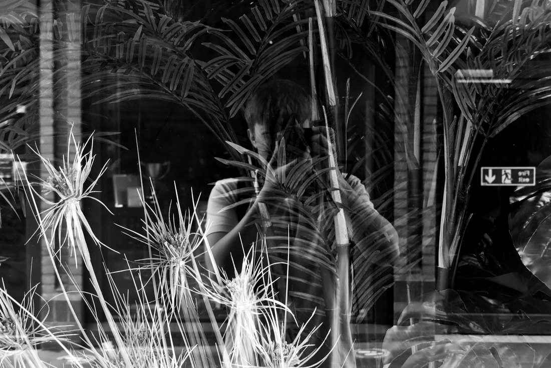
For this Artist analysis I'll be analysing the top left image above as I find it to be the most fascinating image out of all shown. This image is intricate and full of movement. The images background is depicted through a window. There is a dining room furnished with a round table with plates, fruit and a single chair beside it. The mirror also reflects what is in front of it, meaning the photographer is visible, along with his surroundings. The detail alone, is a reason for why this picture falls into the theme of visual chaos, within the category of abstraction. The location looks to be a small shop, located on a high street. "In front" of the window there's a person who can be seen walking past, along with cars parked on the road. The person is walking past the window, unbothered by the shoot going on, suggesting that this image was spontaneous and intrusive. In other words, this image was taken without the persons knowledge.
The images main focus is the photographer seen in the reflection. This is a consistent part of Friedlander's photography, revealing himself in his own artwork. There is so much detail and so much motion within this image. The person behind Friedlander is walking, but the cars seem to be parked. The way the image is presented in a way that makes it difficult to focus on one specific part. There are 3 layers to the image, the view through the window, the photographer, and the scene behind him. This creates confusion and makes it hard to infer information on the image, such as if there really is movement.
The piece has a conflicting tone of voice as it merges 3 layers of "image" together. The image is in black and white, making the image seem more mysterious. The photographer is seen, yet his face is covered by his camera, keeping him anonymous. As he is only shown in a reflection of a window, he looks transparent, only adding to the moody tone of the image, appearing ghost-like.
Contact Sheet:
|
|
|
|
|
|
|
|
|
|
|
|
|
|
|
|
|
|
|
|
|
|
|
|
|
|
|
|
|
|
|

|

|
|
|
Shoot Analysis:
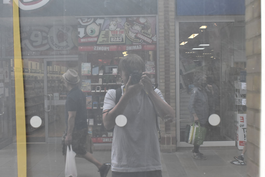
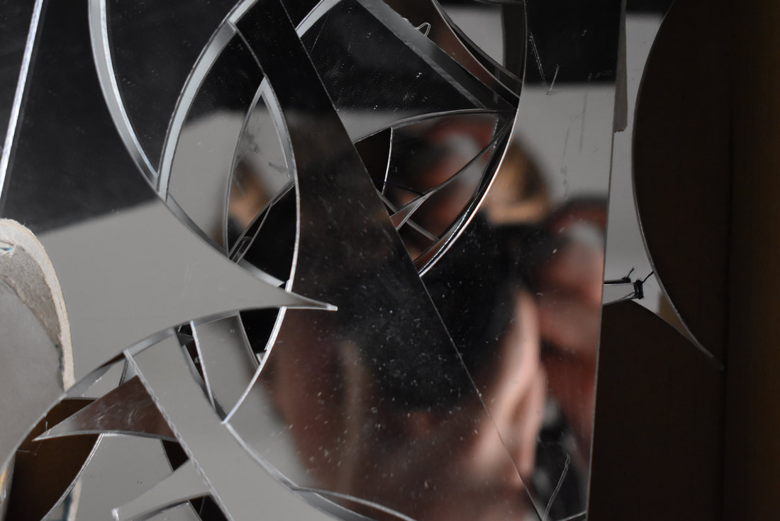
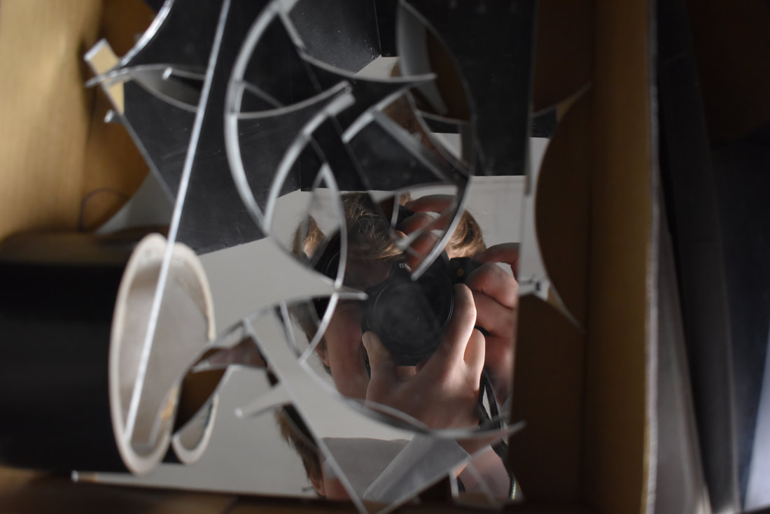
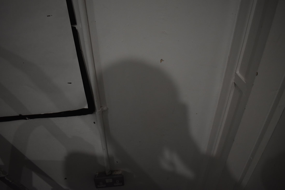
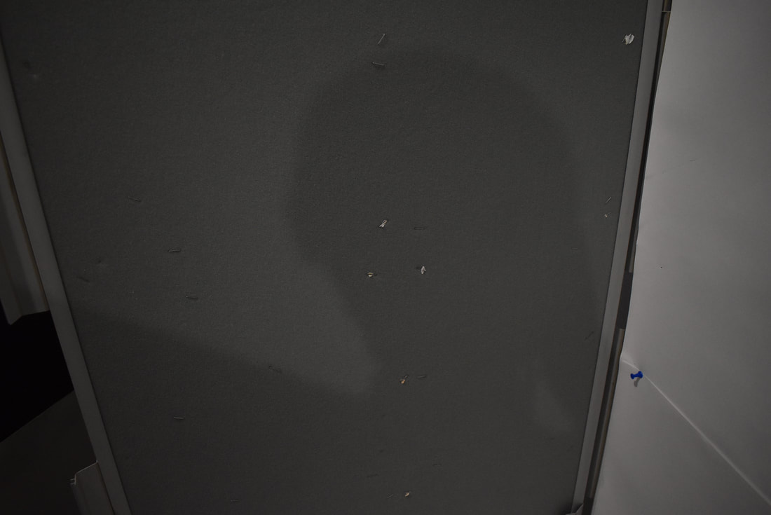
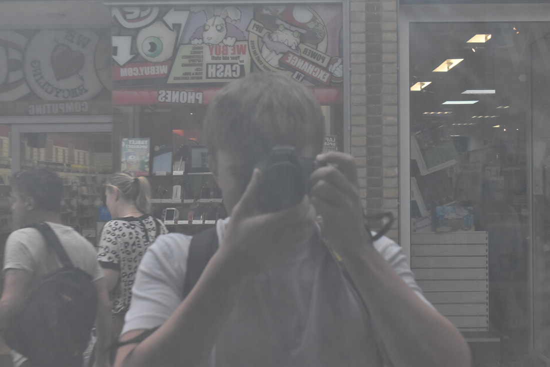
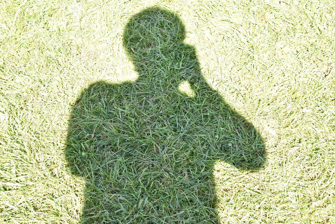
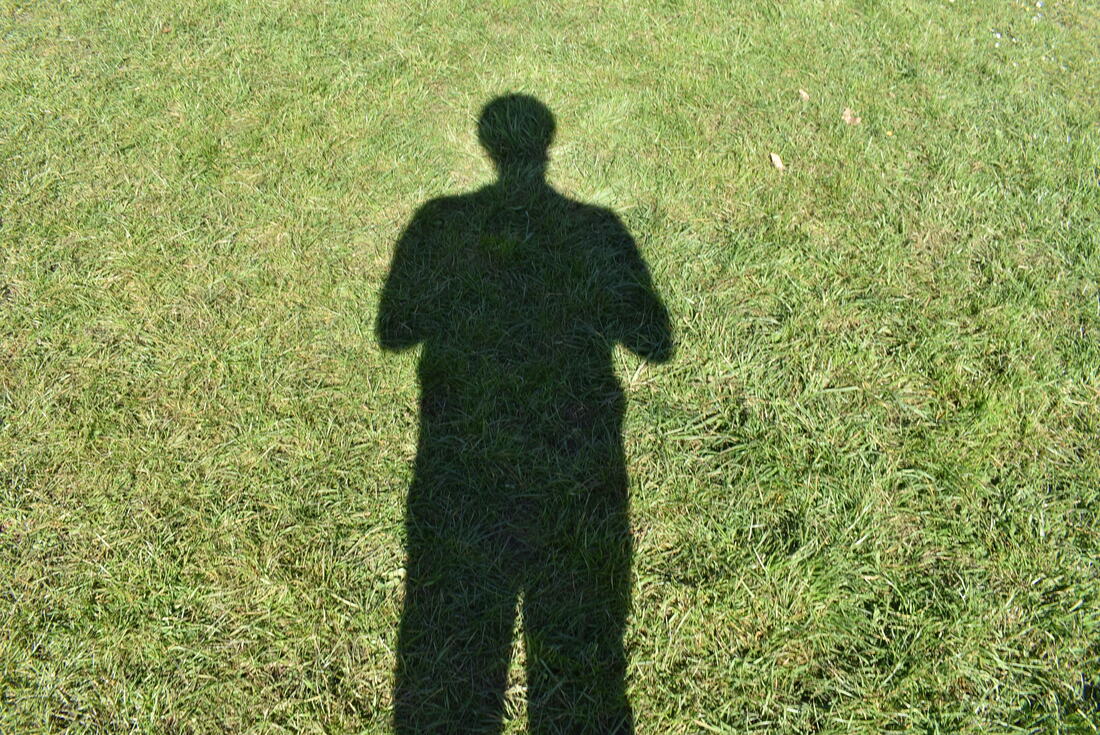
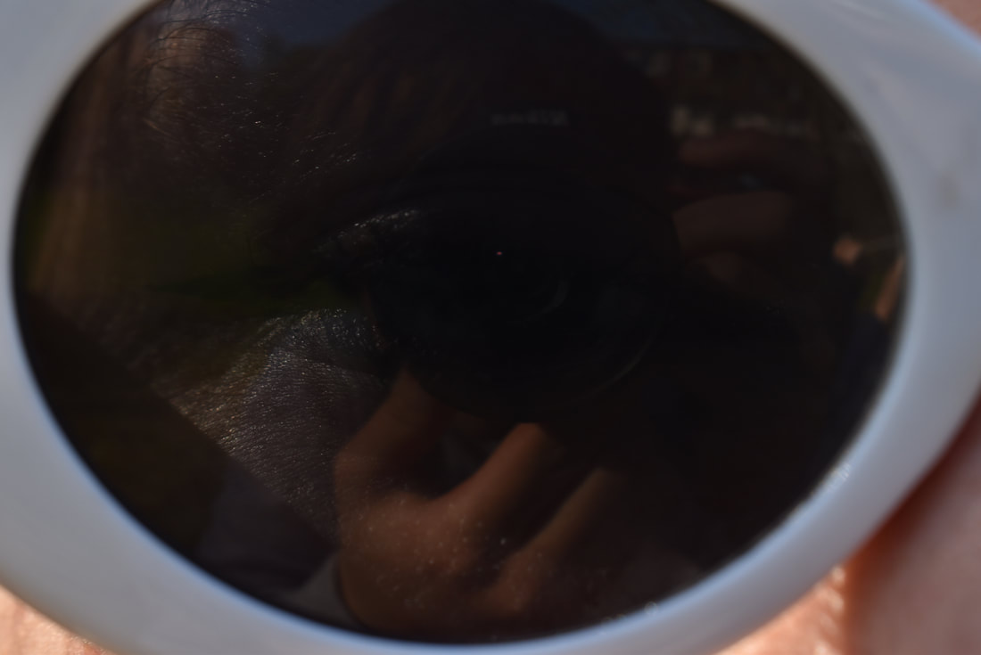
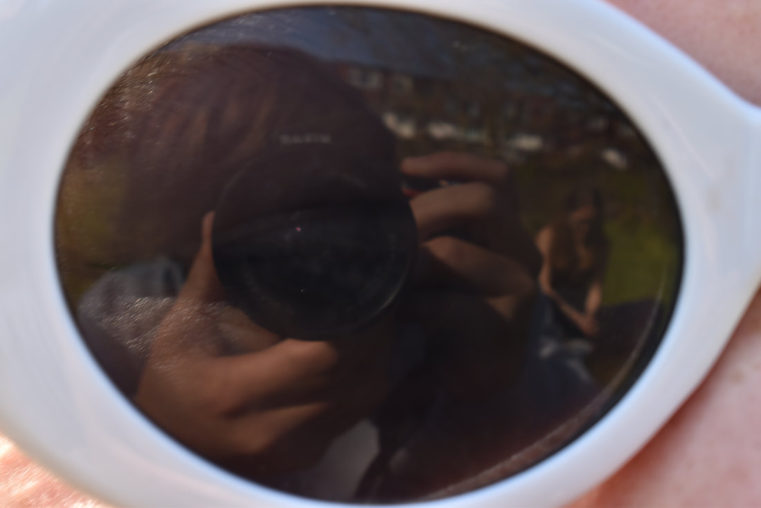
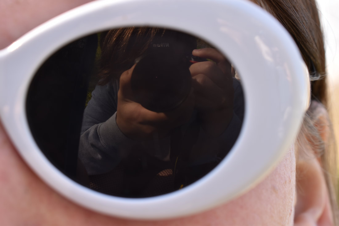
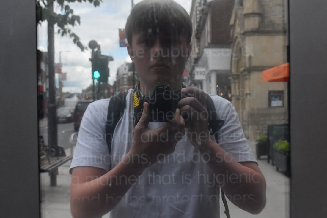
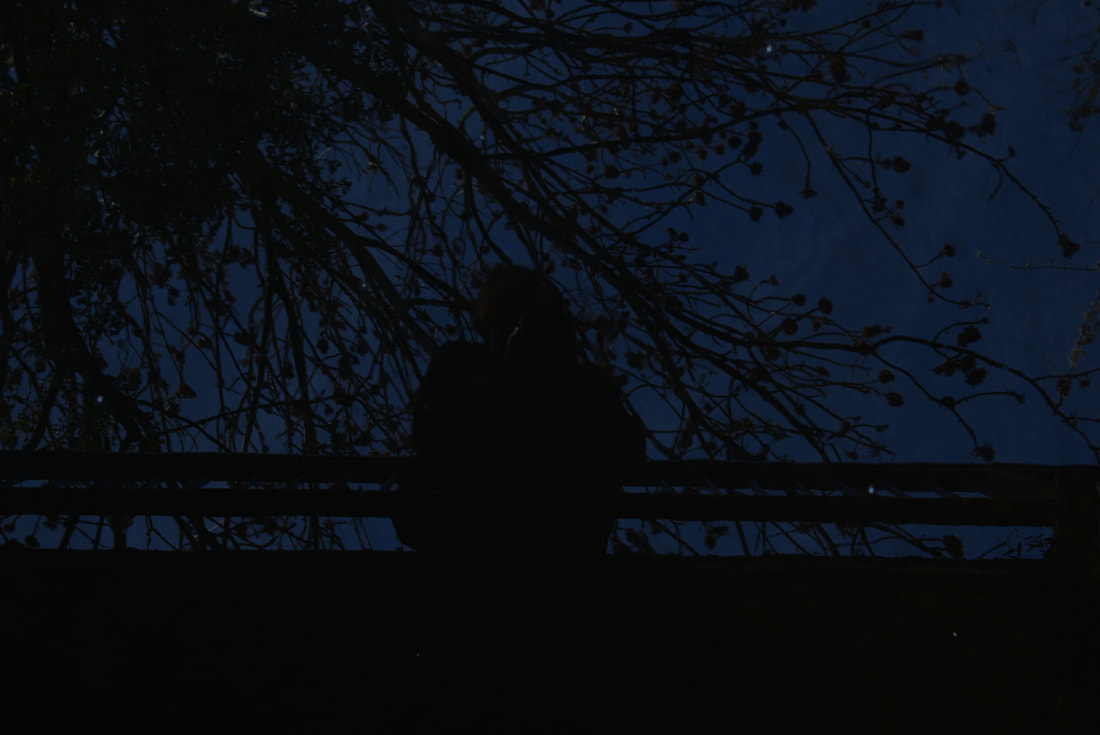
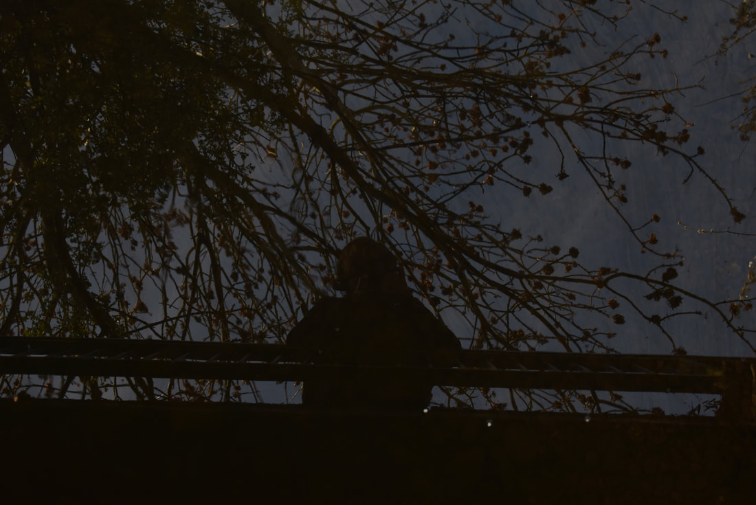
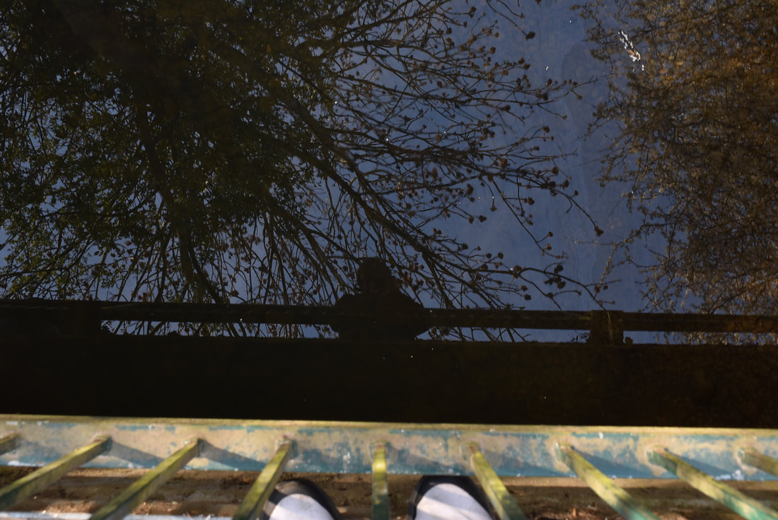
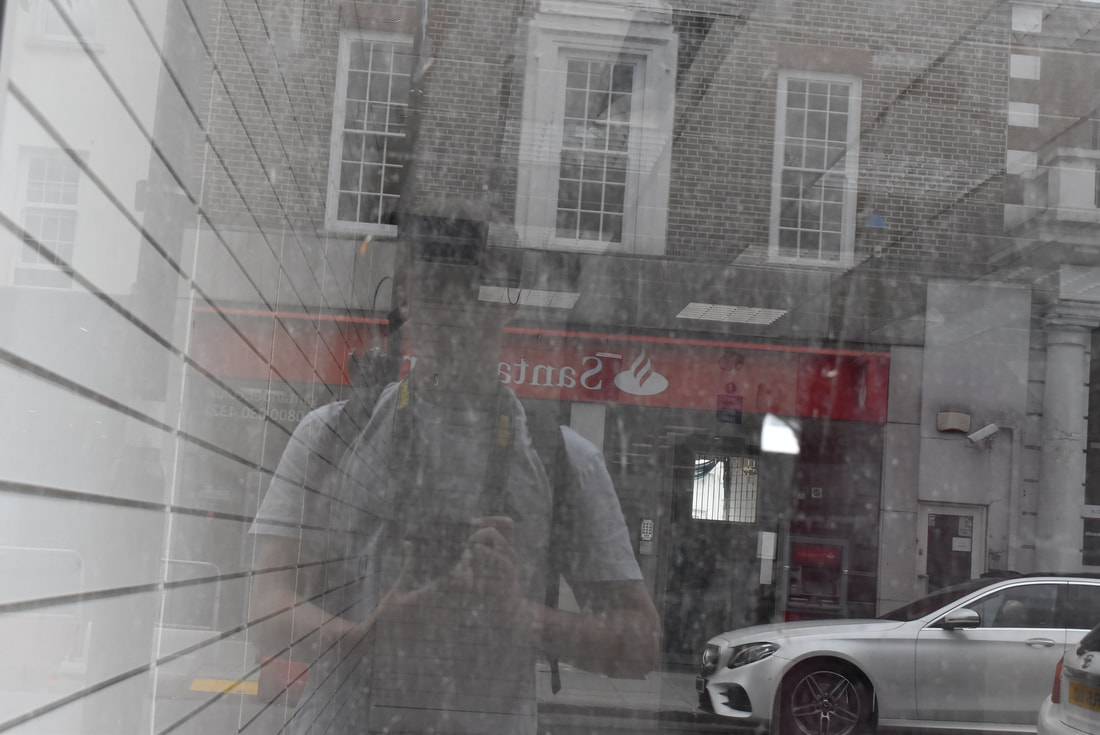
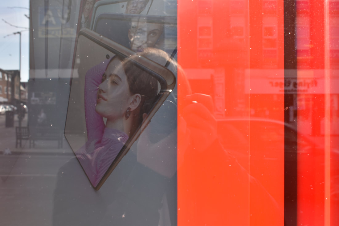
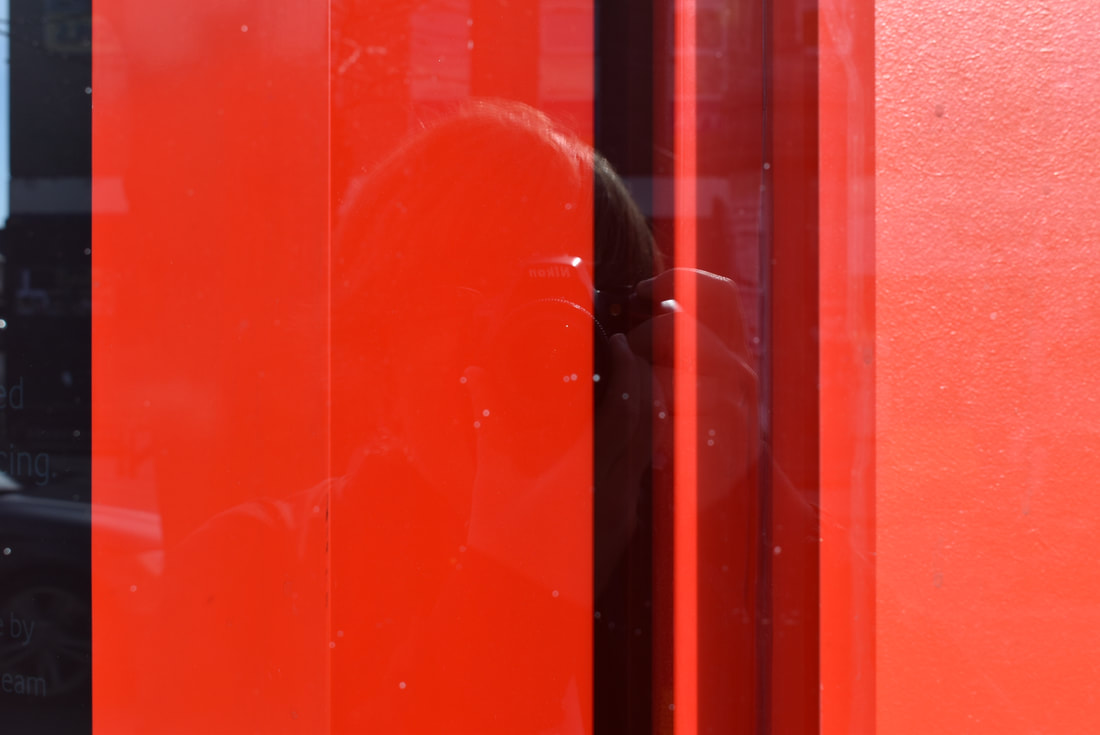
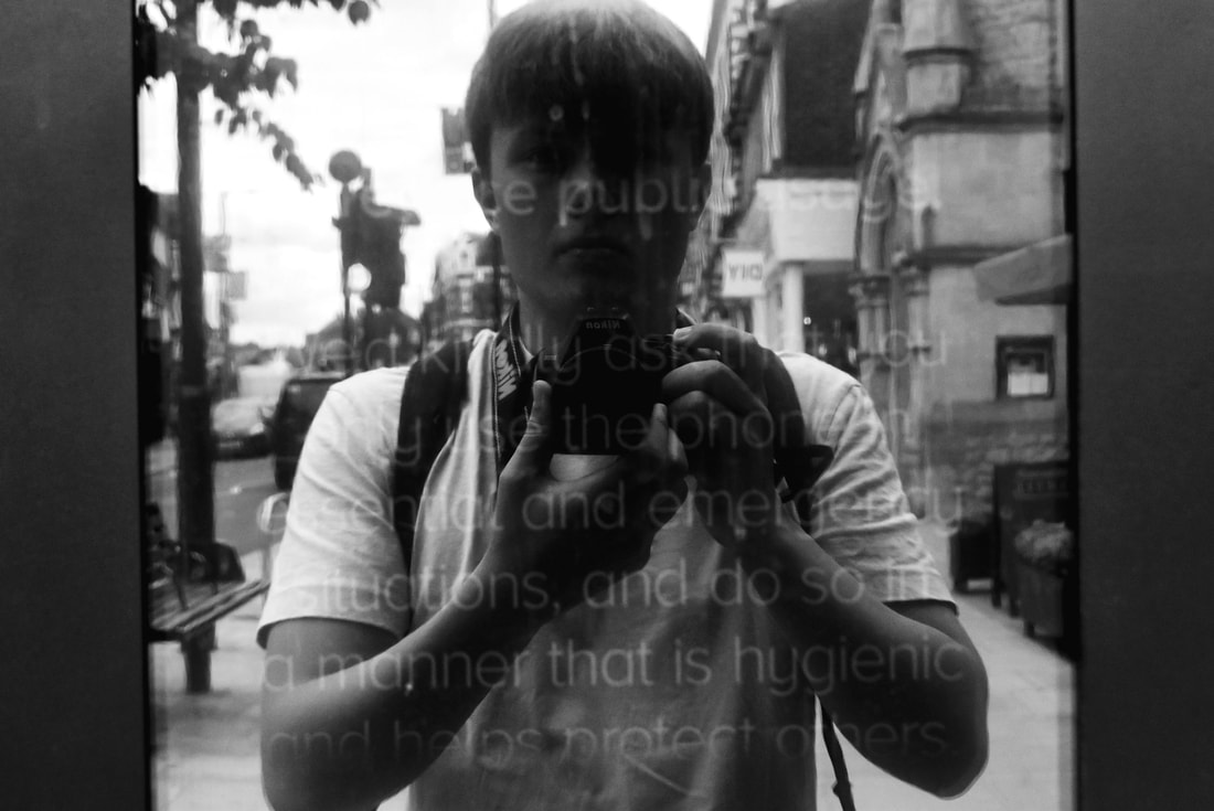
In this photoshoot I set out to find reflections in any shop windows I could. I wanted to replicate the atmosphere and style of Lee Friedlander. I decided that Id find other areas that showed or hinted to the existence of the photographer (in this case me).
I chose to shoot my shadows in fields, reflections in glass and in mirrors. The mirrors I chose were fragmented and broken, never revealing any piece of my identity. I believe these to be the best ways to go and sample aspects from Friedlander's work. I removed all sense of identity whilst indicating that the focus is the photographer, thus making a mystery figure at the centre of every picture. Although I was able to find many windows and places to show my reflections, one struggle I had was that it was hard to see myself in glass. At times I was barley visible and unidentifiable. I found that shooting glass with black walls or shutters/ turned off screens worked best as it reduces you from seeing right through the reflection, which was the main focus of the shoot. This would be a problem I sought out to fix in my edits.
I chose to shoot my shadows in fields, reflections in glass and in mirrors. The mirrors I chose were fragmented and broken, never revealing any piece of my identity. I believe these to be the best ways to go and sample aspects from Friedlander's work. I removed all sense of identity whilst indicating that the focus is the photographer, thus making a mystery figure at the centre of every picture. Although I was able to find many windows and places to show my reflections, one struggle I had was that it was hard to see myself in glass. At times I was barley visible and unidentifiable. I found that shooting glass with black walls or shutters/ turned off screens worked best as it reduces you from seeing right through the reflection, which was the main focus of the shoot. This would be a problem I sought out to fix in my edits.
Edits:
|
|
|
|

Edit Analysis:
The edits above were made in response to Lee Friedlander's work, displaying seemingly random scenes, with fragments of the photographer hidden within. I had an issue with being able to see my own reflection in the raw shoot, so I made sure that I would remove this problem in my edits. I began by turning the pictures black and white to mimic Friedlander's work, giving an aged tone to the piece. I would turn up the contrast, increasing darks and increasing highlights, fully revealing the reflection, creating a sort of outline around every object in the pictures. I also believe that this made the images seem more dramatic, with a sort of serious tone. However I decided to choose images where my face was covered only by a camera to be playful and tease the identity of the photographer, who for all intents and purposes is the main focus of every picture.
Izima kaoru Analysis:

|

|
An artist I have chosen to analyze is Izima Kaouru. He is the first of 5 artists I have carefully selected for my new theme of Chaos around us. I chose him as I was searching through concepts within chaos, the key one here being death. His work intrigued me with its eeriness and wonder with its dark concept. Izima is a Japanese photographer, born in 1954 in Kyoto, Japan. His creative work began in the 70s and his first exhibition "Its a Beautiful Day" commenced in 1977. He is best known for his photographs working with the subject of death. His most widely recognized body of work is landscapes with a corpses, comprising of famous female actresses and models. Izima invites the models to imagine their own deaths, lying with arms and legs scattered around carelessly. His work is dark and morbid, touching on real subjects such as murder, accidents and the fragility of human life. The pictures' acting as "memento moris' ", to fictional deaths that never took place. For this analysis Ill be looking at these artworks above.
The image on the left depicts a woman in an orange maid outfit lying on the floor of what seems to be a café. There are rows of tables with plates, cutlery and glasses, with food and drink left. The way the model is lying, with a tray of food scattered on the floor suggests that this person is meant to be seen as/ is dead. The death is portrayed as accidental, forming an unspoken narrative throughout the image. She slipped and fell due to having roller skates on, falling backwards dropping a tray behind her. The death is accidental and shows how sudden death can be. Izimas' concept behind this image and others like it is a question : "Why cannot a corpse be beautiful?". This question prompts the viewers' to understand and see death from a new perspective. When a person dies, there is a calming stillness left behind. Death is a blessing as it end ones suffering and free's them from it. For just a moment, their beauty can be captured. In a way, a corpse is like sand art. Its wonder and beauty is temporary and will be eventually "washed away" It is in this was his art is similar to a Memento Mori, capturing ones' beauty one last time so they may be remembered like that forever.
This image is not abstract as it is to be grounded in reality, making the piece more shocking. The piece is made in such a way that should make the viewer uncomfortable. The model is beautiful, but in a way that a porcelain doll may be beautiful, both as fragile and lifeless as each other. This image made me feel in a similar way. I viewed the imagine thinking of realism. It made me feel sick, yet compelled to view more images like it. Deep down I knew that the model wasn't really dead, but it was the initial moments of analyzing the image that made me wonder if she really was, that makes this piece so engrossing to me. The works direct tone, displaying the corpse, made me feel a calmness, understanding death as merciful, rather than cruel. The image is not a standalone piece and has many other artworks by Izima showing these beautiful corpses. No matter what scenario or location, the model always looks at peace, lying still, looking as if they were almost asleep.
This piece is displayed in the 4:3 aspect ratio making it seem small, almost as if connoting that this death does not and would not stand out, as death is an extremely common occurrence in our world. The image does not conform to the rule of thirds, being shot in a way where every object is prominent, but are all there to compliment that body. This is used in a way to lead your eyes around the piece. The surrounding is just as important in this image as the model. It helps wrap the "story" together and make it whole. This view is backed by the fact that the model is in the mid-ground, being in the center, but being just one aspect of the piece, many small details being placed in the background and foreground. The image has no parallel lines, as the way the image is taken makes the floor and model get smaller the further back she is, making it seem as if this is supposed to be a persons view on this "incident".
As a whole, I really enjoy viewing this piece as unlike other artworks I've seen before, this one changes my view on aspects of the world, temporarily or perhaps even permanently changing my view on life, death and its fragility. This piece has inspired me to take aspects from it and create and construct an artwork of my very own.

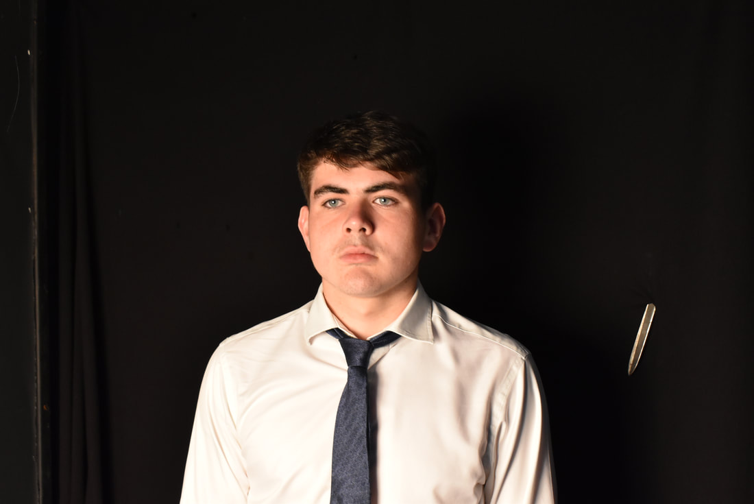
Exam Edits:
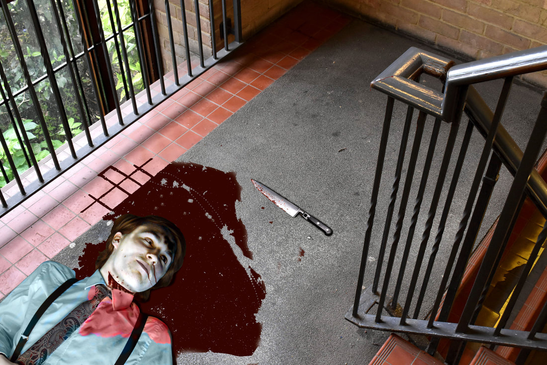
Edit 1
- Turn up the brightness and turned down contrast so the corpses lighting better fit new background
- Cut model out of original image and moved them to current backdrop
- Selected skin and played around with brightness to make skin more pale
- Used eyedropper tool to find colour of lips and turned the colour lighter, furthermore changing colour of lips with colour replacement tool
- Cropped and placed a knife onto the new backdrop
- Used the colour replacement tool and brush to create blood around the model, as well as on their shirt
- Placed blood onto the knife seen next to their head to further cement the narrative, which in this case, is a murder
- Changed the colour of the shirt so their pale skin was more distinguishable
- Used dodge tool as well as the burn tool to make skin abnormally pale, create highlights on edges of the face, as well as create tone/shadows -on the face
- Used dodge tool to create highlights in hair
- Used brush tool, using various shades of red to create a horizontal slit on their throat
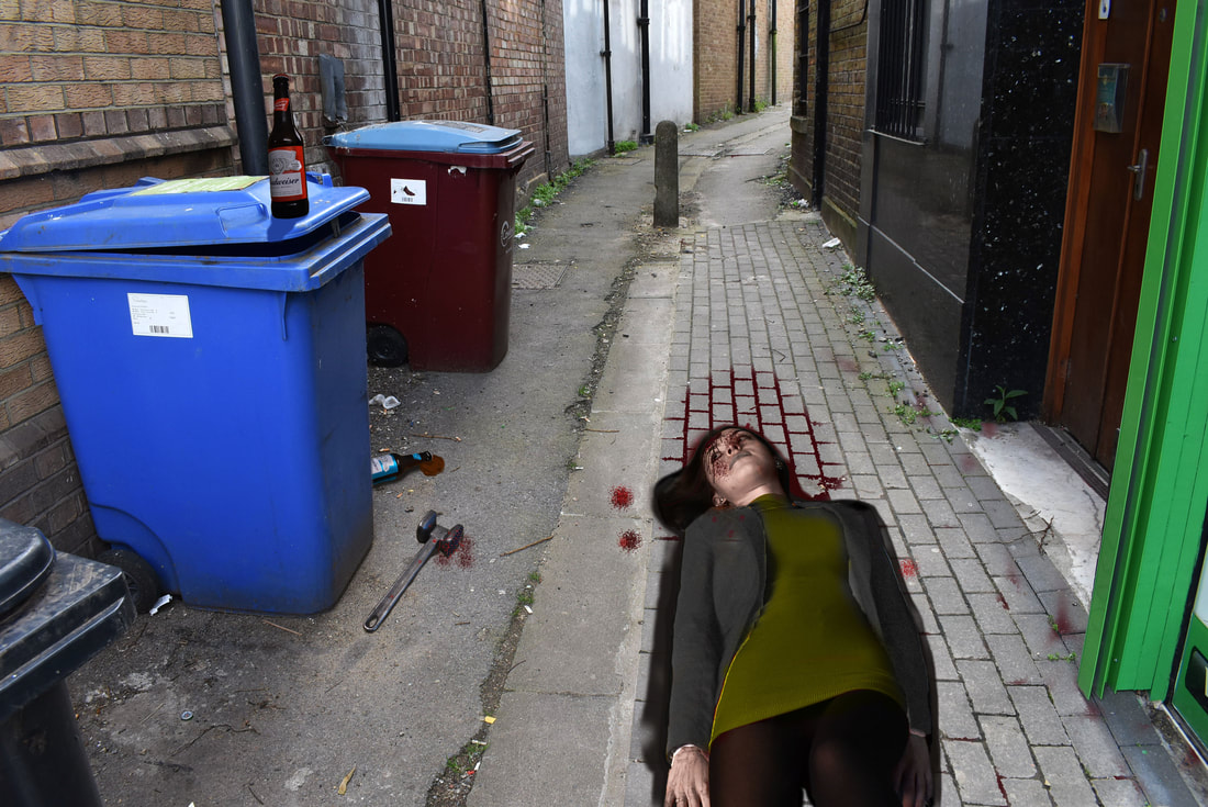
- Used eyedropper tool to recreate the skin colouring, then turning it down, making it paler, to better suit the colour of a corpses skin
- Used the colour changer tool to use this newly found colour and recreate it, making it clearer that the person is dead
- Cropped and cut out a metal tenderiser, dragging it to the new image and placed it left of the corpse
- Used paint tool, along with colour change tool to create shadows around every cropped in image : beers, tenderiser and corpse
- Selected blazer and turned the brightness up and contrast down as to allow the blazers colour to be changed with the colour changer tool
- Used colour changer tool on the top, turning it green as opposed to the original red colour
- Used brush tool to "paint" blood around the corpse
- Switched to splatter setting to create "blood splatter"
-Used eyedropper tool to locate skin colouring and turn it more pale
-Used dodge tool to create abnormally pale skin
-Used burn tool to create shadows/ "bags" under the models eyes
-Used colour replacement tool on lips to make more purple lips
-Cut out model and placed them in new layer above background
-Created a secondary background layer of the water and placed it above the corpse layer
-Turned the opacity down as to create a look of the corpse being beneath the water
Idris Khan Analysis:

An artist I have chosen is Idris Khan, a British Photographer whose work takes inspiration and samples from art, history, music and religion, layering them together on each other. The theme and concept of these artworks is surrounding time. Every single image is put together into a single moment in time, all held within the artworks themselves. I found that Idris linked to my theme of Chaos as his artworks all displayed a sense of motion through the layering of buildings as they look as if they are shaking, linking to the artistic definition of chaos: Constant movement and complete disorder.
Idris was born in Birmingham 1997, to a Muslim Pakistani father, and a mother who converted after meeting his father. He graduated in photography from the University of Derby in 2001 .He was a non-practicing Muslim, which led to his dad convincing him to take pictures of pages from the Qur'an to properly understand and engage in it. This incident is what led to Idris' interest in postcards, religion, magazines and different material which he all used for his artworks later in life, creating pieces compared to compressed memories, many moments pressed into one singular image. His artworks display many locations and building such as Tower Bridge, The Houses of Parliament and other landmarks throughout Central London. Idris has described his work as "It is a challenge to not define my work as a photograph but using the medium of photography to create something that exists on the surface of the paper and not to be transported back to an isolated movement in time"
Idris was born in Birmingham 1997, to a Muslim Pakistani father, and a mother who converted after meeting his father. He graduated in photography from the University of Derby in 2001 .He was a non-practicing Muslim, which led to his dad convincing him to take pictures of pages from the Qur'an to properly understand and engage in it. This incident is what led to Idris' interest in postcards, religion, magazines and different material which he all used for his artworks later in life, creating pieces compared to compressed memories, many moments pressed into one singular image. His artworks display many locations and building such as Tower Bridge, The Houses of Parliament and other landmarks throughout Central London. Idris has described his work as "It is a challenge to not define my work as a photograph but using the medium of photography to create something that exists on the surface of the paper and not to be transported back to an isolated movement in time"
The image I have chosen to analyze is the one above displaying the Houses of Parliament. I found it to be the most intricate and intriguing out of all the pieces i could find. The positioning of every layered image isn't so simple as being shot directly in front of the building but, from many different angles from all around creating a confusing artwork. The positioning and varied use of opacity within the image challenges the eyes to search for the center of it. Yet there is no main focus, no unique parts of the image, as it is all one structure, made from a single building.
The piece displays the well known Houses of Parliament along with the Westminster Bridge all spliced and formed together. There's no ground, no river shown to help grasp the concept of this location and its standing in the world, the image simply floats there, merged with different angles leading to a sickening effect. The image almost makes it seem as if the viewers vision is off, seeing many examples of the same building. This effect is amplified by the use of bold black outlines and contrasted black and white coloring, mixing with the lines to create patterns and shapes. These repeating sections create a sense of movement, as the viewer looks throughout the image. The piece is chaotic, with "moving parts" all around shapes and lines covering the whole piece. It feels energetic and "fast" strangely enough, creating a sort of excitement. This is all conveyed through the portrayal of the piece "spinning around"
The artwork is part of a larger body of work, all of landmarks and buildings. They all have this chaotic sense of movement throughout the piece. I believe this concept is best portrayed in this very artwork. The removal of all colour makes the image seem lifeless yet is contrasted with the movement within it in a sort of ironic way. The layering and use of opacity creates darker sections which have been covered multiple times. The image messes with viewers mind as it is hard to perceive what the image displays. Without a main focus, the image seems devoid of purpose and meaning, making it look simple, even though it clearly is not. This concept of opposites is quite evident throughout the image and i believe that is just one of the many factors that contribute to making it a successful piece. It needs no deeper meaning. All it needs to be successful is its concept of time and placement.
|
|
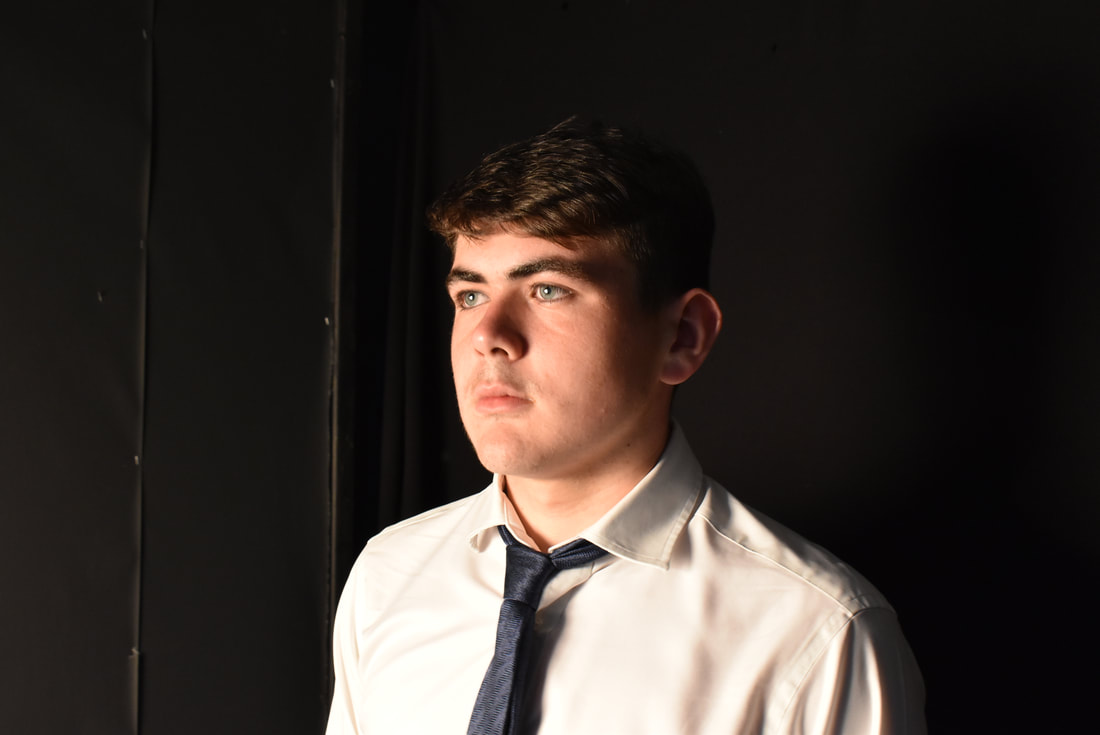
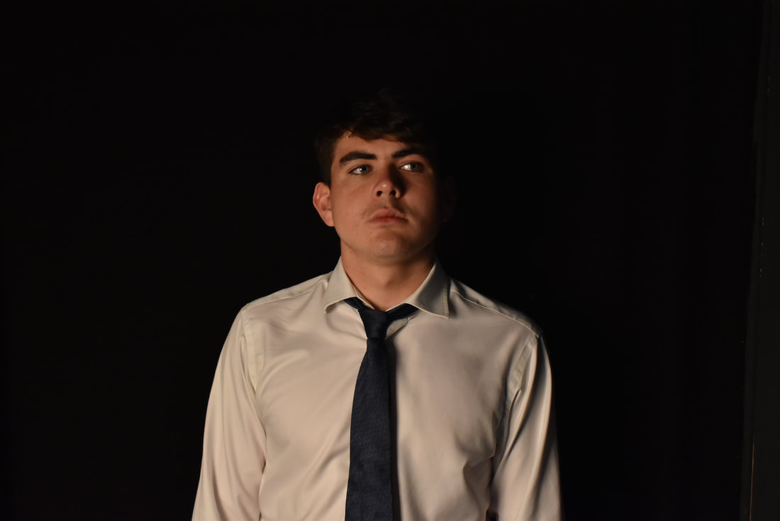
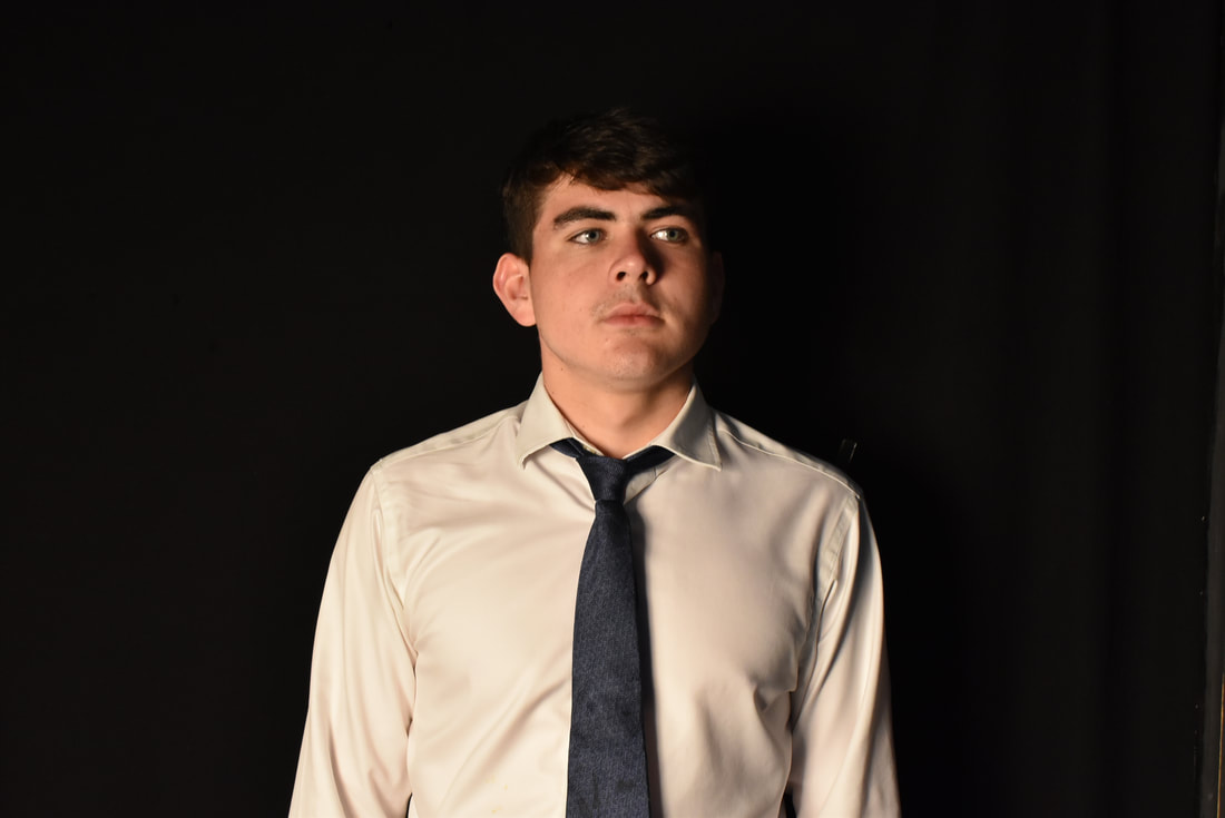
Idris khan photo shoot:
|
|
|
|
|
|
|
|
|
|
|
|

|

|
|
|
|
|
|
Shoot Analysis:
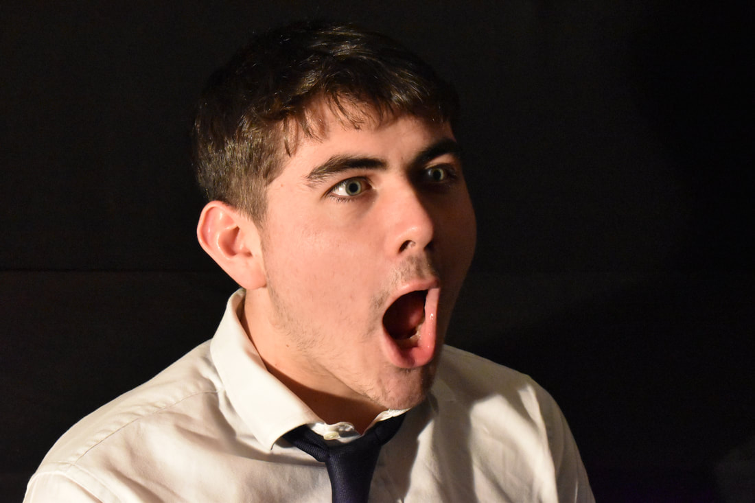
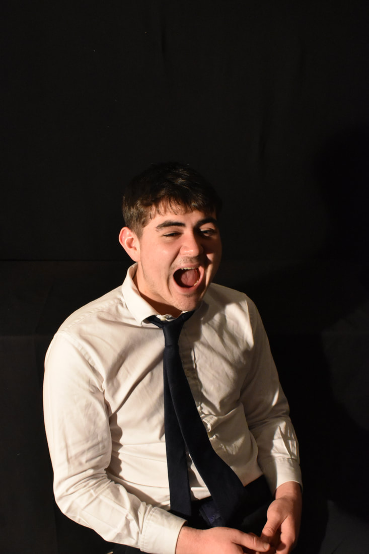
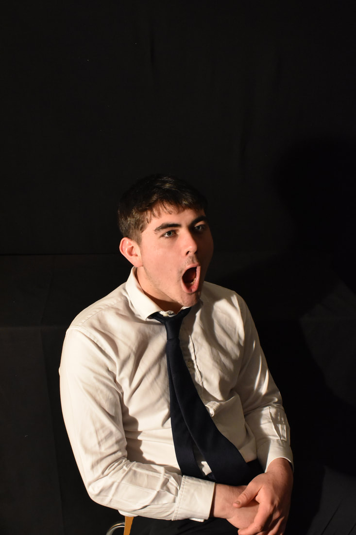
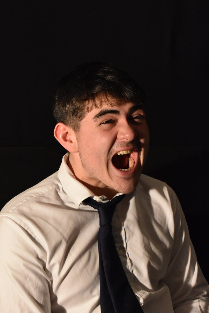
In this shoot I set put to accomplish the task of creating dramatic shots inspired by Idris Khan. Khan works with buildings and structures but I decided to flip this premise on its head. I found that peoples were much more interesting to capture, they're bodies and features all their own forms of architecture. I also wanted to stand out from Idris Khans work, making something unique whilst still having obvious ties to the photographer. For this shoot there were 2 different locations. One was indoors in the studio, where I could play around with the lighting and shadows. The other was shot outside, where I had natural lighting. For each shot I chose a different angle to shoot from, all whilst the subject stood still, unmoving, whilst I panned around them taking shots from any side I could. In each and every shot I asked the model to have a blank stare, a sort of poker face to become a blank slate. Without making any facial expressions its possible to make mood and tone of the picture up to the viewer. I did this as it links to Khans work. Buildings are void of any emotion or characteristics, but a person seeing them, can decide whether the building has any of these traits. It varies across from person to person and that's a key concept of why I have these models in these positions with no facial expressions. The viewer will decided the meaning behind the art.
Idris Khan Edits:
|
|
Edits Analysis:
These pictures are Idris Khan inspired edits. I took the route of editing people, rather than buildings, as I found that over the abstraction unit, people were the main focus, being the main drive behind every photographer Id chosen to study. The focal point of the edits are the people collaged and layered on top of each other. They appear ghost-like as Id edited them to be translucent, allowing the viewer to see multiple of the same people layered. As to the photo shoot, I had taken every picture I had and cropped them and cut them out, splicing them together into a single image. I made the images black and white as to take ever more emotion or hints as to what the images purpose and story is. Colour can tell a great deal on the emotion and mood of an image, something that I chose to take away. What the viewer sees will be a blank slate, for them to interpret their own connected emotions to the piece. There is no mood within these edits however the closest thing to that would be the fact that these edits are mysterious and anonymous, allowing the viewer to make what they will of the images. These edits have no chosen location, as all backdrops have been removed to further create a tension between the meaning of the work and a viewer. Instead I have chosen to create a black backdrop, as it has very few indications to the artworks premise. The outcome of the edits are these Bond-like film posters, dramatic and dark, with the exception that there is no given narrative.
Moving On:
Once I had completed my work on Khan I decided to continue my previous pattern at looking at the concept of death. I wanted to explore this concept but in a more abstract way. Its one thing to analyse a picture of 'dead' people, but its quite different when its plants and flowers. I realised that my edits based on Idris Khans work looked like a sort of limbo, an endless afterlife, making me think about what the photograph is capable of. I started to understand the ability a picture can have on life and death, and everything between. In transitioning to Jiang Zhi I discovered a theme that I was quite fond of. The power of the camera.
Jiang Zhi Analysis:

|

|
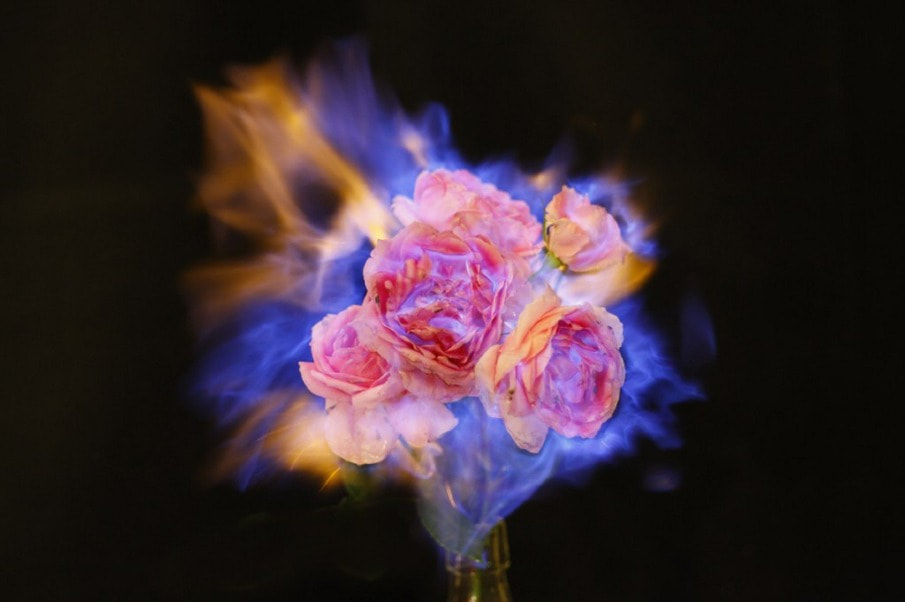
An artist I have chosen to analyses and take inspiration from is Jiang Zhi, a Chinese artist, sculptor and photographer. He was born in Yuanqiang, Hunan Province in 1971. He graduated from The China Academy of Fine Arts in Hangzhou. He is generally considered to be one of China's most diverse artists of his age, making various edited photos and paintings. He has made many artworks, all ranging in skill and imagination, yet it is his 'Love Letters' pieces that really caught my attention. These artworks display various plants and flowers, all exotic and beautiful, being burned, completely engulfed in flames
The piece I will be examining and deconstructing is the one above on the left. This artwork didn't stand out from the others as they are all thematically the same; flower on fire, in front of a grey wallpaper. Yet I felt that the composition of this piece, the very placement was more pleasing to the eyes. The flower in this image is not centered like in the other pieces, somehow making its stand out, break from conformity. It sits on the very edge of a wooden table, rather than its center. Another reason that I found this piece so appealing is for its colors. Every colour is similar to the other, all the same shade of grey. The lighting makes the table look a shade of grey, the plant pots gray. Even the flames, although orange on the tips, are too a blueish-grey. Its a part of the piece that really brings it together. This grayness can connote various things, sadness, depression, death and much more. However the use of grey throughout this piece and all the others could be to highlight the small amounts of yellows pinks and blues in each flower and flicker of fire, making them bolder and the very center of the pieces.
The piece I will be examining and deconstructing is the one above on the left. This artwork didn't stand out from the others as they are all thematically the same; flower on fire, in front of a grey wallpaper. Yet I felt that the composition of this piece, the very placement was more pleasing to the eyes. The flower in this image is not centered like in the other pieces, somehow making its stand out, break from conformity. It sits on the very edge of a wooden table, rather than its center. Another reason that I found this piece so appealing is for its colors. Every colour is similar to the other, all the same shade of grey. The lighting makes the table look a shade of grey, the plant pots gray. Even the flames, although orange on the tips, are too a blueish-grey. Its a part of the piece that really brings it together. This grayness can connote various things, sadness, depression, death and much more. However the use of grey throughout this piece and all the others could be to highlight the small amounts of yellows pinks and blues in each flower and flicker of fire, making them bolder and the very center of the pieces.
|

|
As noted before, this piece is part of a larger body of work, all with the same flower on fire. They all carry a chaotic mood to them. They all have some relation to the concept and theme of chaos. I believe that the piece has much deeper meaning and message its means to carry across. I believe that photography is a superior art form as it can truly immortalise people, and objects/buildings. The image is seen to present a flower on fire. We know that all things burnt, no matter what, would turn to ash and dust, completely fall apart. Yet as we the viewer look at the image before us, the flower does not change. It does not crumble and turn to dust. The beauty of photography, capturing the flower in its final moments. Its life and death being both captured, the photographed flower being in eternal limbo of 'undeath'. Yet still we know the real flower is gone, taken away by the fire and it still stands here captured, forever.
This image is depicted in a way that makes me believe it is an alternative 'still life' piece. The whole image, is moody and dark, thanks to its large use of grey, even though it is beautiful and memorizing. This is a theme that carries on throughout all artworks I have analysed, where the piece appears dark and morbid emotionally, yet has a interesting visual appeal.
Overall I really enjoy this piece, along with all the other ones in the Love Letters works. The visuals, connotations, deeper meanings and whole aesthetic of the pieces are successful in being intriguing and execute all desired roles well.
Photo Shoot:
|
|
|
|
|
|
|
|
|
Shoot Analysis:
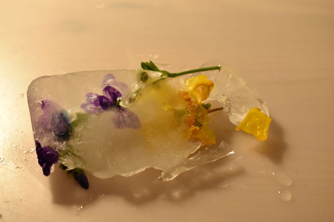
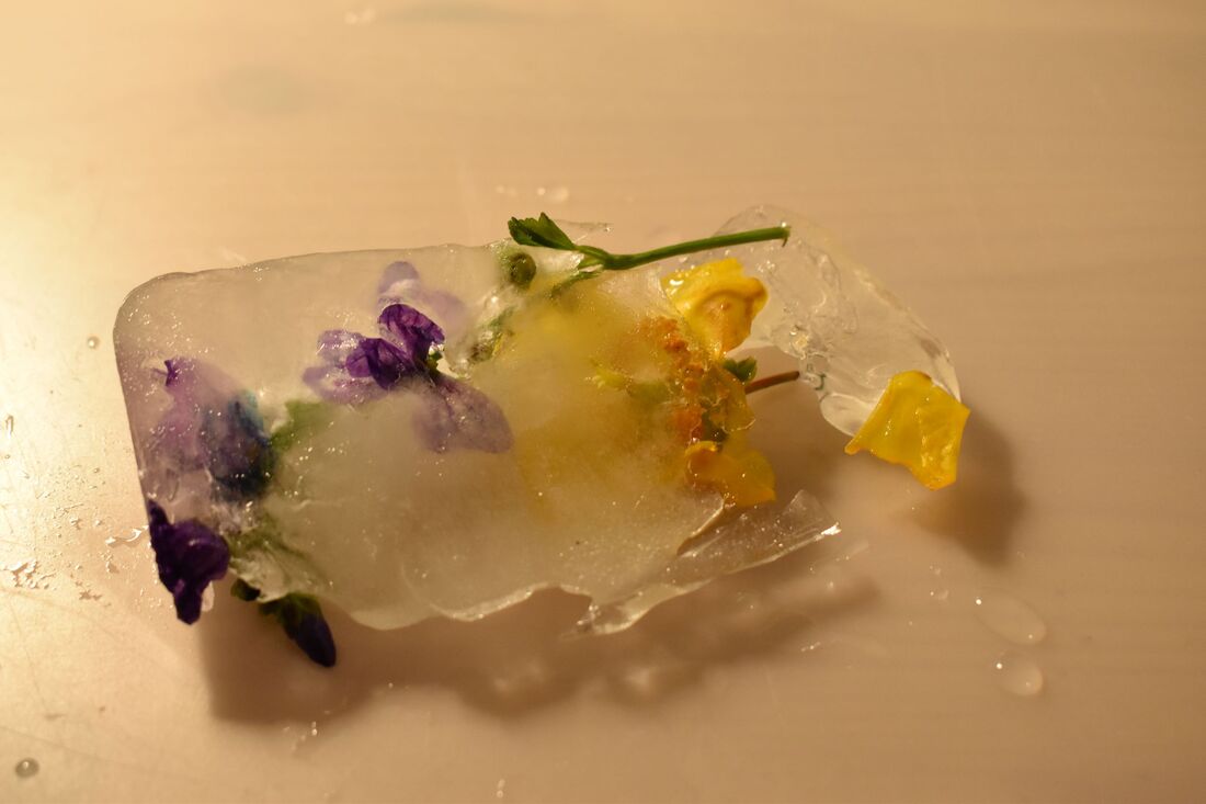
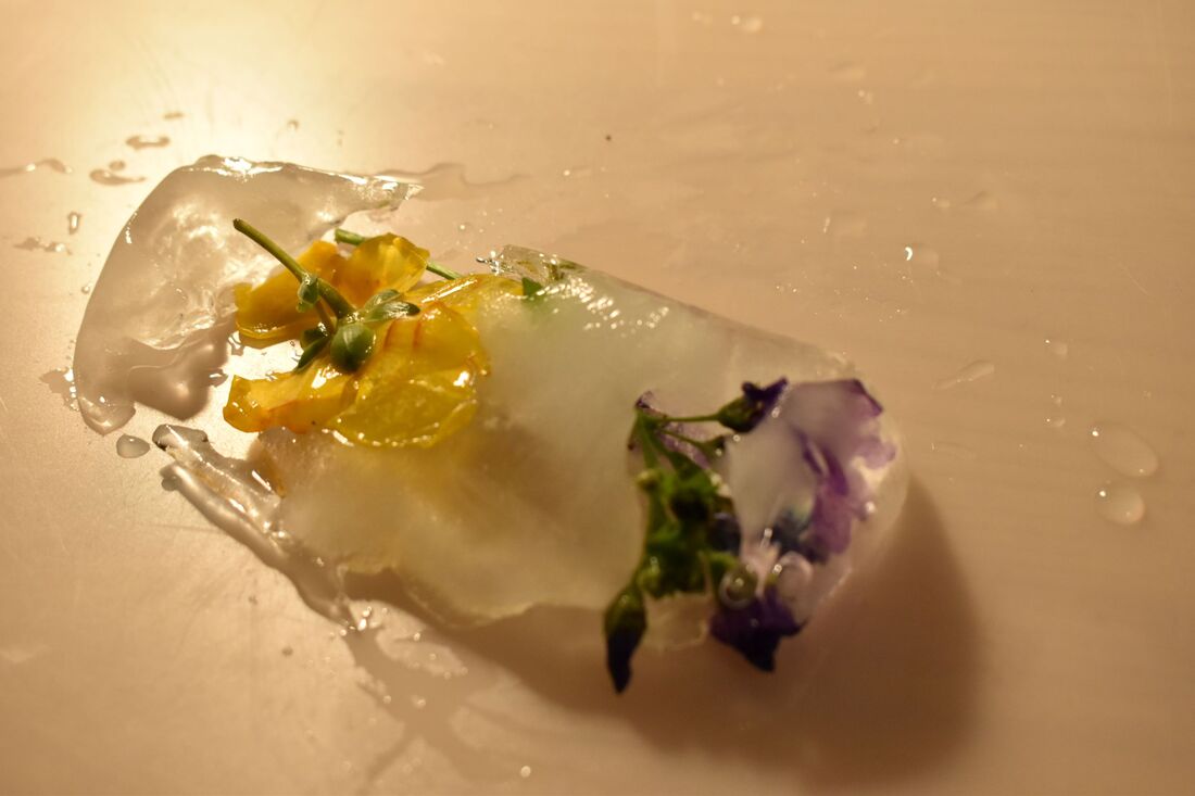
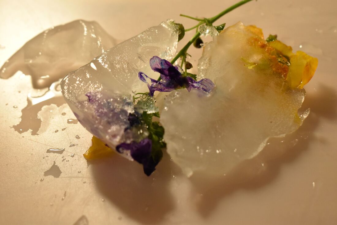
This shoot was exciting for me. I was able to prepare my set and needs for the picture beforehand. Unlike in many pictures I didn't just take a shoot and walk on, I was able to create the subject. I was thinking about the photographer Jiang Zhi and how I could learn and take from their art. I decided that I was going to shoot flowers that were dead or dying, whilst still being perfectly preserved. I chose to freeze flowers in ice, killing them while saving their exterior nature, denying them to decay. This is the theme of limbo and undeath that is present throughout Jiang Zhi's work. I went out and searched for flowers, finally settling on a purple and yellow one. I the put them in a plastic box filled with water and let them freeze for a day. Once taken out I had limited time before the ice really started to melt. When taking shots, I felt that the subject looked better when the flowers were half frozen, not completely covered in ice. The only setback I had is that there was only a few minutes until the ice had completely melted, meaning I had to shoot quickly.
Edits:
Edit Analysis:
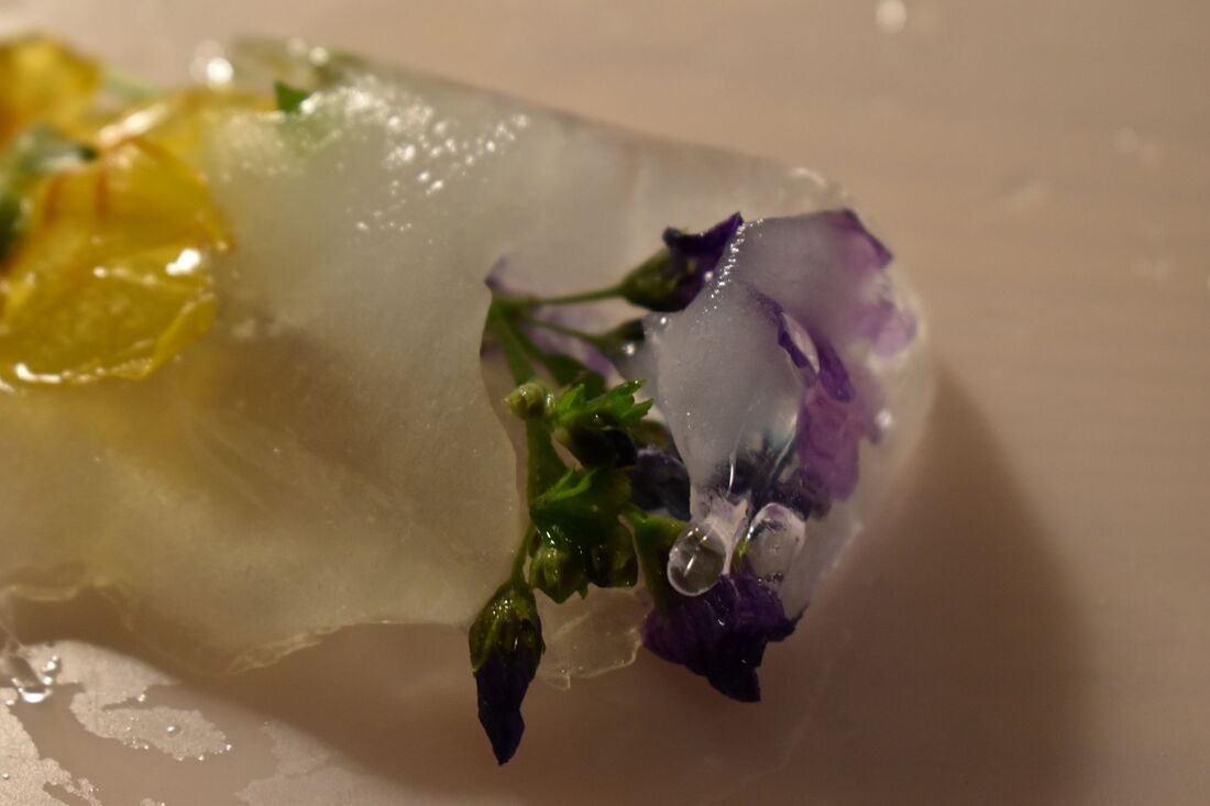
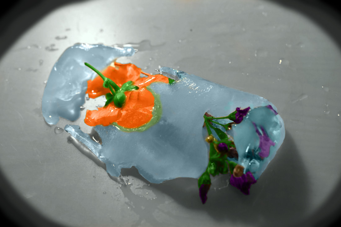
For my edit, I chose what I believed to be the most successful shot out of every one. I chose this extreme closeup as I was able to see the small details on the flowers and strangely enough the ice. For the edit I decided to turn the entire image black and white, whilst not only preserving the colour of the flower and ice, but also using the colour-changer tool, to give more exaggerated colours of deeper oranges. I made the ice blue as to make it seem more more obvious that it was ice, with a stereotypical cartoonish blue. I gave these aspects colour as to make it clear that these were the focal points of the edits. If it weren't clear enough I also created a sort of black shadow across the outlines of the image creating a circle that appeared to make a spotlight on the focus of the image; the flowers. I feel that the edit is an outlook on our society, a sort of metaphor. The flower is only alive/preserved as long as its encased in the ice. However the ice is melting and there's water all around the ice, yet it isn't highlighted, meaning no one pays attention to it. Humans are the same. We're all dying, all aging in a slow march towards our inevitable end, yet as a society we ignore that a birthday is another year closer to death. We focus on the positive and choose to ignore that we have wrinkles or cant run as fast as we once could. This is the same for the flower as an artwork. We're focusing on the flowers and the ice, choosing to ignore that the flowers time is slowly running out.
Pelle Cass Analysis:
Pelle Cass is an American photographer from Boston, currently residing in Massachusetts. He's an award winning photographer whose work varies from project to project. Locations within his work usually take place in urban locations, busy parks, high streets, various pathways through out a city. His varying pieces are well edited and the shoots are carefully chosen. They all show skill and knowledge of editing and illusion. I chose him as his work stood out from any other artworks I saw. His work spoke to me in a way I hadn't foreseen.

|
The piece shown to the left originates from his "Selected People" works, in which specific pedestrians are chosen and frozen into a single moment, over the period of a few hours. This creates a common theme life, death and eternal limbo, stuck in between. These people have been merged into one "timeline" so elegantly and smoothly that its is had to even realise what's inherently wrong with the image as the editing is so subtle.
|
The importance of this piece isn't in the actual editing skills, but rather the patience and camerawork, as creating a piece like this takes time and effort. The art in this piece, and every other one like it is that the art makes itself. Every person captured unknowingly become art by simply walking and living. The work is a tribute to time and reality, bringing everyone together at once to show the hustle and bustle of the city and connect everyone together. We all share similarities and its even more evident within Pelles work. Other artworks depict colour coded "conga lines" or images where only people wearing a blue shirt are left in the picture. Every pictures is similar thematically but has a different theme and connection that brings the whole artwork together. I like the idea of this theme and work, as it creates art that simply put creates itself and the concept which I believe is hidden beneath the art, in my very own depiction of what the work means, is that time and space are relative and that the beauty of everlasting life in an image is portrayed successfully. This piece has so much detail hidden under the surface, a story behind every person, walking towards a different destination, for varying goals. Every one of these stories are being told in this one square. The image has a sense of movement, as the people who have been spliced in make the square look busy, bizarre, full of activity and life, adding to the image. If there's so much movement from every small person, then which one of them is the focus or which area is the centre of this piece? I believe that they are all as important as each other, as they make worlds collide in what appears to be a very narrative driver photo. The people have no idea that they are being photographed, meaning they act natural and do not change, really helping convey each of their mysterious lives and own stories into this picture. This is the beauty of the image, it has unintentional narrative and stories, untampered with and pure. Every shoot will be different and random, as the photographer has no control over the subjects, who are the core of these collaged images.
Pelle Cass Shoot:

|

|

|

|

|

|

|

|

|
Pelle Cass Edits:
Edit Analysis:
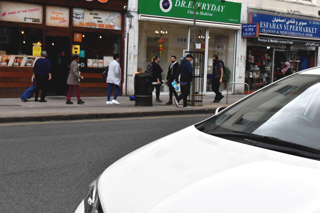
This is an edit inspired by Pelle Cass and his work. The intention of the edit was to show how deceitful an image can be. Alterations can be easily made by anyone. We the viewer have no power, as the it is the photographer who has complete control over us. They can choose what we see, change aspects or events. I wanted to recreate this concept, by standing my camera on a tripod, waiting for people to walk past on the street opposite. They were my art work, living their ordinary lives and simply walking past. The backdrop was to never change, whilst the props (the people in this case) were ever changing. I took various shots of people standing on my 'set'. When it came to editing, I cut out each individual and placed them directly onto the same spot they were. The final outcome is to create a piece where multiple images from different moments in time have been merged together.
Dorota Gorecka:
Dorota Gorecka Artist Analysis.In starting my first steps to my final piece I have decided to cover a topic on death and mortality as a complete contrast to my personal study on life and immortality. I searched through online galleries and through and through to find morbid art and photography that would assist me in realizing my final piece. The first photographer I selected to work on is Dorota Gorecka, a Polish photographer based in Lodz. Dorota learned to love photography in her spare time at the advertising agency, where she worked. She would often use the photography equipment in the unused studio there, getting more and more hooked to the art of photography. Her work reflected heavily in what I wanted mine to look like and not studying her photography would be an opportunity missed.
|
|
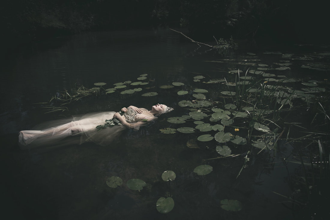
One of her pieces that I'll be focusing on is the one above titled 'Ophelia'. The artwork is heavily inspired by Renaissance art and this piece specifically is a modernisation of a painting of the same name, created by John Everett Millais.
John Everett Millais was an English painter and illustrator from the 19th century and was one of the founders of the Pre-Raphaelite Brotherhood. His work was greatly influential and admired for its realism. Perhaps one of his most famous artworks was Ophelia, a depiction of the Character from Shakespeare's Hamlet. In the play she becomes plagued with grief and insanity and jumps into a river with a heavy dress, drowning herself. She's depicted holding flowers and having a few float around her, interlocking her with her surroundings, becoming lifeless as the nature around her.
It is clear that these pieces are all influenced by Millais, whilst changing enough to make it her own artwork, standing out from his and others alike. As for one major difference, her work is void of colours, being dark and dreary, contrasting to his colourful depiction of this scene.
Dorota mostly works with female models, as seen throughout her countless pieces. She claims to mainly use natural lighting as she believes it makes the photos moody. I personally believe that Dorota uses female models as they play a stereotypical role as the object of obsession, something to admire, shown through the male gaze, sexualized and ever seen as beautiful, even if shown dead in a photo. This is perfect for the tone of the pictures, as they work as intended, as there is something dark, sinister and moody about thinking someone is beautiful and graceful in death. This is the concept used for her pieces that are heavily inspired by literature, such as Shakespeare's work as his plays have been known to be nothing but tragedy.
The image is a landscape portraiture, portraying a woman in a wedding dress floating in the water. The woman has her eyes closed and floats in a swamp-like river/pond. Its clear enough to say that the woman is supposed to be dead, with both of her hands on her chest with a flower in her hands. This is a symbol and gesture used on the deceased in caskets, at funerals. It may be a coincidence, but the woman is very pale, perhaps another sign suggesting that she's dead. The dress the model wears has become translucent in the water, exposing her legs and feet, with the white material making her seem ghost-like and supernatural. There is a feeling of eeriness created by the un-natural position the woman is lying in; her entire body perfectly straight out, as if positioned in this manner by someone, hinting she may have been killed. Its unclear whether Ophelia commits suicide or falls into the river by accident in Shakespeare's Hamlet. Her death was revealed to have happened when she stood on the branch of a willow tree, falling in after it snapped. As the reader we are unable to know if this was the truth or a lie told by Queen Gertrude, but knowing Shakespeare, there may be deeper meanings behind this. The willow tree is synonymous with hanging and lynching, creating a the question if she killed herself, or was killed. This mystery in the play, was definitely picked up on by Dorota who has a passion for literature, meaning she made her photos just as mysterious and left ambiguous on purpose.
The photos strange setting give it a mysterious charm, making me and any viewer ponder how, the woman, specifically Ophelia died in this interpretation of her death in Hamlet.
|
|
|
|
|
|
|
|
|
|
|
|
Edits:
|
|
Christian Hopkins:
|
|
Christian Hopkins is an American photographer who specialises in surrealistic portraiture. His work was perfect for the theme of the 5 stages of grief, more specifically the stage of depression. I wanted to find a photographer who satisfied my thirst to find a set of "grounded" pieces, with perfectly integrated adjustments. Hopkins' work is all created around his own depression and struggles. He uses his grief and pain within his photography, working in a similar way to art therapy. The theme of depression and pain can be seen through all of his work, in the subtle greyscale, the pieces sucked of all colour, and anything that would connote happiness. The work helps Hopkins express himself, through his pain and struggles, making every picture personal and intimate.
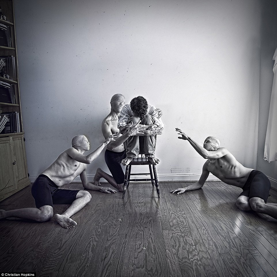
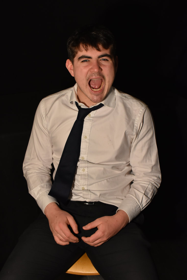
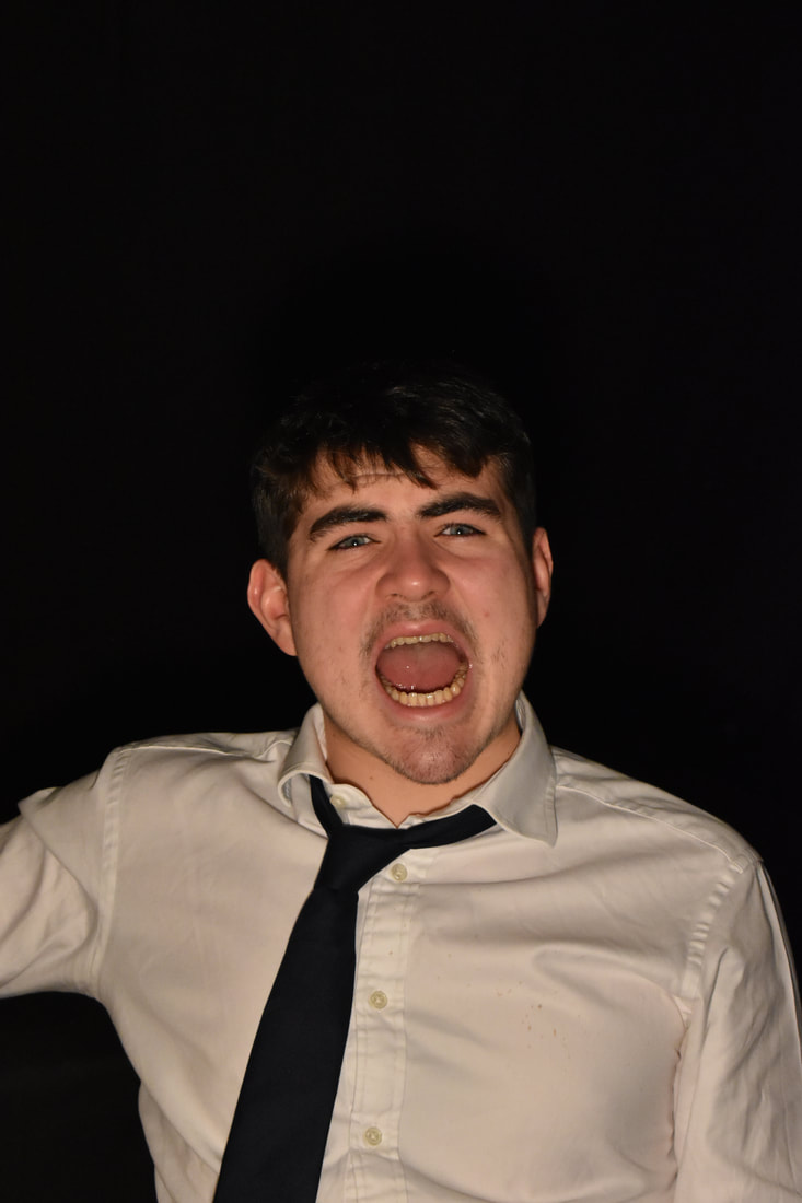
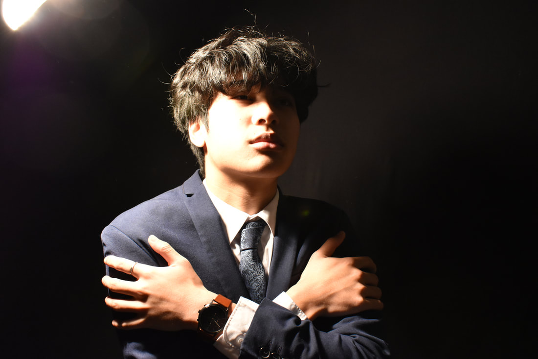
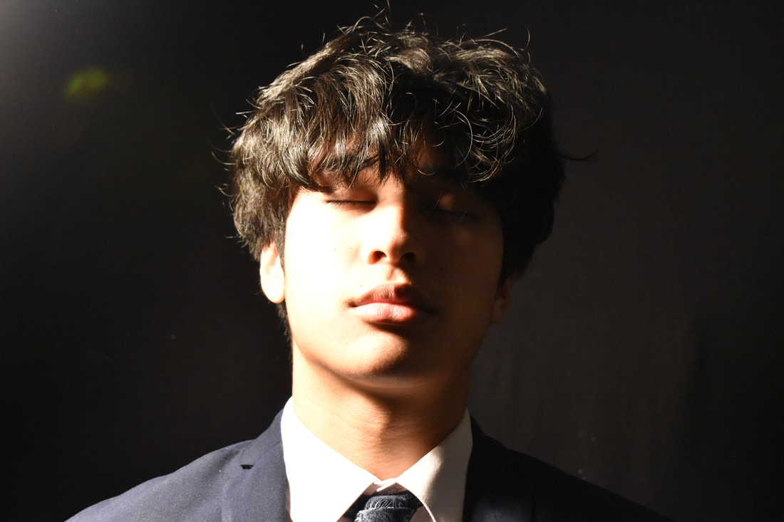
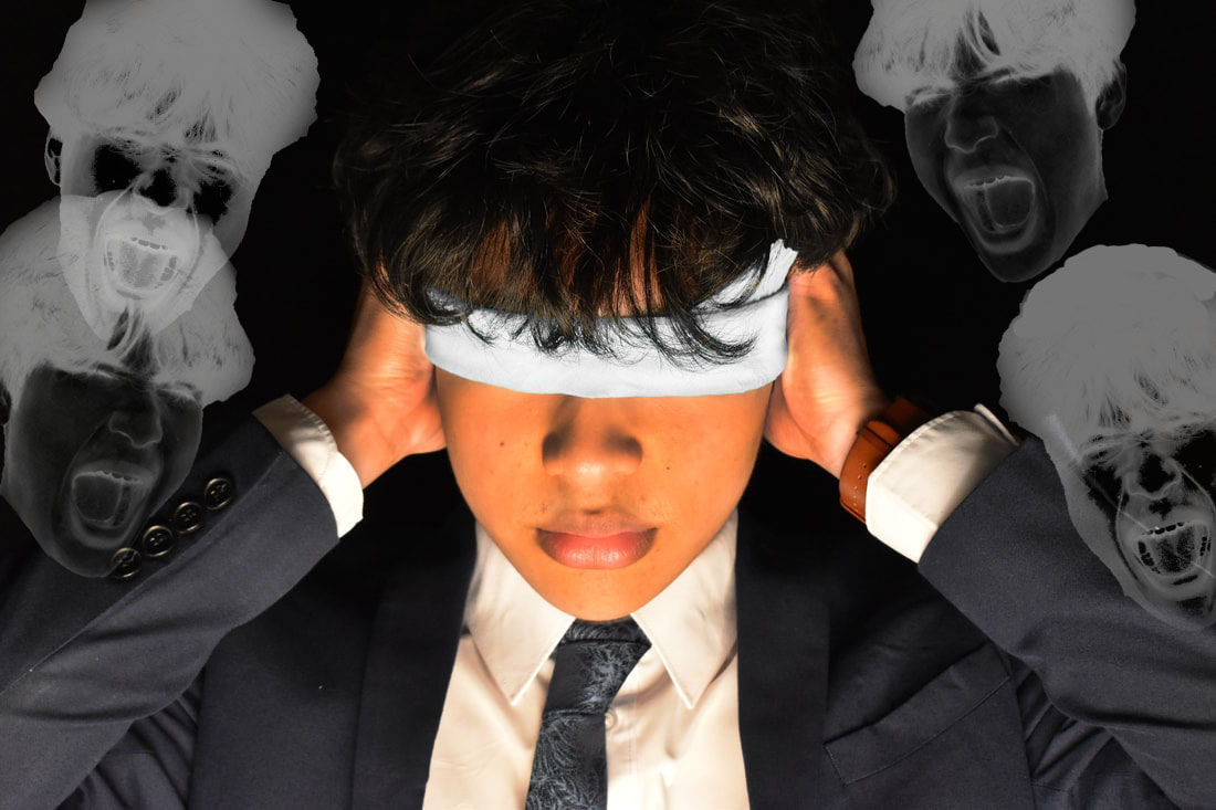
The want to analyse the picture shown above on the top left. The image depicts a man sat on a chair with his face buried into his knees, hugging his legs. Around him sit shirtless men, with white rags covering their faces, all reaching out towards the central man. the way they are positioned and from their body expressions, a narrative is created. The man is clearly terrified of these figures. Personally I believe these are not supposed to be literal "monsters", but rather figurative "demons" that the man is fighting. It's a narrative story of a person fighting their own depression, in series of pieces of the same lone man with abnormalities, and various monstrosities surrounding him. I interpret the pieces as different stages of grief, perhaps reflecting the mans own personal grief.
The piece displays a sense of movement in the form of the figures all reaching out, grabbing at the central person. It is easy to imagine how the picture would play out if it were a video, showing a great use of framing, positioning and setup to successfully create this effect. The image has a dark tone of voice, presented through the gritty colour scheme. My instinctive emotional response to this image was empathy, as the theme of depression and battling this emotion, is a narrative that many can relate too, being far too common in our modern day society. On the other hand I knew that this work must bring the photographer some sort of happiness and fulfilment, as he is allowed to express himself in an art-from for all to see. The work makes me feel hopeful, as being able to share art and photography is a step towards healing, and beating the stage of grief.
An aspect I am fond of within this piece is the simplistic and minimalistic background. It helps brings attention to the foreground and midground. There is no visual noise within the piece, making the main aspect and absolute focus of the piece remain to be the person and the "demons" around him. This successfully helps convey the narrative of the piece. I think that the motive of the piece is to reach out and express the photographers feelings. By sharing their own conflict with depression, the picture can help those still struggling with others. I believe that its better to suffer with others than to suffer alone, because with others you have people to help you overcome your struggles.
|
|
|
|
|
|
|
|
|
Edit:
Francis Bacon:
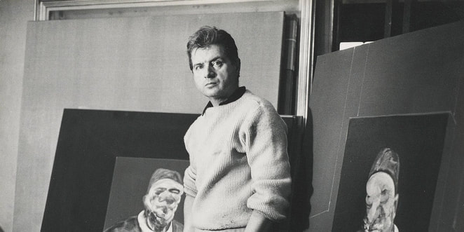
Francis Bacon was a British figurative artist famous for his unsettling self-portraits and work focused on the human form. His art all stems from his childhood traumas and mistreatment. Francis Bacon was homosexual and being born in the early 20th century, was ashamed of himself. His family was deeply religious, causing inner conflict in Bacon, as he was confused about how to feel about his homosexuality. A defining moment in his life, that many speculate was a topic in his art was when his father found him admiring himself in the mirror, in his mums underwear and high heels with lipstick on. He was disgraced and kicked out of his home by his parents, forced to move out on an allowance of 3 pounds a week, the weekly average being 5 pounds. He would move house, living with other artists and living with rich homosexual men, after gaining a taste for a luxurious life style. He would only being his career as a painter in his twenties, struggling to find subject matters that caught his interest, finally finding success with triptych in 1944.
|
|
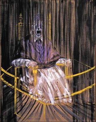
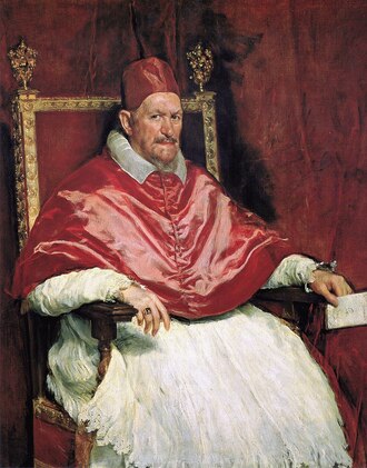
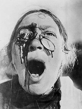
Bacon's Screaming Pope peaked my interest with its over-exaggerated facial expression, a demonisation of the Pope, who within this artwork is meant to represent Catholicism and Christianity as a whole, all linked to his self-conflict with his own sexuality. I find that fully knowing and understanding Francis Bacon's life and the events in it help give his artworks more meaning, making them more impactful to the viewer. The artwork is known as ''Study after Velazquez's Portrait of Pope Innocent X'', made in 1953. The painting is actually a distorted take on Portrait of Pope Innocent X, changing the colour palette from red to purple, changing the detailed background to one that is completely black, with any white or beiges actually being the untreated blank canvas. Bacon made these horrifying grotesque paintings, with the Pope's mouth wide open, as if it were screaming. Bacon said that the screaming faces were actually inspired by a Russian black and white silent film by the name of "The Battleship Potemkin'', made in 1925. It has a key scene where a woman is screaming with shattered glasses on. In one of his screaming pope paints has a small black frame on their face, positioned in the exact same spot, as seen below. Perhaps this was not intentional, however I believe this was a tribute to the scene

|
|
The artworks tone of voice comes off as satirical in a dark way, appearing to show Francis Bacons' own perspective on the Christianity, mocking the institution, perhaps related to his frustration with his sexuality contrasting with the views of the church. The artwork makes me feel insecure and small, as the way its painted makes the pope look like he's screaming at the viewer, drawing them into feeling a connection with the artwork. The artwork is part of a small group of screaming faces, or perhaps it is just a common thematic choice for his artworks. As screaming is common throughout many of his artworks, furthermore most of his work are portraits. Many of these portraits are often self portraits, with him mutilated and mutated, with bruised cheeks and out of proportion facial features. Its clear that Bacons' work is judgemental and opinionated on, all pointing to the origin of his pain: his sexuality. Furthermore his sexuality wasn't the problem, but rather how it was perceived. The Church, his parents and himself were all to blame for his depressed outlook on himself, as they judged his sexuality. I find the work inspiring through his ability to fight his demons and make art out of it.
Photoshoot:
|
|
|
|
|
|
|
|
|
|
|
|
Edits:
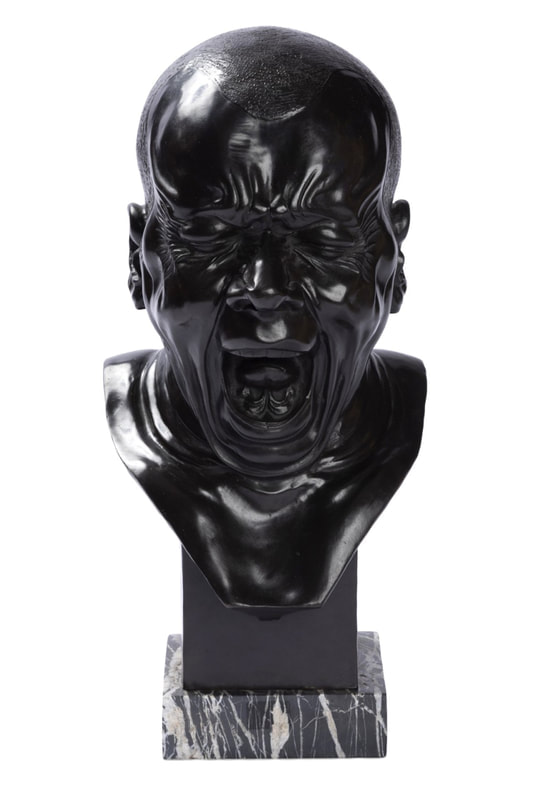
Franz Xaver Messerschmidt:
|
|
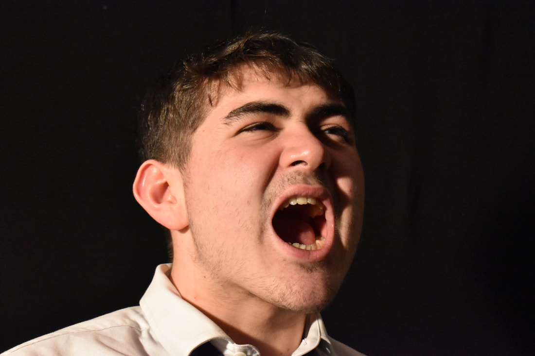
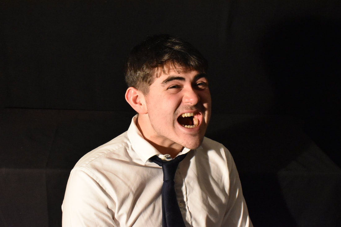
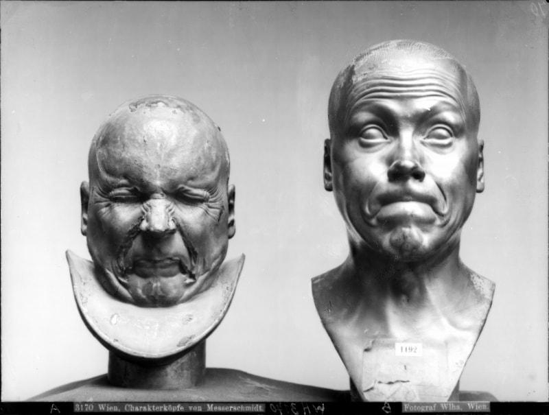
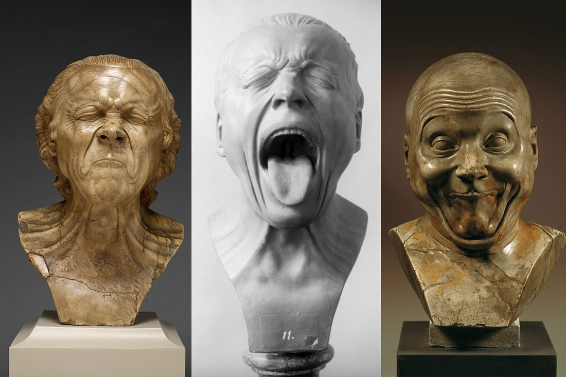
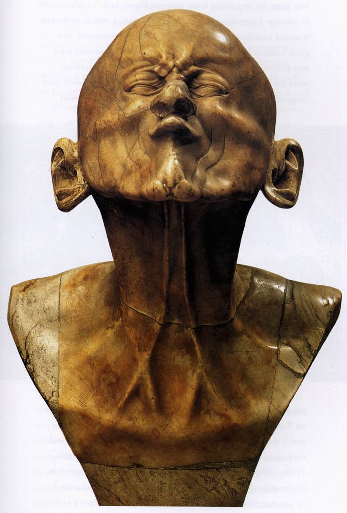
Franz Xaver Messerschmidt was a German-Austrian sculptor from the 18th century. He is most famous for this brilliant sculpture heads, a set of busts with extremely exaggerated facial expressions. Each bust depicts a certain emotion, feeling or action (specifically ones that would contort or change the faces structure). I decided to use Xaver's work as inspiration towards my final piece as I needed an artists who dealt with facial features and bold emotions.
Xaver's line of impressive sculpture busts portray subjects such as: " laughter held back, yawning, an intentional wag, the face of a satirist, the ultimate simpleton and a person afflicted with constipation." Many of his busts portray people with constipation and tensing faces, showing an interest in the facial expressions one makes whilst excreting, suggesting a scatological interest when it came to faces.
I found the great detail on the busts to be fascinating, every wrinkle and fold in the skin somehow characterised and expressed in stone. Such a skill to make something as hard and unmovable as stone to appear soft and fluid as skin is intriguing to me. Every bust tells a different story of its own, depicting an emotion and allowing for the viewer to imagine what is causing said emotion, creating a story based on a simple head and facial expression. Its remarkable how varied each bust is, every head being the same but wrinkles and folds able to express different emotions. For example all that separates a smiling face of a happy person and the frown of one who is sad, is the positioning of the lips, each corner turned downwards. Small muscle movement that mean two vastly different things. Xaver's ability to sculpt these emotions and make them obvious and clear is simply amazing. Xaver does this by overexaggerating the facial expression, stretching the 'skin' far beyond what an actual person would or actually can do. The heads seems eerie as the faces are almost inhumanly stretched and bent to the point that if one were to imagine recreating the faces it'd be painful. The busts look natural and real but the exaggeration of the expressions make the faces appear uncanny and unsettling.
The most famous from the series of busts is the 64 canonical grimaces. Xaver would pinch his lower rib and watch the facial expression he makes in the mirror, intending to recreate them in marble and bronze sculptures. Xaver was deeply interested in necromancy and arcane, being drawn to darker subjects and topics. He was a disciple of Hermes Trismegistus and lived by teachings on the pursuit of universal balance. In achieving this Xaver claimed that his busts had angered " The Spirit of Proportion" an ancient being who safeguarded the knowledge of universal balance. The spirit would visit him at night and force him to endure humiliating tortures for his transgressions. Xaver used this experience as inspiration for one of his most famous busts: "The Beaked". Xaver's work is beautiful in the way it recreates a mundane part of our everyday lives, the faces we make, reacting to the world around us. These key emotions and facial features hold great importance in our lives and for those who are intrigued by Xaver's work as I have been.
|
Photoshoot:
|
|
|
|
|
|
|
|
|
|
|
|
|
|
|
Edits:
|
|
|
|
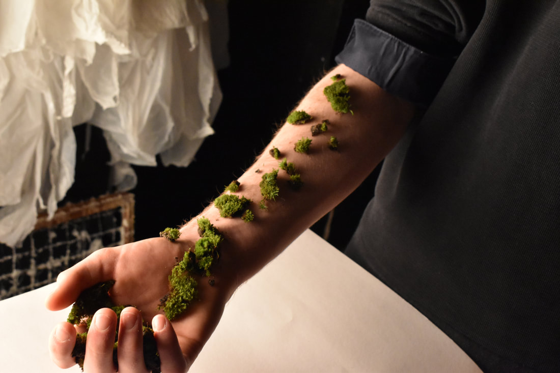
Stephen Gill:

|
|
Stephen Gill is a British experimental, conceptual and documentary photographer. I find his buried series to be the most interesting, with its peculiar neon colours. Stephen's work is inspired by his everyday surroundings in his city life, more specifically east London, all in order to create work that reflects and describe the times we live in. Stephen Gill became interested with photography in his early childhood thanks to his father and his interest with collecting pond life and observing them under a microscope. He became obsessed with this, being able to see an entire world within a small area. This concept can be seen in his work, his photos becoming documentations of the world around him. Stephen clearly has an eye for small details that many would usually look past and ignore.
In the "Buried" series Stephen Gill collaborated with the places he photographed. He not only shot places and scenes, but also buried the physical images there to see what the place would add or subtract from the final work. The result would be very earthy pictures that sustained damage of sorts. The images appeared to look as if they had been drenched in acid or a corrosive substance, as the images had seemingly random blots of neon discolouration around the images. On some parts of the pictures you can see that the plastic layer on top has melted/worn away to show the white back of the picture. Dirt has permanently stained the picture, tiny grey dots scattered across the image, like acidic raindrops. The combination of all these parts makes the image look psychedelic, with its blurred and distorted image, and bright recoloured fragments creating a whole new image. I love the concept that Stephen Gill had only taken the picture, but the land/ area had done the rest of the work and added the final finishing touches to really complete the piece. He had found a way to collaborate with the land. The land was an art piece waiting to be made, an empty canvas, with the soil being the tools.
Personally I like the image below the most. I find something beautiful in its chaotic destruction. I believe that chaos and the undoing of all things is more beautiful than anything. All that destroys leaves beauty behind, a natural artistic masterpiece, with the true artist being chaos. When I first laid eyes on this piece I felt there was something nuclear about the image, as if it was dangerously radioactive. The melting, strange vibrant neon colours covering the piece and grey burn marks all supported this imagined story. I like to imagine that the image depicts a couple facing an atomic blast, as if the radiation of the blast distorted and corrupted the image. This piece and series of images can be used to summarise the entirety of my photographic work and interest within photography, an obsessive interest in total chaos and unmaking of all things, the inevitability of death. Death is the only constant we can rely on happening, no matter what. I believe it was this series that made me understand that I am deeply intrigued with this dark morbid topic.
Shoot:
|
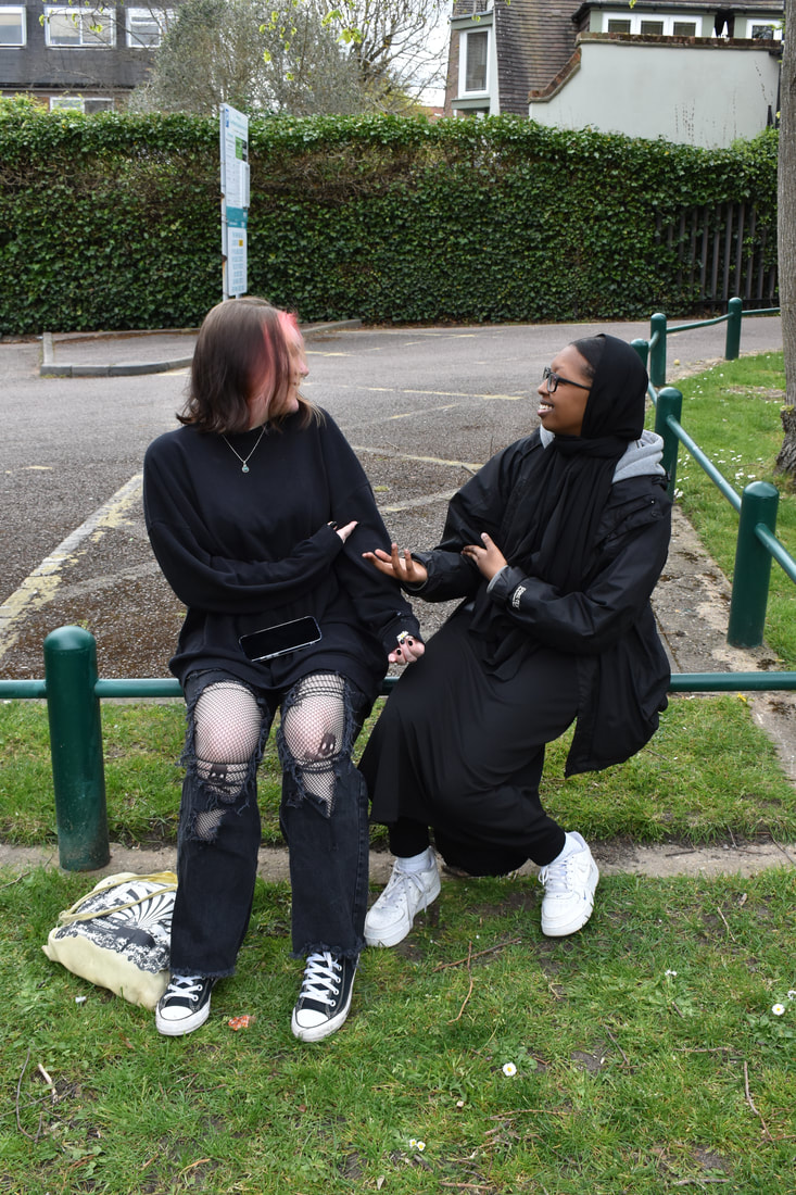
|
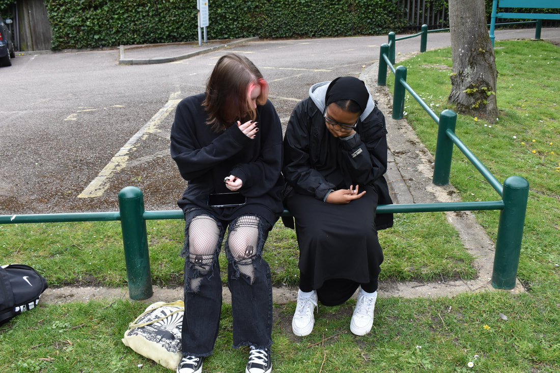
|
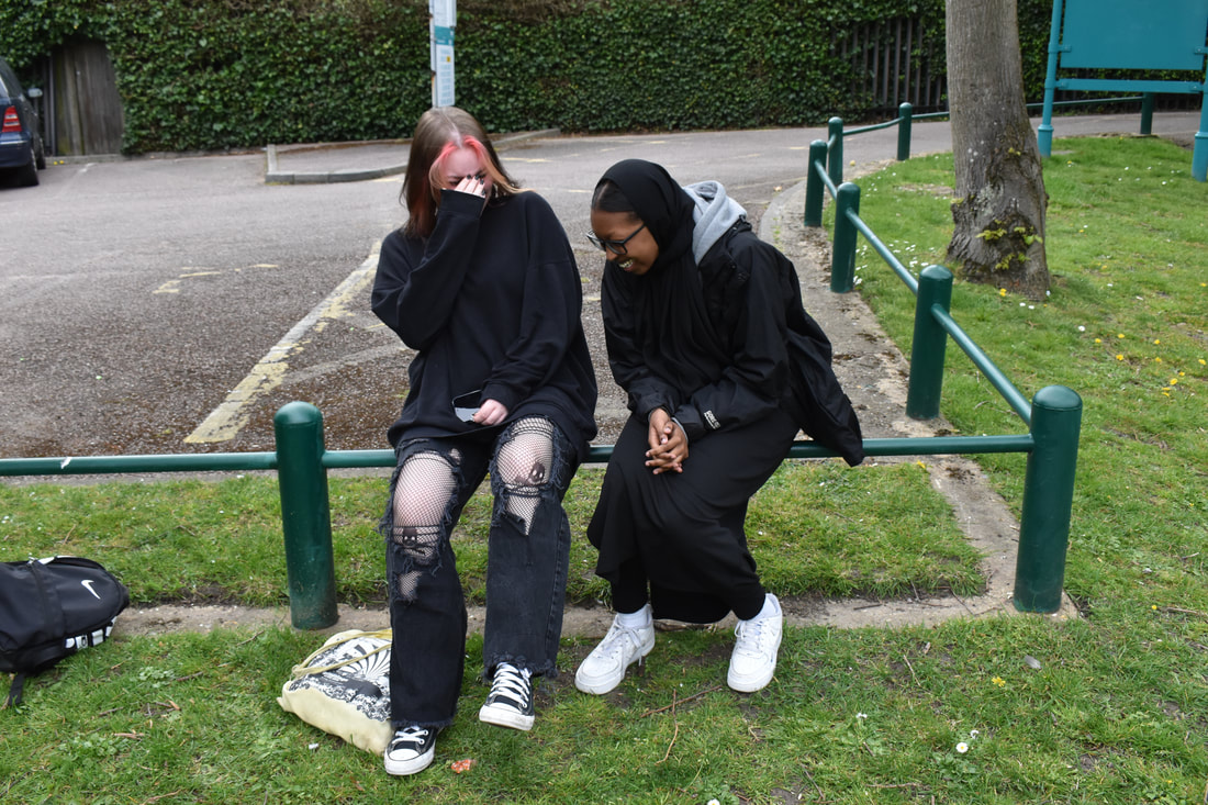
|
|
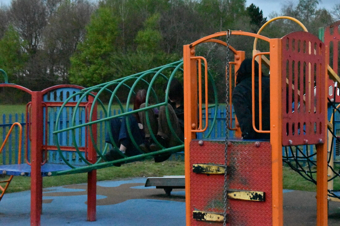
|
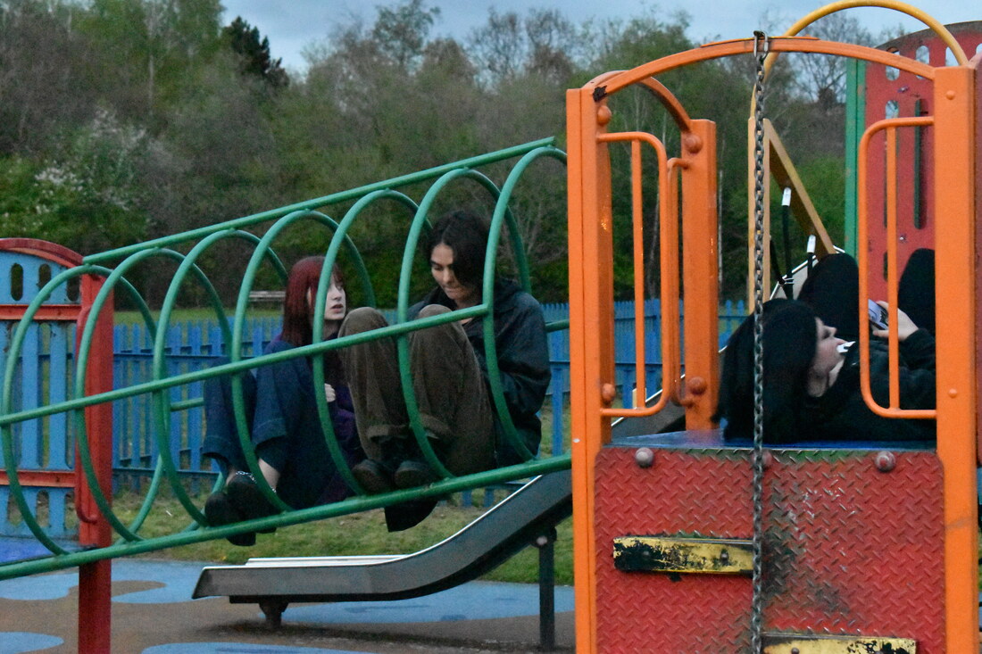
|
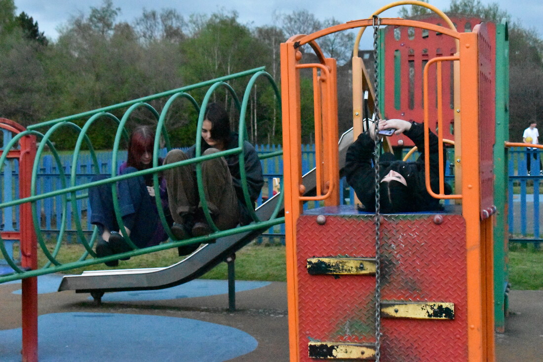
|
Edits:
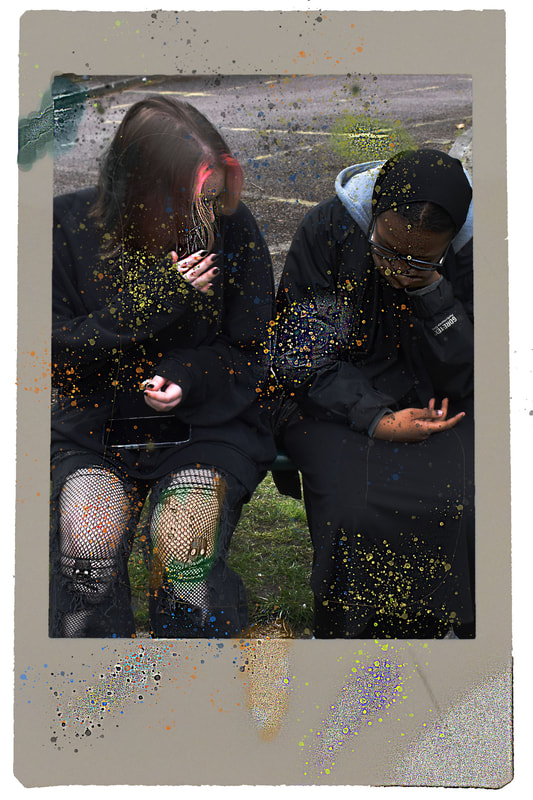
|

|

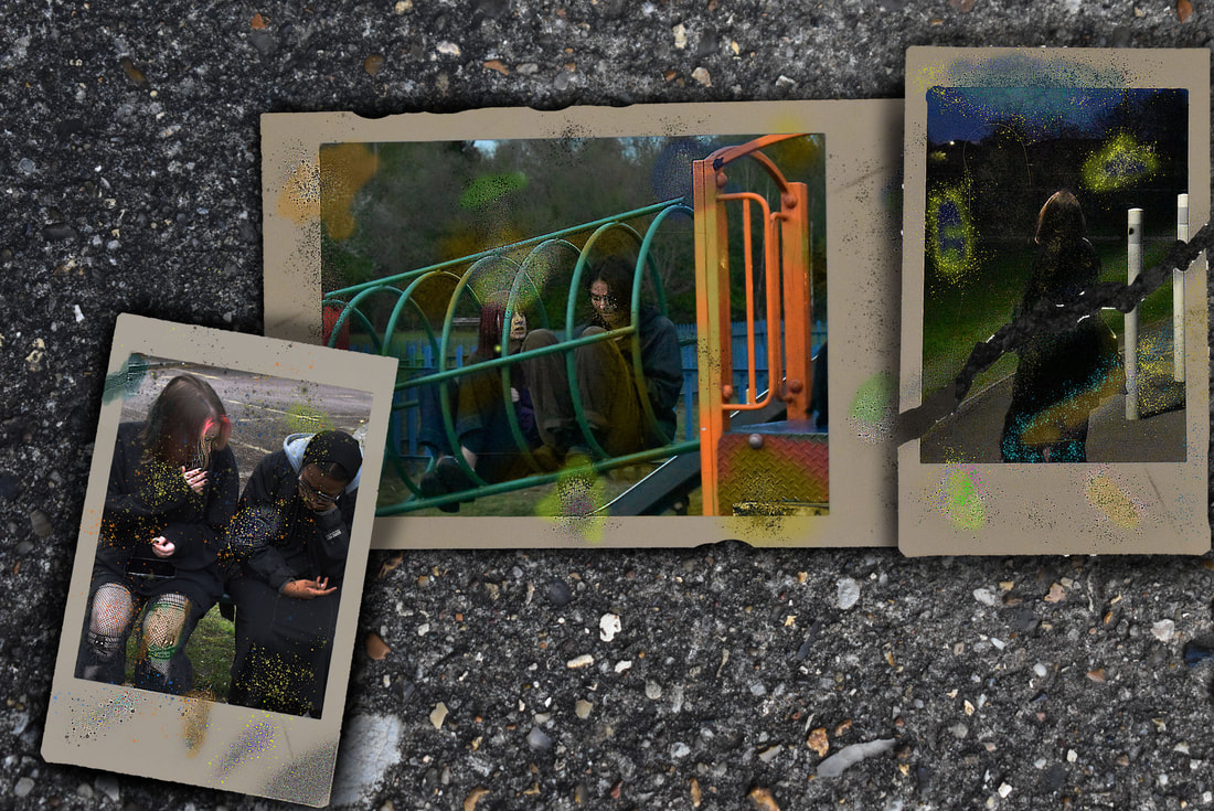
Final Piece
For my final piece I wanted to continue with the theme from my personal study. I had come to the conclusion that neither photography or any other art-forms are able to immortalise a person. We will die no matter what, every memory of us will disappear and all proof our lives will one day wash away. I believe that the only natural way to progress is to understand death and to come to terms with it. We will all face death some day and no matter how we try to prolong our lives and the lives of others, we will all be taken. I believe that death is what makes life so beautiful and precious. If we lived forever then what would make our lives special? We must cherish the short time we have. We all die surrounded by friends and family dying with our famous last words. This is how I disappear, how we all disappear, going to sleep and so long and goodnight. To surrender the night and all burn bright in the end.
Therefore I wanted to create a piece which conveys the concept of death and all the emotions and feelings that come with it. We will never beat death, so we must all learn to cope and deal with it. Accepting death allows us to live our lives to the fullest.
For my final piece I chose to try to capture this idea and make it physical. Life, death and all in between shown in a piece.
The final piece would use the most vital parts from each of the 5 artists and photographers. Dorota Gorecka would be used to connect death to life. When we die, there is no more life for us, however we create new life in the children we have, the new life that springs from us. We are flesh and blood waiting to be turning into fertilizer. Christian Hopkins inspired me to look at how we harm ourselves and our emotions deeply affect us, more than we would ever expect. Francis Bacon allowed me to start looking at the common way we grieve and suffer. The five stages of grief, learning to overcome death and begin the healing process. Franz Xaver Messerschmidt opened possibilities for how we physically express the pain and emotions we feel. They aren't just in our heads mentally but also physically. Loss can be just as painful as physical pain, and is beautifully expressed on our faces and facial expressions. Stephen Gill was the final step. Once we die we must all return to the dirt we came from and be buried, with our lives along with us. We were all art and will continue to be artistic masterpieces. From ashes to ashes, from dust to dust.
Using the ideas from my chosen artists, I realised a piece to convey each concept. I have 2 giant mounds of dirt/earth, in long cone-like shapes. They appear like stalagmites and stalactites, representing life dripping into death, like gravity forcing water to drip downwards inevitably. The two formations are opposite each other, with one on the floor and one upside down on the ceiling, directly above the other. There are sheets of white paper scattered, pinned to the top mound, which gently blow in the wind, due to a fan. There are multiple projectors lighting up the pages, mounds and walls of the room with images of screaming faces, all contorted with different emotions, all linked with the 5 stages of grief. My final piece will be a tribute to death, to the living struggling with death in their lives, as well as the fallen no longer with us.
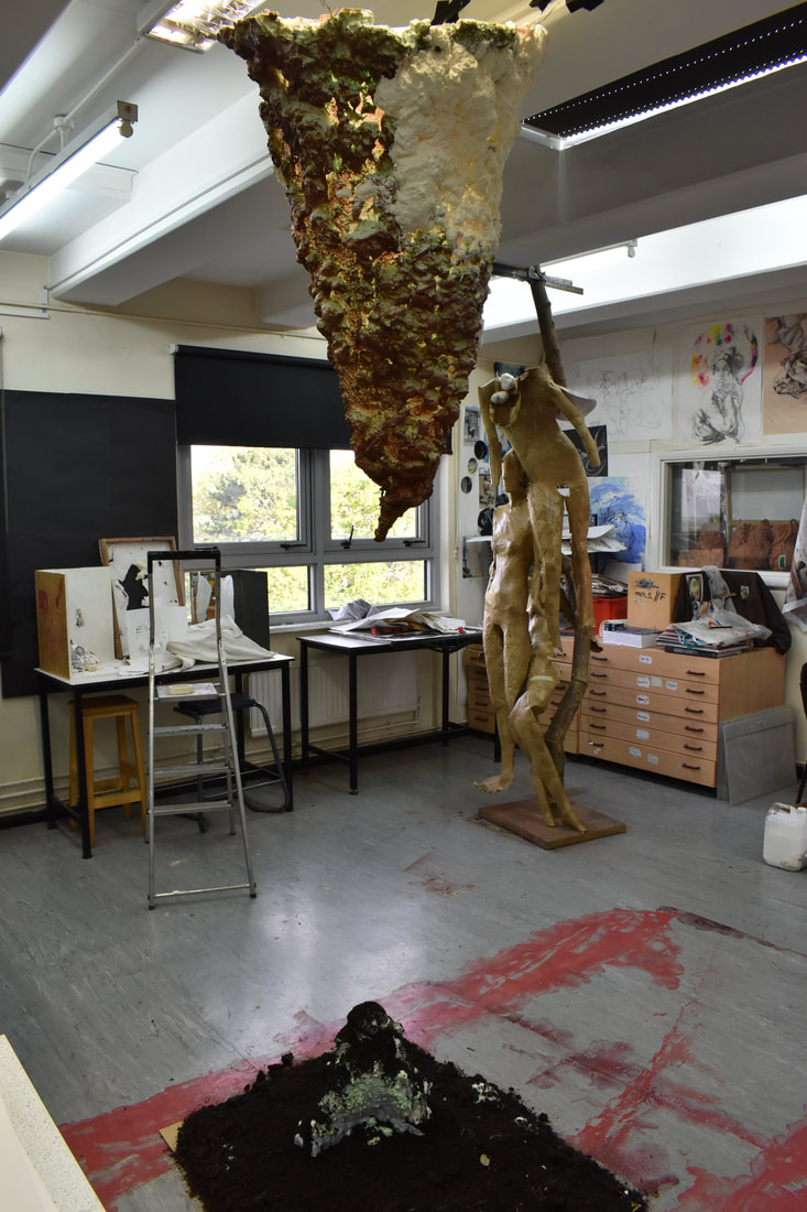
|
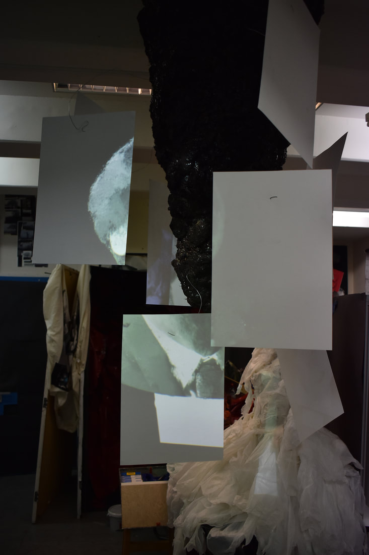
|
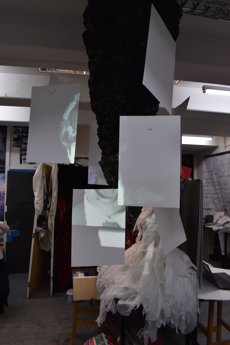
|
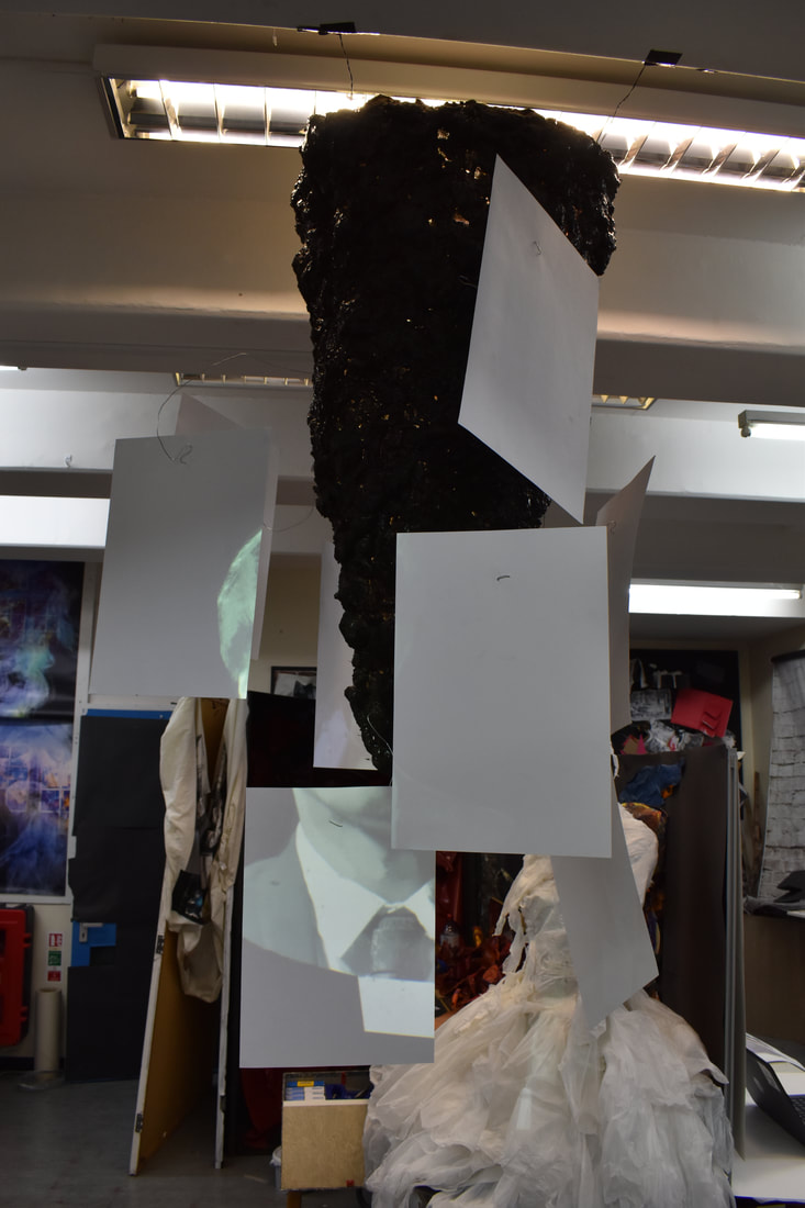
|
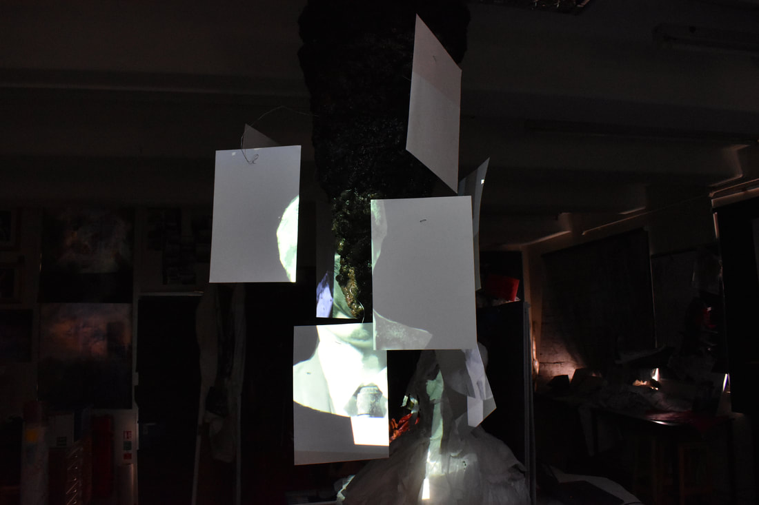
|
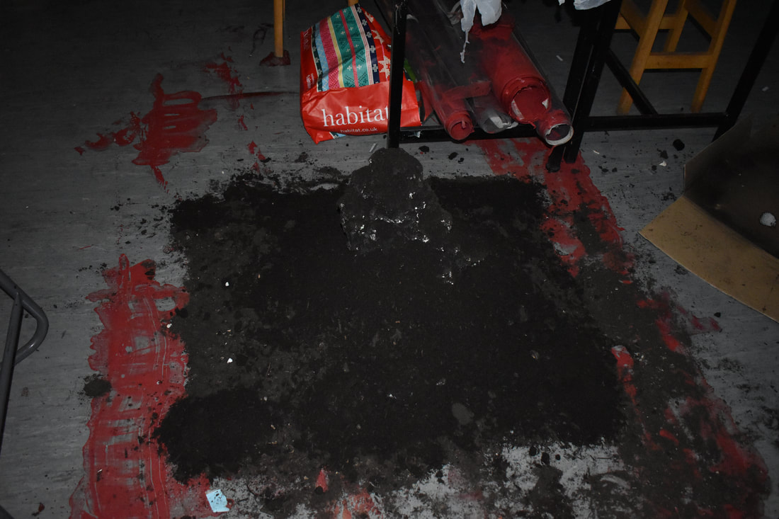
|
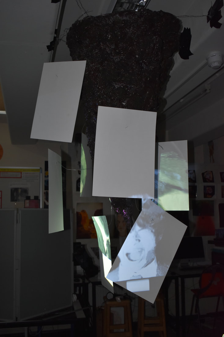
|
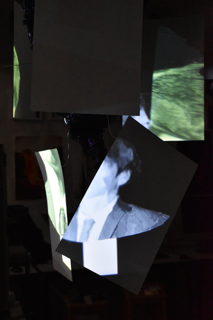
|
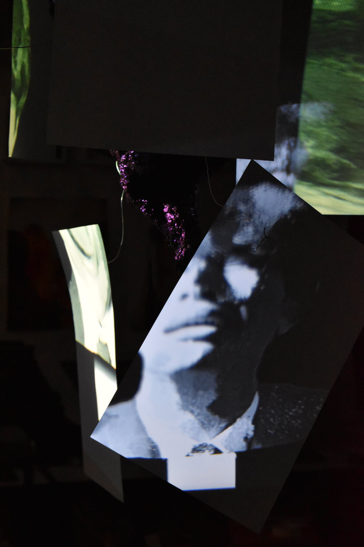
|
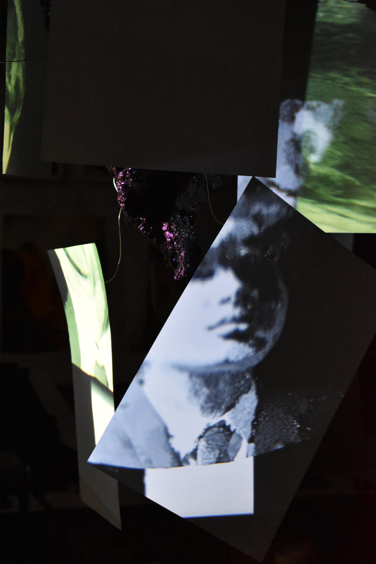
|
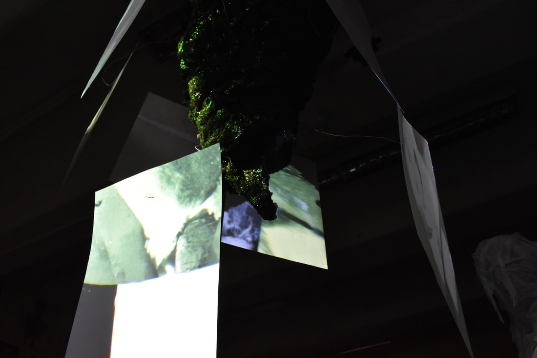
|
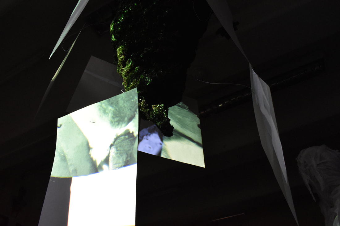
|
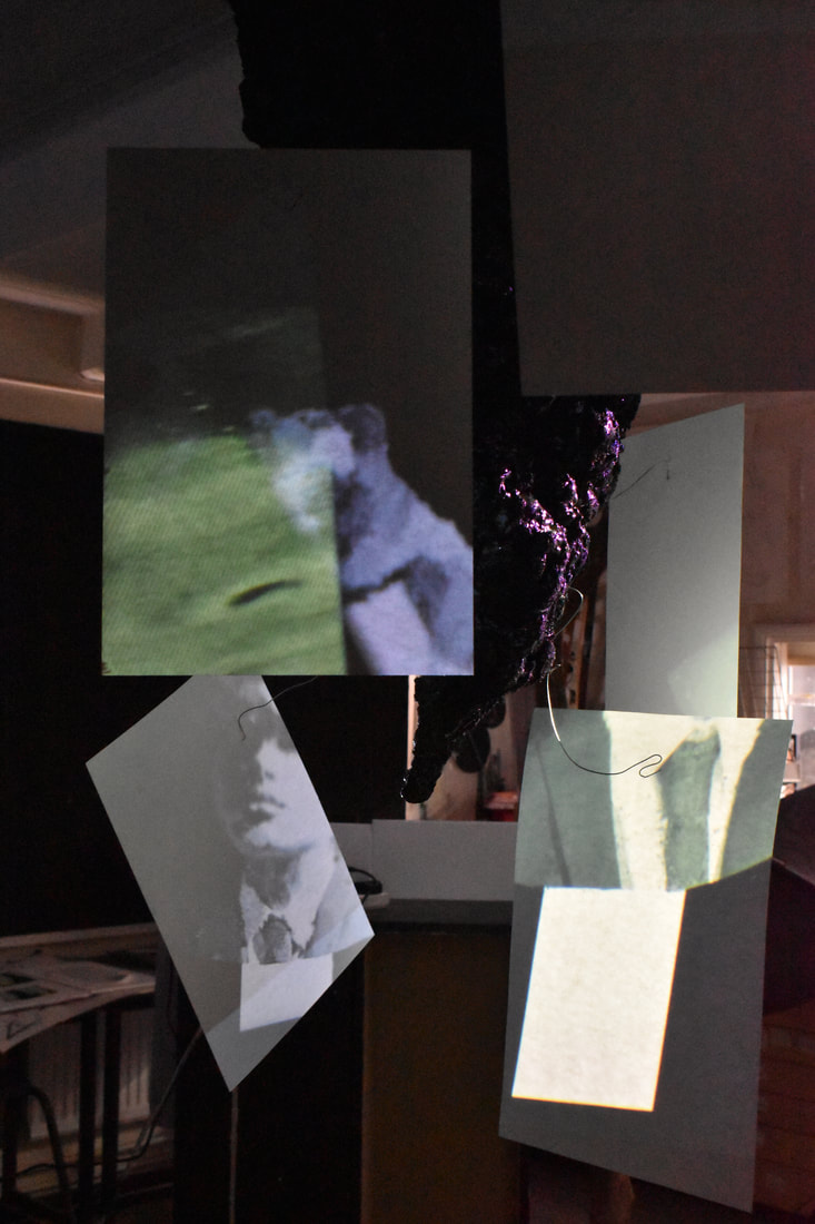
|
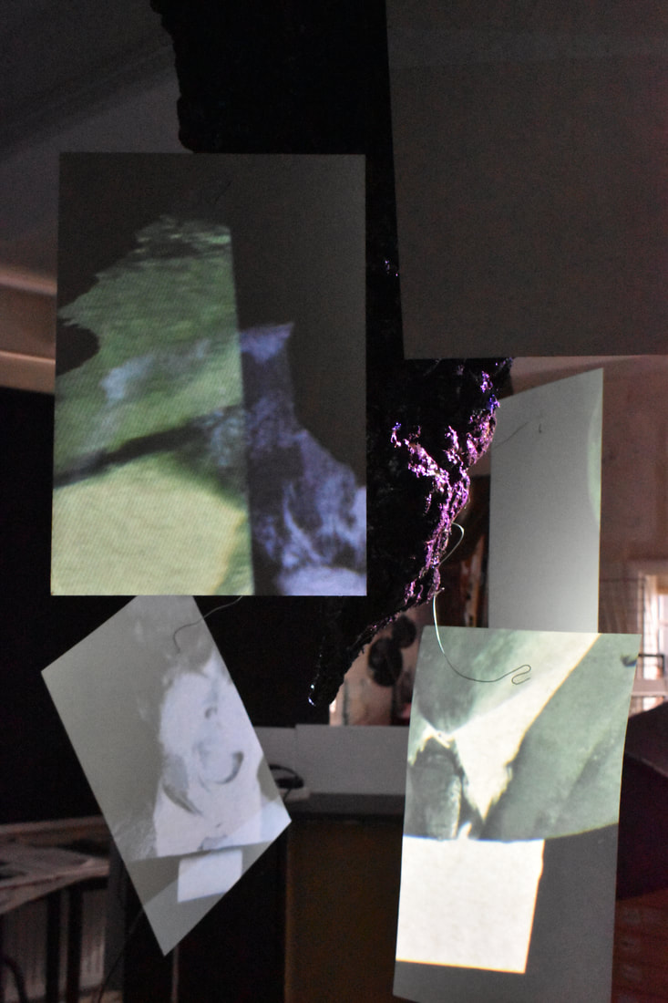
|
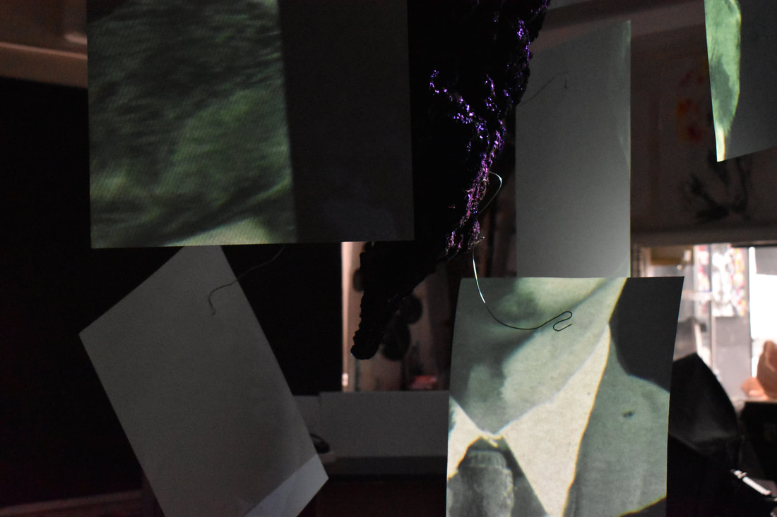
|
|
|
|
|
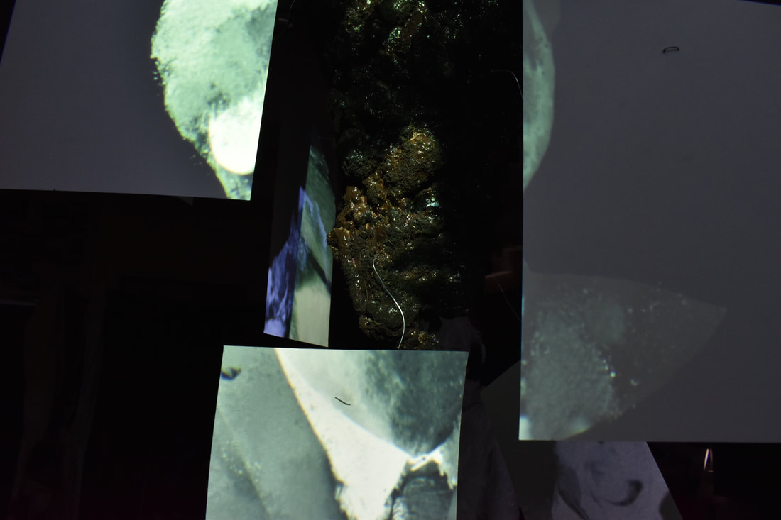
|
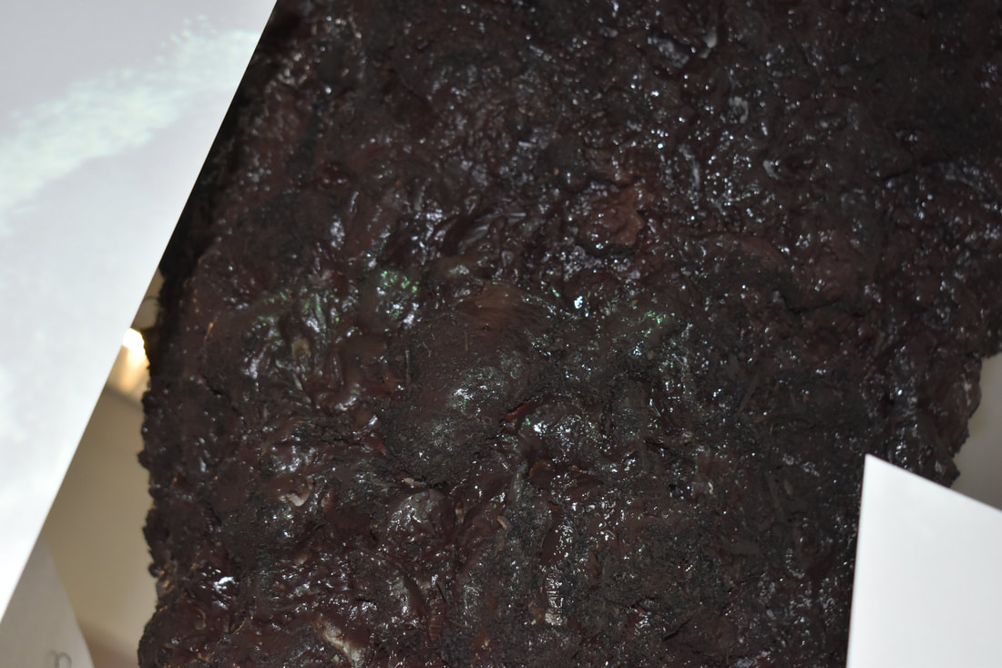
|
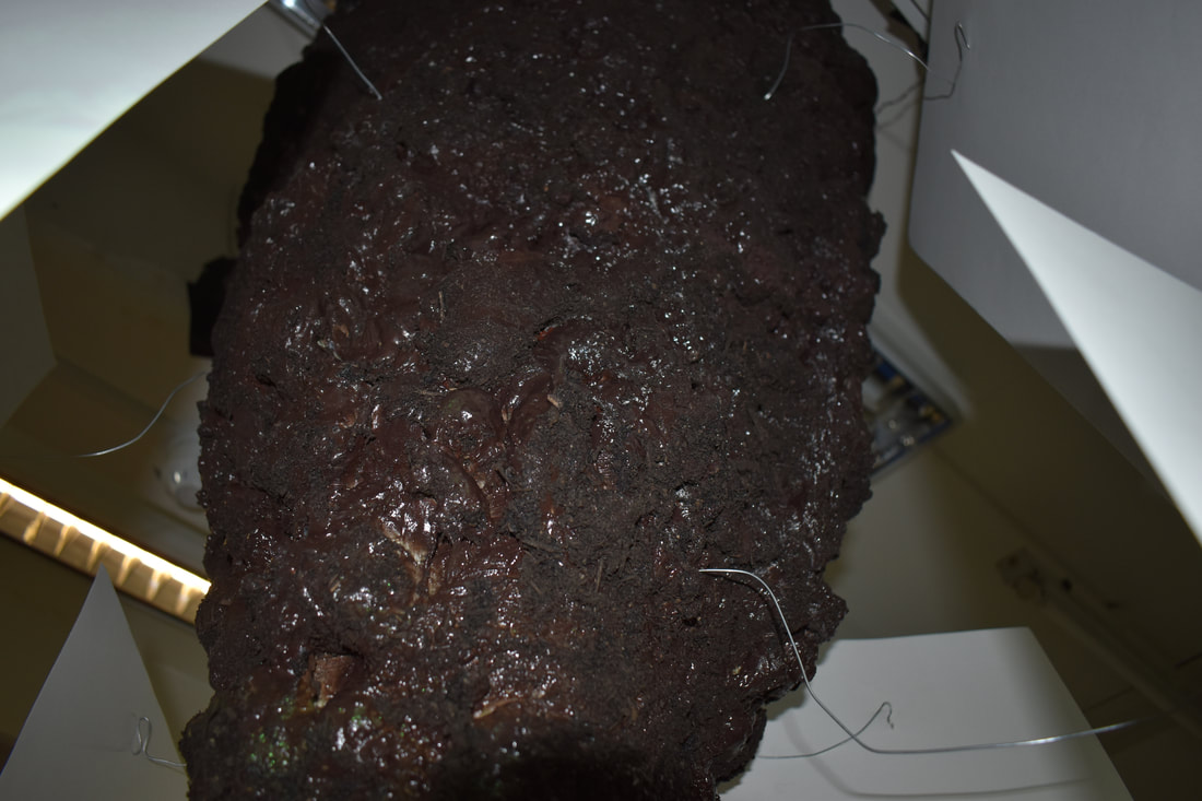
|
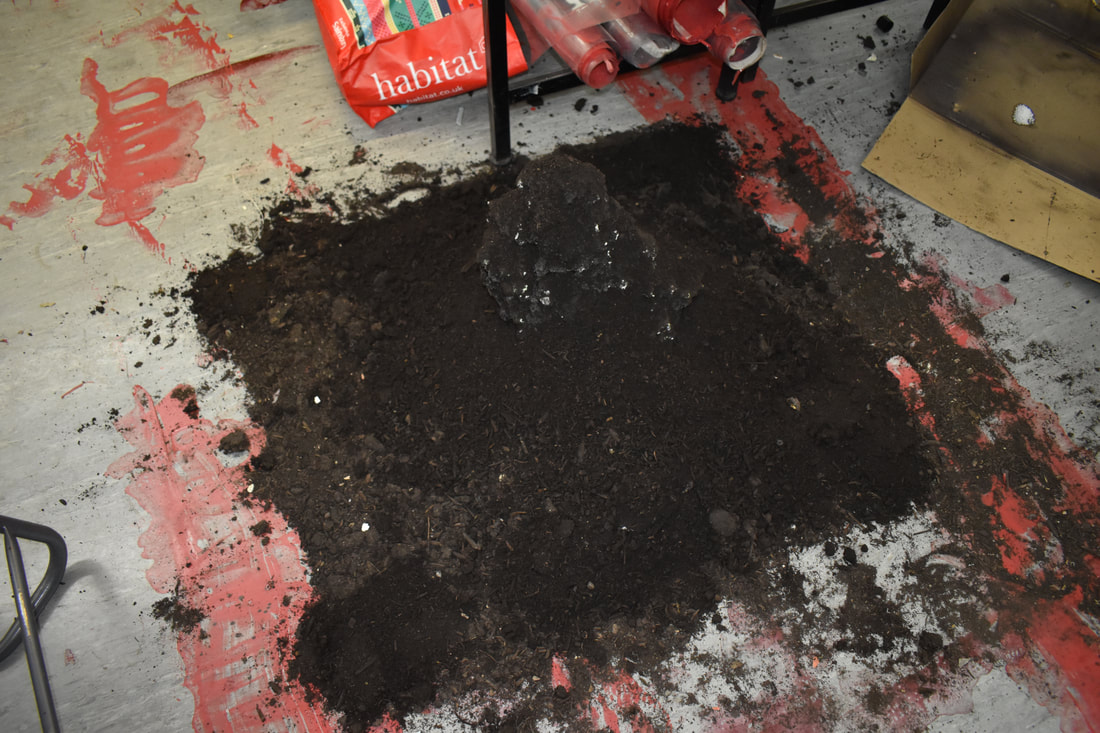
|
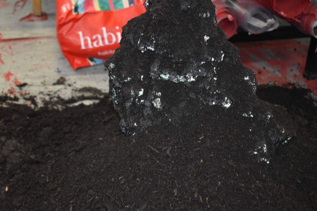
|
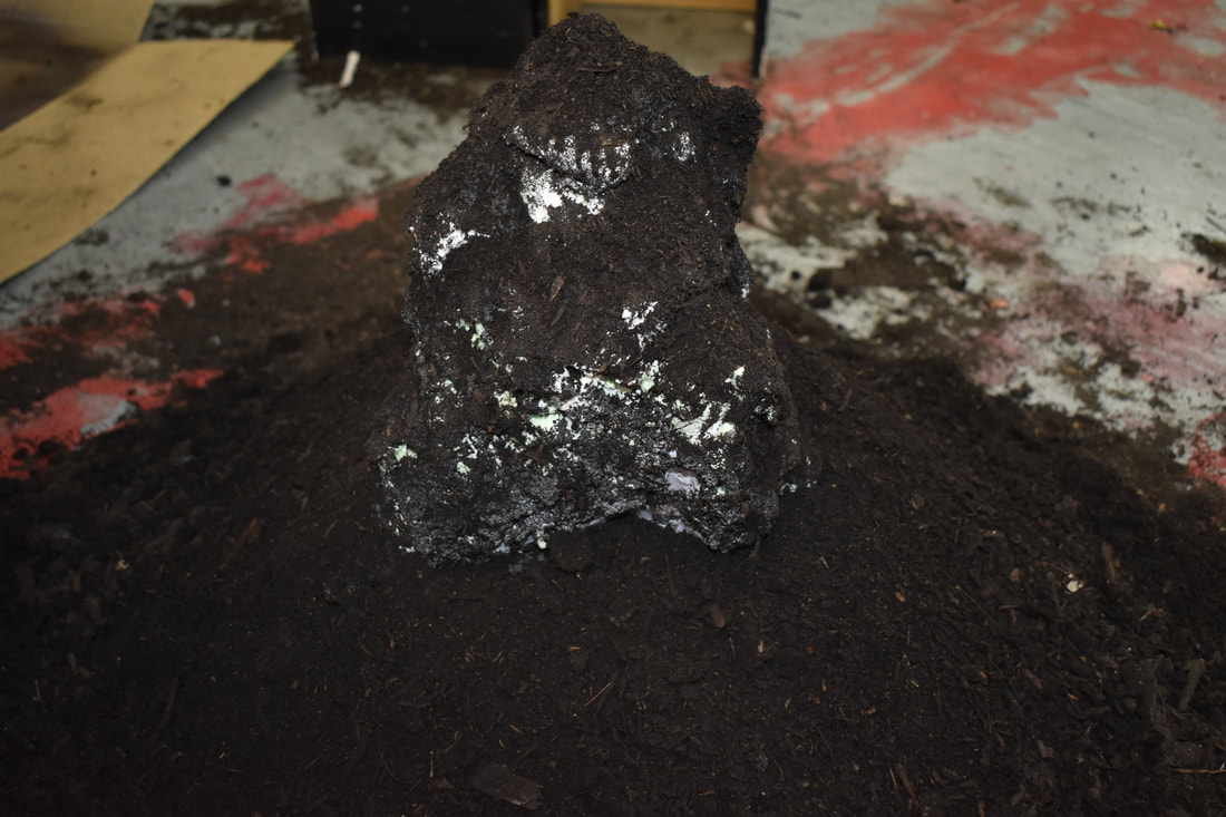
|
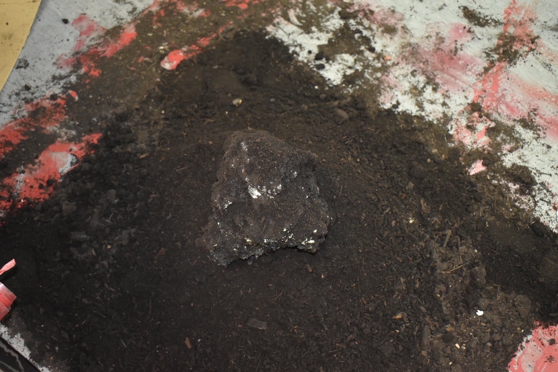
|
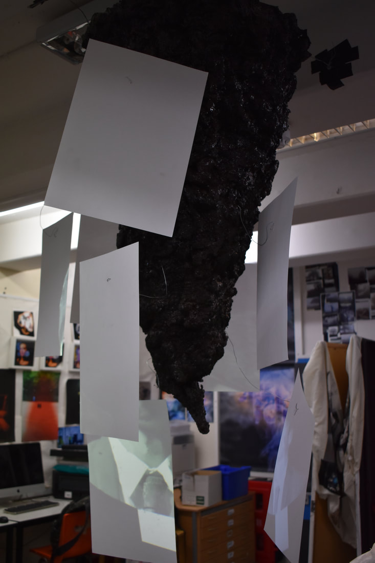
|
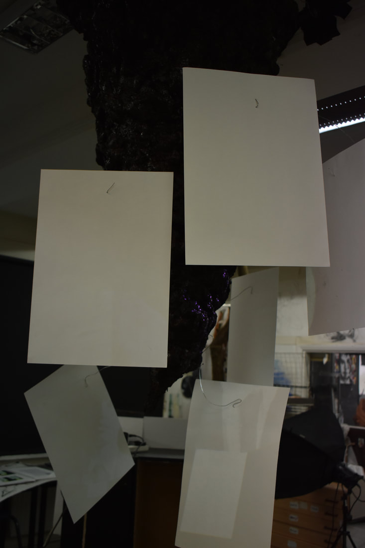
|
|
|
|
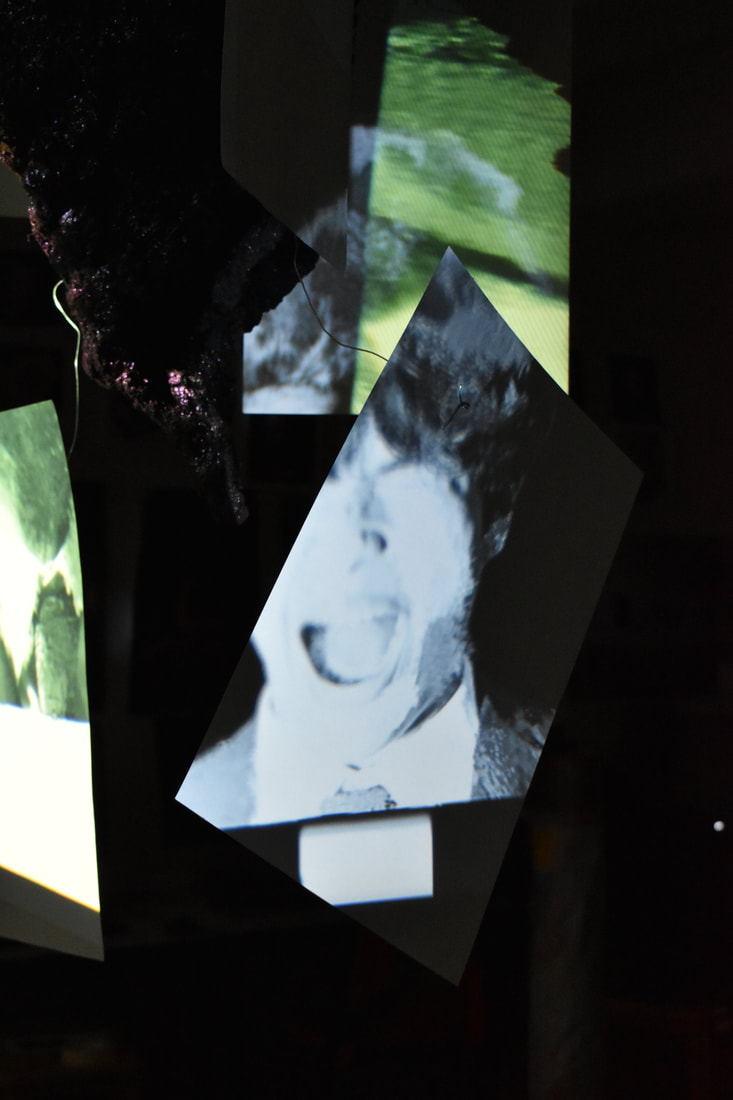
|
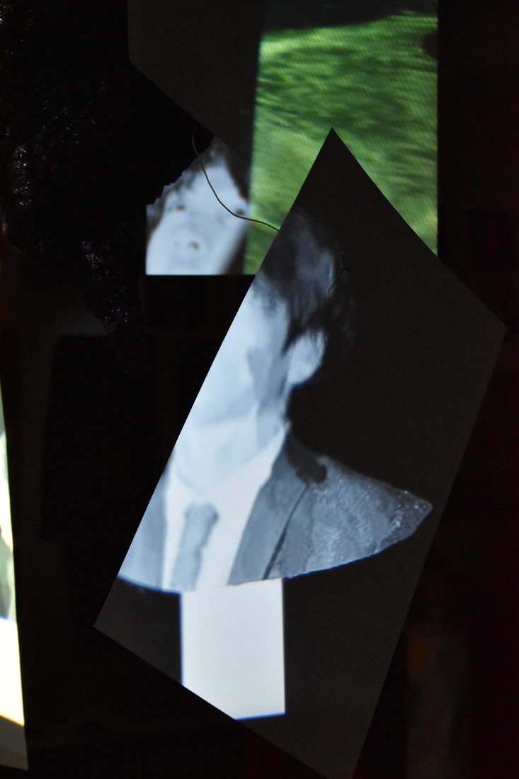
|
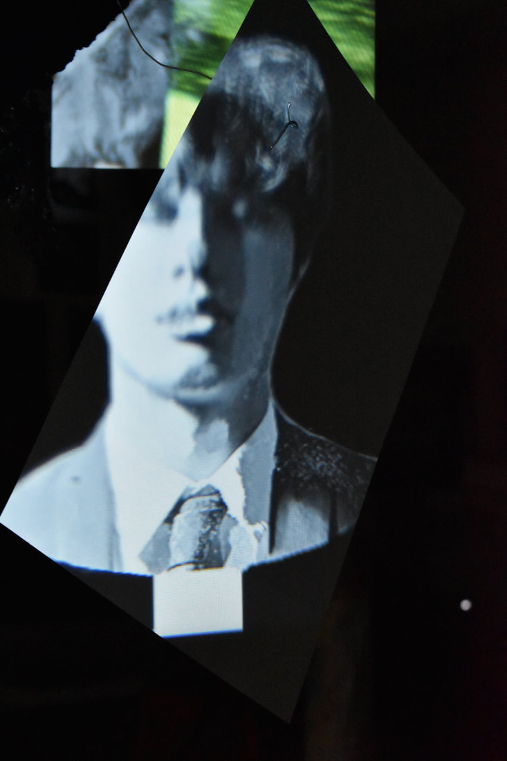
|
To start making the piece I used metal wire to create two cone like bases. I than covered the wire cone in plastic sheets carefully to make sure there was a surface for the next step. I used a plaster foam and covered the plastic sheet surface in it, as to sculpt the perfect 'rocky'/earthy' look to it. Once the foam dried and hardened properly I painted the surface in a dark brown paint. I still felt the mound didn't look natural enough so using the still wet paint and PVA glue I attached actual dirt onto the mounds. they had a more realistic texture to them now. This also created the effect that the entire mound was made from dirt, rather than a brown hollow shape. The floor mound was created in the same way, with more dirt poured onto it so it resembled more of a puddle, continuing the idea that life drips down onto the puddle that is death. I used multiple white sheets and stuck them around the top mound by using metal wire sticking out of the dirt. These have images of my edits from Franz Xaver Messerschmitt, with busts of faces conveying various emotions, all closely linked to death. Finally these sheets will be swaying softly as a fan sits near by, making the images project on the walls, mounds and change sheets to light up. Anyone and everyone can and most likely will show these emotions. Death surrounds us and always will.
I hope that the viewer of the piece can understand the full meaning behind it. My intention is to educate the viewer, teaching that they should never let go or forget their loved ones who've passed away. Even if we will forget and die, if a person is important to us they should never be forgotten, yet we must learn to carry on with our lives, continue to be happy, as they will live on in our lives, we will dedicate our love for them. The fallen deserve to be remembered.
I hope that the viewer of the piece can understand the full meaning behind it. My intention is to educate the viewer, teaching that they should never let go or forget their loved ones who've passed away. Even if we will forget and die, if a person is important to us they should never be forgotten, yet we must learn to carry on with our lives, continue to be happy, as they will live on in our lives, we will dedicate our love for them. The fallen deserve to be remembered.
Weebly analysis
My A-level photography began with a simple task, to familiarise myself with the course and its various aspects. I learnt to research seemingly unknown photographers and analyse their work. By understanding their work I was able take specific information and aspects with me into my very own work. My knowledge and understanding of photography would widen and expand when I began the "Formal Elements" section. In this section I learnt key parts of editing and taking shoots. With my idea of photography broadened I could progress to understand how to edit and use more complex aspects of photoshop. In Digital Construction I studied photographer Jan Groover and learnt to compile and splice items within photoshop. My photographic skills were gradually increasing and improving. With my basis of photographic understanding complete, I could now move on to create my own concepts and ideas and give my work meaning. I was finally able to spread my wings with my first artist Ryuta Iida. He would be my first step towards the final piece and weebly I have today. The concept of abstraction gave way to my dark ideas and needs within my photographic work. Izima Kaoru is the first artists I analysed that drew me to the morbid, darker side of photography that I now display. Through varying artists I managed to discover a love and fascination for death and how it affects our lives. Amongst Izima, there was also Jiang Zhi, Dorota Gorecka and more. My final piece is the result of two years of hard work and evolution of concepts and ideas that changed as my interests change. Abstraction was the research and understanding of how death affects the lives of everyday people.
